English 1102: Television and Feminism

Dr. Casey Alane Wilson • Georgia Institute of Technology

Category: Review Topic 3 (Page 2 of 5)

Quick Cuts, Chaos, and Colors

The Mindy Project remains steadfast in its exploration of the idea that life is messy, complicated, and not always fun. This is reflected in the rom-com genre itself, the music, the dialogue, and the cinematography. In general, the show is bright, chaotic, and complicated – the way in which the show is shot reflects this.

A notable example of this is in the season 2 episode “Music Festival”. The show relies on dramatic events as crucial plot points, and this episode is no different. The first scene involves a pastor declaring that he’s becoming a DJ. This declaration is coupled with a vast array of camera shots and angles. There’s the wide, sweeping shot of the church, the camera moving to follow the pastor down the aisle, close ups on Mindy and the pastor, shots of the audience, and ever-changing angles. These shots are pieced together quickly, rarely lasting more than a couple seconds. This scene was focused on dialogue, not actions, so most of the shots focus on the people talking and shift rapidly to match the quick nature of the conversations.

However, even in scenes not dialogue driven the nature of the cinematography remains the same. The name of the game is creating chaos in the background and placing the central action or characters in the front. At the musical festival, the backdrop is insane: people everywhere, bright colors, balloons, hoops, and things flying everywhere. Even still, the main characters remain in the center of all the shots, which allows the focus of the audience to stay on them. This usage of quick cuts relates strongly to the theme of the show – life’s chaos.

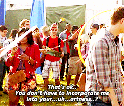
Mindy experiencing the chaos at her first music festival.

Similarly, the color scheme of the show is bright. Mindy herself is never seen in outfits of less than three contrasting colors, and all the background walls range from white to pale pastels. There is no absence of color, and the brightness allows everything to be seen plainly and clearly. This demonstrates the honestly the show is bringing, it doesn’t shy away or attempt to hide from the realities of life. It also relates to the fact that the show is a comedy, the brightness keeps the comedic nature of the show, even when the conversations or topics are difficult.

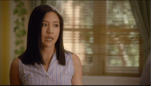
However, when the show opts to use muted colors and long shots, it’s a stark change of pace. This occurs when Mindy breaks up with her boyfriend. The only two camera angles are focused on the two characters, the shots are longer, the backgrounds are bare, and the colors are subdued. This creates two clear distinctions in the show: the time for fun and the time for serious matters. The show attempts to walk a fine line of being a funny rom-com, and still accurately reflecting the parts of life that are not enjoyable. The differences in cinematography allows the audience to understand when these tonal shifts will occur.

Chaos Everywhere

For the second Blog Entry, I am focusing on the Cinematography and direction of the episode “Quick Hardening Caulk” (season 2, episode 19) of New Girl. In this episode, there are a lot of major moments.  Jess and Nick would eventually have to confront their underlying feelings about each other and then kiss head-on. These big changes are well represented by the cinematography and direction.

This episode is shot in lots of quick cuts. These quick cuts allow the show to jump from one scene to another in a short time. This matters because these sudden switches from scene to scene help lead up to the climax of this episode at the same time. The quick cuts add to the dramatic effect of Jess and Nick finally kissing again. In addition, these back and forth scenes parallel the sexual tension that Jess and Nick are both feeling towards each other.

There is no evident color scheme in this episode, but because the whole episode is creating a build up to Jess and Nick it seems to have lots of random colors. Maybe the writers chose to do this in order to mislead the audience and throw us off. Also, the disorderly colors could have been referring to Nick and Jess’s relationship: it’s messy. The lighting in this episode also seem duller and then begins to get subtly  brighter towards the led up to Jess and Nick’s kiss. The writer’s choice to do this reflects their intent on making Jess and Nick stand out from the other characters in this episode. The whole episode tends to focus on their relationship and when there are scenes of the others characters they are short and not very memorable. Overall, I believe all the little details in this episode are meant to reflect Jess and Nicks relationship.

ironic Jess quote because Jess is attempting to make a major decision in her life

Camera Flips & Other Cinematographic Tips

I am not the best at focusing on details and minor messages in media, instead I focus on the plot and characteristics of the main characters. For me this class has been eye opening because we analyze all aspects of television, movies, etc in class. When I was analyzing an episode of Fresh off the Boat, I had to be super intentional and focus on the aspects of the show and visual design.


The first thing I noticed were the bright colors in the show, most likely because the producers are trying to emphasize that the entire show is in the past because it is based on a memoir. The best example is inside Eddie’s school hallway where the lockers are bright orange and the walls are bold yellow. The same theme is in the Huang house, where the wallpaper is yellow and green print, which is outdated for 2018, but in style for 1995.


The next thing I noticed was how the camera was only on the person who was talking. This means that while the scenes are long, the camera is constantly flipping between speaking characters. This did not annoy me…until…I over analyzed it through this prompt…whoops. The long camera shots promote growth of relationships because that is really what this show is about. The plot is just the same thing in different situations for comedic effect, while it focuses on the coming of age aspect of Eddie. But, back to the camera flipping a lot. This technique is super straightforward and focuses on the speaker more than the background or scenery. The quick flipping also enhances the back and forth bickering that is destined to happen in a family with three sons, a naive father, and a control-freak of a mother. But, it can also hurt your head a lot because the camera never stops moving in a similar way that Hallmark cameras are CONSTANTLY moving. And sometimes it is like woahh just zoom out a little bit!

In this ONE 40 second scene, the camera flipped drastically 17 TIMES to follow the speaker

I continued to go into the next episode and noticed all the same visual/cinematographic elements, so it is something that ties all the episodes together. While I have watched 6 episodes, this is the first time I was intentional and noticed the cinematographic components even though it is a constant throughout the series.

It’s a text-mergency!!

Crazy Ex-Girlfriend uses several strategies in the cinematography and direction of the show in order to convey the emotions of the characters in the show. In season 1 episode 11 Rebecca Bunch accidentally sends a text to Josh Chan expressing her love for him, and has to figure out a way to delete the text before he sees it. Bunch goes through a rollercoaster of emotions during this episode due to the gravity of the situation and her severe anxiety. She has to find ways to deal with the problems happening in the episode along with this recurring anxiety.

Most of the show is shot with medium shots. You can see the character from the waist up and the background. It is very effective within the show because it shows the characters’ facial expressions and emotions up close, but also what’s going on in the background. There are some close-up shots which truly convey the characters’ emotions and the anxiety experienced by Bunch specifically. There are some long takes, such as the scene where Bunch is in a meeting at work and accidentally sends the text to Chan, but most are quick cuts. It matters because emotions are a significant theme in the show and using certain shots when filming is an effective way to convey them.

The lighting in the show is usually bright. When Bunch is at work, the colors are mute and serious. The colors became dark when Bunch got back to her apartment and Chan figured out that Bunch had fabricated her story as to why her apartment had gotten broken into. However, in general, the color scheme of the show is bright and cheery due to the light-hearted nature of the show. The episode stands out visually from many other episodes because it has more dark colors. The color scheme leans more to the dark side in this episode.

Capturing Comfort

Every episode of Murphy Brown follows a similar setup in its composition. Most notable is the intro. Each episode begins with a focus on an individual character and is sound tracked by a famous soul song. This is the title sequence which plays the actors names. Many episodes have a meta component with the song choice as the characters sing along and the lyrics give the viewer a glimpse into what the show will be about. This important sequence shows the camera following the character around the room and highlighting the do mundane actions they take. The actions manage to display the characters emotions without any need for dialogue. In this particular episode (season 1 episode 21, “The Bickners”) Frank sits on elevator as doors open and close without exiting, when he finally moves he gets a muffin and throws away the edible part, only keeping the wrapper. In the background “This is A Man’s World”. As the camera often does when a viewer is supposed to perceive the actor’s emotions, the camera goes up close to face.  These scenes always end with a fade out of music and dialogue begun by another character entering.

Murphy Brown is a sitcom, and thus it follows the trend of having a laugh track. This is to aid in the humor. Whenever a joke is made at the expense of someone it zooms into their reaction. The show features many long shots, yet occasionally adds short ones to keep an interesting flow and follow conversations. In between major scenes, the show fades out to a video of the office building and then zooms into top floor, this is possibly to suggest the importance of their work and give the audience a concept of location.

The show has three settings, Murphy’s house, the bar (even though Murphy is a recovering alcoholic), and the office. It only strays from these when following a specific story. This creates a comforting feel. As with the similar settings, all episodes have generally subdued tones, with earthy browns, grays, and pastels. The way episodes parallel each other make Murphy Brown an enjoyable and easy show to watch. One that takes on issues yet manages to not be too aggressive about it and keep viewers comfortable.

Related image

1/3 settings: Phil’s Bar and Grill

Juxtaposition of an Awkward Position

I’m not sure how the rest of you feel, but when I think of cinematography I think of CGI explosions and huge blockbuster movies like Star Wars or The Avengers.

This means when looking at the cinematography of a show like New Girl my mindset required an adjustment.  But since then, I’ve realized the importance of direction in all forms of media, including television shows.  These shows are filled with purposeful decisions made by the director that alter the way in which the show is delivered.  And today I’m going to go more into depth on how these nuances guide the production of a New Girl episode!

The most recent episode of New Girl, Naked, was by far my favorite.  The concept of this episode is that Jess walks in on a singing and very naked Nick before a big date which results in him losing all self confidence.  At the same time Winston is having a hard time finding a job due to his love of basketball.  The clever aspects of direction I will focus on are the juxtaposition of setting and action, and the running of parallel story lines.

While watching this episode I had to pause it multiple times because the image on the screen was hilarious.  For evidence of this:  Please look below.

  What makes each of these funny is the fact that the actions being preformed don’t make sense in the given setting.  Examples:  Dancing naked… in front of a (semi-close) friend, discussing embarrassing moments… in an elevator with a stranger, checking your friend out… while he’s using the urinal.  These images all host a contrast between conventional setting and unconventional actions.  This is purposefully done by the directing team to make the character’s seem every more ridiculous and hilarious.  I think this is a common tactic by the crew for New Girl because of the contrasting nature of the show based in the stark differences between Jess and the guys.

The second aspect of the show which was cleverly directed was the running of similar plot lines.  Both Nick and Winston are having confidence issues (Nick with dating life and Winston with his career).  Jess and Schmidt respectively work to boost Nick and Winston’s confidence.  And as the similar story progress the show quickly pans back and forth between the two parties at play.  This move by the director is done to show both the similarities and differences of our characters.

Through this rapid back and forth from scene to scene the audience see’s how Nick and Winston both are doubting themselves and their decisions.  The director uses this to create sympathy for the characters.  The director also shows the different ways in which characters deal with their doubts (dancing to Jamaican music and crying over one’s wikipedia page).  This hilarious contrast is used to get laughs, successfully so I might add.

New Girl certainly isn’t a blockbuster action movie but it’s cinematography and direction should not be ignored.


Lights. Camera. ACTION!

As the acclaimed actress Julianne Moore once said, “People think that the directors direct actors. No. Really, what the director’s doing is directing the audience’s eye through the film.” As members of an audience, we often focus more on the actors and actresses that we see on screen rather than the directors and cinematographers that make the movies and tv shows we watch. These people are an integral part in creating the mood of a show while also engendering feelings and deciding how the audience will perceive the things that happen on the screen. To explore this idea further, let’s look at episode six from season one of Supergirl.

Rolling!

One thing that is evident from the very beginning is how quick the shots are. We see the camera changing viewpoints every time someone talks. Also, any time that someone moves or changes position within the scene the camera will move with them. During scenes like the ones in the coffee house at the beginning, the camera is constantly jumping back and forth between the two people talking, Kara and James. The camera is almost never still unless it is in moments when we are given new crucial information that we need time to process. An example of this is when Alex finds out that her boss knows something about her father’s death, and we can see how still the camera is in this moment.

The placement of the camera is also something that should be noted. The quick moving takes are often shot as a close-up of the person talking, or over the shoulder of the other person in the conversation. Throughout the episode, we feel as if we are up close and personal with the actors rather than far away. It is extremely evident that the director wants to make us feel like we are a part of the action that is happening on the screen. They want us to dodge the punches along with Kara and feel the wind on our face just like she does.

In regards to the lighting, the show as a whole is very brightly lit. The only things that are shown in a darker light are places like the DEO and people such as Kara’s evil aunt because these things are shrouded in mystery or evil. Because of the nature of the genre, it wants to convey a very clearly defined difference between good and evil, light and dark. It also wants to give the audience a sense of hope and optimism that good will win in the end which cannot be achieved with depressing and dismal lighting.

In conclusion, the director and cinematographer of a show have a lot of power in deciding how characters are perceived and how the plot of a show progresses. Through the use of lighting and the many different styles of camera angles, the audience can gain key insights into the different characters and what is going on around them.

They’re in jail for a reason right??

Sometimes, when watching this show, I forget that these girls are actually criminal masterminds so them manipulating the law confuses me at times; but then I remember these girls are in jail for a reason right? Chocolate Chip Nokie is episode ten in season six and in the first couple of minutes of the episode the directors do a great job at showing how easy it is for our beloved criminal masterminds to get away with running a “multi-million dollar” business.

https://drive.google.com/open?id=1uS5UNEMQkzqx5UaK0pbHofVPp_NB9o0O

The episode starts with our “don” Daya using heroin which flows into the showcase of  how she got it in Litchfield Maximum Security (emphasis on maximum). She convinces her mom to work with her by getting into the prison heroin business after her lover-Daddy-messes up how they bring in the contraband. After disguising the heroin packs at the bottom of an extremely unsuspicious container of Chocolate Chip Nokie protein shake, a guard brings it in unknowingly and as the containers are tossed in the trash the contents are obtained. GENIUS right?

In this very short 2 minute clip, the directors seem to capture every time the heroin is seen on screen very closely. From the time Daya uses it first to when her mom is placing it in the canister, heroin is the main focus. These camera angles emphasize the reason some of these girls are in jail. There is such a strong sense of trouble in these few seconds and it just reminds the audience that this is the reason we are watching the show. However it is amazing how these girls maximum their skills and run a full out business better than some of the businesses in their real world (cough cough Red).

The lighting stays consistently bright throughout these two minutes however it gets noticeably darker when the drugs are being transported. I think the directors added this hint of darkness because again the audience needs to remember that although doing it extremely well, a crime is being committed.

In these few minutes of an episode, angles, lighting, and an emphasis on strategy can make the audience in awe of the characters which also establishes a “reader-character connection”.

Long Takes and Heartaches

CINEMATOGRAPHY in Scandal

Camera Crew with Kerry Washington on the set of ScandalS


Season 1, Episode 6, of Scandal dives into the story of how Olivia and Fitz’s notorious affair began on the campaign trail. The episode is the most fitting to study cinematography within the show because very distinct cinematic strategies and elements are used to tell the backstory and current status of the relationship.

The show is shot very methodically and has a few captivating cinematic characteristics I would like to specifically point out. For example, opening scenes and occasional transitions are shot with pans through the background setting or behind an unfocused blocking object before focusing on characters. In addition, Scandal is filmed with extremely close-up shots. A large majority of the scenes in this episode and others are purely facial. Scenes with two or fewer people hardly ever show below the shoulders of the actors.

Another factor in the cinematography and filming direction of the show is the length of takes. The most notable length of cuts are the very long scenes of just Olivia and Fitz. This episode, in particular, emphasizes their alone time through lengthy takes with only their faces in the frame. For example, twice in the episode, Fitz asks for just “one minute” of silence with Olivia and the cameras grant him both of those moments in full. The only short takes with these two characters are during sensual scenes. During the sex scene, the camera spends very little time on each frame and there are nearly a hundred different takes within the two-minute scene. The intro itself is a flash of multiple images within two seconds with a clicking noise, which imitates the paparazzi cameras.  I believe the directors wanted to stay true to the theme of the theme of the show, its namesake, scandal. The longer scenes with Olivia and Fitz are more romantic and pure. Meanwhile, the sex scene being more inappropriate (since Fitz is married) is much shorter and filmed like the intro, insinuating the scandal that it is.

In regards to lighting, the show uses it to reveal mood and dictate morality. Olivia and Fitz’s scenes are always dark with a few warm colors, indicating romance and a sensual tone.  During interviews, debates, and other campaign events, the scenes are very bright. I believe this is to show how the darkness attempts to hide the affair, but the lights used during the campaign events follow the old narrative that where there is light, there is truth. Thus, a brightly lit campaign demonstrates a candidate of truth. However, the darkness tries to hide reality.

The use or lack of color may be the most distinguished cinematic element in the episode.  The directors choose to desaturate the frames in order to reveal flashback moments. This specific episode, “The Trail” explores the Grant campaign trail of two years prior and details the evolution of Olivia and Fitz’s affair. Therefore, the lack of color in certain scenes is what tells viewers that this happened previously.

Messages Straight from Prison!

In the fourth episode of the Netflix Original Series, Orange is the New Black, several arguments are presented that fit within larger cultural discussions. To support those contentions, the show’s producers employ literary elements to aid in their deliveries.

Perhaps, the strongest argument in the show arises towards the beginning of the episode. During this scene, Piper’s roommate, Ms. Claudette, orders her to clean up a mess in their cell block that was left behind by another inmate. As Piper removes the stains, Ms. Claudette teases her for being ill-equipped to handle the disarray because of her privileged background. In the middle of this segment, a flashback is shown where Ms. Claudette is introduced to a maid-service as a child. The use of the flashback, the apparent age difference between Ms. Claudette and Piper, and Ms. Claudette’s demeanor toward Piper in this situation illustrate that her expectations of Piper are not unfounded. In other words, in spite of Piper’s upbringing, Ms. Claudette expects her to perform tasks that she had to do as a child. This particular scene is a key reflection of how millennials in society are held to a much lower standard than individuals who were raised in periods where morals and values were highly revered.

Ms. Claudette as a young girl

The show delivers another thought-evoking message halfway through the episode. In this segment, Red, a well-respected inmate hands a business card of one of her close associates outside the prison to a convict who has an upcoming release date. The act in this scene certainly relates to the cultural conversation of how difficult it is for ex-convicts to find jobs. Even more, the occupations that some former inmates end up settling in are far from their desired destinations. In addition to that, the scene extends the discussion of how recently released inmates are more likely to end up behind bars if they don’t obtain employment. Lastly, this segment provides an excellent demonstration of one of the show’s themes in which one must find opportunities in the least of circumstances to foster their own personal growth.

The argument that most closely relates to the title of the episode, Imaginary Enemies, arises when Piper gathers the courage to stand up for herself. In this segment, Piper voices her frustrations toward Ms. Claudette, who attempts to scold Piper for lying to her. During this exchange, other inmates focus in on the situation to witness the actions that Ms. Claudette will take. However, to their dismay, Ms. Claudette does not retaliate and instead, listens to Piper and smirks once she walks away. This display, in some ways, echoes the notion that those who are willing to express their opinions are sometimes frowned upon as agitators. On the contrary, those who do so appropriately are able to establish and maintain better relationships with their peers. Also, this scene conveys that individuals who exhibit this behavior showcase the ability to share their beliefs without having to compromise those of others.

Piper’s Confrontation with Ms. Claudette

Throughout the fourth episode of the first season, several assertions come about that help advance the plot in the series and introduce many culturally relevant discussions. The show’s producers present these arguments to the audience with the assistance of dialogue between characters and well-timed flashbacks. Upon closer analysis, it is apparent that many of the contentions made in the episode have some connection with interpersonal characteristics and societal awareness.

The Cinematography of “Merry Christmas Season”

The episode “Christmas Eve Eve” on New Girl is the sixth season’s Christmas episode. It begins with a scene of Jess, Cece, Nick, Winston, and Schmidt worn out and tired after a long Halloween. The cinematography follows the same halloween vibe: it is dimly lit and the characters are in costume. This somber and spooky scene sets the stage for Winston to announce the news that Jess dreads most: no one wants to celebrate Christmas at the loft. A dreary background for dreary news.

Image result for new girl christmas eve eve

Jess is ready for Christmas Eve Eve!

The scene then shifts to a flashback of a past Christmas, which is happy, colorful, bright, and merry, but then Jess plugs another Christmas tree in, which cuts out the power, and all the Christmas Joy ends. Flashbacks are utilized many times in this episode, often accompanied by elevator-type music, so that the audience can tell it was a flashback rather than current times.

The remainder of the episode takes place two months later than the first scene when it is two days before Christmas, or as Jess says, “Christmas Eve Eve.” Everything from now on is jolly and bright. There are Christmas decorations around the loft, all the characters are wearing Christmas colors, and Jess is pumped for Christmas.

There is an interesting cinematography move that provides comedic effect when Nick puts on his new sunglasses and makes a joke. The show cuts directly to Jess unwrapping the gift she got for Nick- the same exact pair of sunglasses. It is unfortunate for Jess, but a great call on the film side.

Image result for new girl nick sunglasses christmas eve eve

Nick bought himself a lil Christmas gift

Another interesting scene is when Nick is in the bar, and it is bright and filled with joyful Christmas elves, but he is just stressed about going through all the receipts. It is a clever juxtaposition. Another well placed sequence of events is when Nick and Schmidt enter the mail truck and it is filled to the brim with boxes, but when they go to the actual store it is empty. This has the effect of showing the change of the times from when people used to actually shop in stores to the shift towards online shopping.

The episode ends with Jess sad in her room because she accidentally left her name out of the secret Santa drawing. However, the scene brightens up when Nick comes in to talk to her, and then brightens even more when Ferguson comes in with a Christmas hat on. This foreshadows that something bright and happy is about to happen. Nick brings Jess out to a snowy and jolly winter wonderland with singers and elves and happiness. This ending scene and Christmas theme throughout really sets this episode apart from the others because of the many allusions to Christmas and the cheers brought because of it!

Image result for new girl christmas eve eve

A happy ending featuring Darlene Love

Everyone’s Sad and Dramatic, and You Can Definitely See It

The cinematography of Grey’s Anatomy seemed ordinary at first. It’s a hospital drama, not an action movie or romance show. But, at a closer look, the show’s camera angles, quick cuts, and close ups provide a clear way to view these interns’ and doctors’ lives.

Much of the show is focused in Seattle Grace Hospital, with some time spent in the bar and Meredith’s home. Most of the camera shots in all three settings are of characters’ faces and expressions, which highlights their emotions and reactions to the many dramatic situations they are involved in. These shots are often shown at different angles too, and this helps to provide different views into their expressions. Other common hospital shots are of doctors and interns walking down hallways, doctors and patients, and doctors during surgical procedures. The shots are choppy and quick, switching from one character to another to show their reactions as soon as they can react. It also reflects the fast pace of the show; a lot happens in a short period of time, and there’s no time for panning around settings or long, sweeping shots, unless they’re of an important patient or doctor.

The lighting differs in each setting. In the hospital, the light is stark white and harsh, as is expected with hospital lighting. It’s unforgiving, just like the environment. However, the lighting at the bar is darker, as the interns often visit at night. But, this also sets the stage for more personal talk. Finally, at the home, the lighting is warmer and less harsh. The moments that occur in Meredith’s home are usually more homey, and they act like a family (a dysfunctional family, yet still a family).

Each episode has a bit of a different theme and focus, but the episode I analyzed was the Christmas Episode. It didn’t have large differences; however, the lighting reflected the Christmas theme. In the hospitals, families had trees and decorations. In Meredith’s home, Izzie decorated the house with as much Christmas related things as she could.

Image result for grey's anatomy christmas episode

Christmas cheer, right?

Chicken Pox and Radars: Sitcom Filming

Sitcoms are some of the safest mediums in television, they have had a long history and have been almost perfected to a science. Shot by shot, Fresh off the Boat is your average sitcom fare. There is basically no risks taken, and it shows.

In most visual mediums (specifically television and movies) there are three types of shot: Long, Medium, and Close

An example of a medium shot in a movie.


And this might look closer than the medium shot, but compared to a classic close shot, it it too far away.

The show plays it safe, generally sticking to this medium, individual character-based shot composition. Compared to other episodes of the show, nothing much changes. This staple visual design is helped along by using another staple sitcom design technique, the shot reverse shot.

Characters, such as Jessica shown above, are often individually shot, with the camera making quick cuts to the other character she is talking to, such as Sunny or Louis.

Besides the normal sitcom shots and filming techniques (shot reverse shot and the medium shot) we do have some slight variations in Blind Spot episode 10 of season 1, such as the chicken pox animation that plays when a character contracts the virus and the strange horror-themed narrative they add in as a gag.

Ah, the classic ‘suddenly-appears-in-the-mirror’ horror technique.

I am surprised that they did anything different, but this difference was used a purely a gag.

To accentuate the character-based medium shots, there is one form of lighting in the show, bright and focused on the character’s face.

This lighting makes sense for a sitcom, we are expected to focus on character faces and reactions to the situations they are in thus delivering the comedy, but this is once again a classic sitcom decision. This lighting is consistent among most episodes in “Fresh off the Boat” and isn’t even changed in the gag-horror shots.

All of these shot and lightening choices are, once again, classic sitcom choices, which is perfectly fine. The shot quality, choice, and direction is fine because it does what it needs to, helps to frame the gags and dialogue, but it doesn’t do anything more.

How Shallow Depth of Field Builds Intimacy in the Bold Type

One constant element of The Bold Type is its use of shallow depth of field in nearly all of its shots. Many of the scenes in the show have a sharp focus on the characters while blurring out their surroundings. This film technique seems prominent in most tv shows today, but it specifically serves as an important tool in shaping The Bold Type’s overall premise. I was inspired to analyze The Bold Type’s use of shallow depth of field after watching a video essay by Evan Puschak of Nerdwriter on how The Handmaiden’s Tale uses shallow focus to convey the oppressive nature of Gilead. The Bold Type, likewise, not only uses shallow depth of field for aesthetic purposes but also to build intimacy within its character conversations. The show places a heavy emphasis on the daily details of its three lead women. While the show is set in the big city of New York, it is clear that the character’s lives are given a larger spotlight. Conversations are a huge factor in the show, and the use of shallow depth of field creates the illusion of a more intimate relationship between the viewer and the show’s characters. Character’s facial expressions and body language are given spotlight during a conversation. This extra focus helps draw the viewer into the discussion.

In the finale of season one of The Bold Type, Jane is tasked with writing a piece on a rape survivor’s art and activism. This episode is filled with deep conversations and plenty of extended close shots of the women talking.  During the final scene when Jacqueline takes the weights from Mia, the use of shallow depth of field is especially clear. Arguably it adds to the inspiring nature of the scene. Although the moment is between Mia and Jacqueline the focus still shifts from woman to woman. We see each woman’s facial expression at that moment, especially Jane’s. It’s a subtle effect, but this transition of focus works wonders within a show which revolves around character conversations. The shallow focus and the position of the camera cradled between the women’s’ shoulders gives the viewer a feeling of intimacy within the conversation. However, while the camera is constantly mobile, it remains looking over the women’s shoulders and never breaches their little circle, helping maintain a feeling of privacy within this crucial scene.

The camera looks over Sutton and Kat’s shoulders and focuses on Jane’s reaction to the moment.

The focus is on Jacqueline as she enters the circle.


Work Cited

Puschak, Evan. ” One Reason The Handmaid’s Tale Won Emmys Best Drama. ” Youtube, 31 August 2017, https://youtu.be/cY4aCnfrqss. 

Visualizing Our Darkest Desires

WestWorld is a theme park created on the premise of satisfying humanity’s deepest desires without repercussions. Visualizing this with meaning is thus an obvious challenge, but it’s a challenge the creators and directors of WestWorld confront seemingly effortlessly.

The show is shot from different perspectives for long periods of time. Each episode, we see the camera alternate to follow different characters in the show. For example, we may start off following Dolores, but 8 minutes later will find ourselves back at the park headquarters following Bernard. These are mostly long shots, and while many other shows employ this tactic when there are multiple characters in the storyline, WestWorld employs it in a unique way. Since WestWorld is literally about a world within a world, each time we change character perspectives we find ourselves in a totally new world (I know, a lot of “world” in that sentence). When we find ourselves following a character in the park, for example, it’s easy to fall into the perception that it’s real. It takes the changes in perspective to headquarters for us to get a reality check and remind ourselves this is nothing but a simulated world. This tactful employment of cinematography makes it all the more interesting for the viewers as we immerse ourselves in two different worlds and eventually watch them collide.

Whenever we find ourselves in WestWorld, everything is often bright and vibrant. We’re treated to beautiful shots of the canyon landscape, enthralling rivers, and colorful towns. When characters embark through journeys in the park, the weather is often sunny, and the shots will give us impressions of desolate lands. This is in stark comparison to our shots within the WestWorld headquarters, where shots are often darker, the ambience far from vibrant, and the perception gloomy. Offices are seemingly always windowless in this building, giving the impression of more of a labyrinth than a workspace. This highlights the stark difference between the two worlds: The simulated world of pleasure, and the reality of running such a morally ambiguous world.

Seeing how I’ve finished the show by now (I did a little bit of binging), I can analyze the visuals of the show as a whole. While the show overall follows the trends I’ve explained above, it gets even more complex as the show advances. When these two worlds of simulation and reality begin to collide, we begin to witness the visuals reflect this. Slowly but surely, both worlds become more reflective of the reality, and the visuals of WestWorld become more morbid and dark. Overall, the writers, directors, and producers go through great lengths to wrap the viewers in the visuals of two distinct worlds, and the amazing quality of WestWorld reflects this.

The beautiful scenery of WestWorld

Page 2 of 5

Powered by WordPress & Theme by Anders Norén