English 1102: Television and Feminism

Dr. Casey Alane Wilson • Georgia Institute of Technology

Tag: cinematography (Page 1 of 4)

Light and Dark: Cinematography of Orange is the New Black

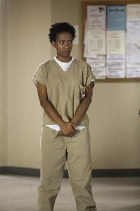
While the first season of Orange is the New Black is generally shot in the drab confines of Litchfield Penitentiary, frequent flashbacks spice up the visuals while providing intriguing backstories to many of the prison’s residents.

The show immediately kicks of with a series of quick cuts from a flashback of Piper enjoying getting clean, ending with a jarring closeup of her which eventually zooms out to reveal the confines of prison. Although the show is pretty much entirely shot in third person, the camera follows a variety of perspectives, some with minimal relation to the protagonist. The scenes generally only contain a few characters, but may start with a zoomed out view of many characters (such as in the mess hall), before focusing on the primary character in the scene.

The confines of prison are generally drab, but relatively well lit. There are several scenes that take place at night or in darker environments, such as in the prison theater or late at night in the dorms. There are also a fair number of romantic and sexual scenes, which are shot with much longer takes than other parts of the show. The solitary confinement is shot with an alternating focus on the inmate and the emptiness of their cell, giving the viewer a sense of that character’s isolation. Overall, there are many scenes with one on one interaction where the camera switches perspectives frequently, such as Piper’s meetings with Larry and Healy.

I believe the frequent cuts of the show serve to demonstrate how quickly change can occur in prison, while the longer shots emphasize individual relationships and emotions. The generally uninteresting background draws more focus on the colorful personality of the characters, who keep the prison from becoming too boring. Overall, the producers of the show did an excellent job keeping their shots in tune with the plot of the story, and using visuals to emphasize characters and emotions.

Below, I have linked an article that goes into much more detail on the equipment used in shooting OITNB.

https://www.creativeplanetnetwork.com/news-features/doing-time-inside-netflix-original-series-orange-new-black-423037

Cinematic Crash

image

Image of the plane crash from Scandal S1E

Good evening, people. I am signing on just one more time. In my last blog post, I plan to revisit cinematic elements in the Scandal show, but in episode 5, “Crash and Burn”. The cinematographers capitalize on portions of the show where characters face tragedy and crises. Specifically, the cinematographic tactics used when Olivia and her team see the plane crash site and when they listen to the black box recording of the crash.

This episode begins with the disappearance of Pope and Associates’ client, Amanda Tanner. The team goes into a frenzy and cameras switch quickly between their faces as they scramble around. The show then suddenly cuts to Quinn and Harrison stumbling down a hillside to discover the horror of a deadly plane crash. The cameras flash horrific images of burned plane pieces, smoking fabrics, scattered clothes, and even dismembered body parts. Then, it pans back to the shocked faces of Quinn and Harrison. Dramatic music plays in the background and there is a grim filter on the lens as it blinks between these somber pictures. I believe Rhimes and her directors wanted Scandal viewers to feel the gravity of the situation just as Quinn and Harrison were experiencing. Olivia and her client, the husband of the plane’s pilot, visit the site later, and the somber mood is amplified by the client’s explanation that the red flags symbolized parts of passengers bodies. The cameras then proceed to pan around the crash site to demonstrate the hundreds of red flags scattered throughout the smothering plane pieces and all along the ground.

However, I think the most cinematographically intense scene occurs when Olivia and her team must listen to the black box recording of the crash. The pilots start out just conversing between each other in a friendly manner and the camera remains zoomed out at a long distance from the team while they listen. But, as the action picks up and the crewmembers become increasingly stressed, the camera starts focusing in closely on the facial expressions of Olivia’s team. Eventually, the camera starts cutting faster and faster between their horrified faces as the recording on the box intensifies. Finally, after all this action has built up, the camera stops on Olivia’s face, which fills the entire frame, at the exact moment that the plane crashes and the audio cuts out. Thus, viewers are left with her intense look filling the screen and it is completely silent. This very dramatic sequence of cinematographic elements increases the heart rate and suspense of viewers as they watch and listen carefully to this scene, just as the team’s heart rate and suspense rose when they listened to the black box recording.

Therefore, I believe in this episode of Scandal,  the cinematographers desire to use their filmographic art to connect the viewers to the emotions and experiences of Olivia and her team.

Beige is the New Orange is the New Black

Saved the best for last. For this final blog post, I’m going to be writing about the cinematography of Orange is the New Black, focusing on the seventh episode of Season 1, ”Blood Donut.”

The color scheme of the show has the most visual definition, or lack thereof, of any of the other aspects of visual design in the show. The show features very little orange or black, in fact, the most prominent color present is beige. Beige is not only the color of the prisoners’ uniforms, but it also saturates the walls and floors of Litchfield. Even the grass within the prison fences is slightly dead rendering it brown, and the trees surrounding the prison are winterized. Even outside, muted earth tones remain the dominant color scheme. In the outside world, colors are far more pronounced and are clearly brighter. Earth tones seemingly remain the primary color scheme, dark brown and beige being replaced with cream and yellow, but there are flashes of bright colors that break this monotony. These are absent in the prison. Lighting contributes to this visual difference between the two places: in the prison lighting is almost constantly white fluorescent, which is colder, and natural light is almost always absent. Outside of prison, lighting is either warm natural daylight or warm, dim, and yellow incandescent lighting.

So much beige

Another visual choice that greatly impacts the show is its shot selection. The show uses a lot of close up shots, framing the faces of its characters. This is effective as Orange is the New Black is, at its core, a show that focuses on all of its characters, their stories, and their experiences, with their being in prison serving as merely a plot device. Even during dialogue, characters are often framed individually while speaking, letting the audience focus more on what they’re saying. Another aspect of shot selection the show uses well is intermittent long takes. These are used not to increase dramatic effect as they normally are, but to highlight the monotony of prison life by lingering on more mundane moments.

Orange is the New Black is a show that revolves around its excellent visual design and character development. It may miss the target in terms of short term plot as a result of looking long term, but sticking with the show makes the viewers appreciate its core tenets. Using this, the show makes important points about the prison system and the lives of women, while remaining entertaining.

“‘Orange Is the New Black’ Blood Donut.” IMDb, IMDb.com, www.imdb.com/title/tt2595996/mediaindex?ref_=tt_mv_close.

Into the Darkness

I’ve talked about both writing and cinematography in Search Party before, but I want to take a moment to explore how those two concepts portray character development in the show, particularly Dory’s character. Our first interaction with Dory is silly and bright. She’s standing on a street corner in New York, contemplating the missing person poster tacked to the nearby telephone pole: Chantal Witherbottom. Obviously there’s something about her that Dory is interested in, since she gets distracted enough to step in dog poop as she is contemplating the poster. That scene is funny, too; an upset pedestrian calls Dory out for it, complaining that she’ll make the “whole MTA smell like shit” if she wears them on the train. This moment is jarring yet humorous, and it anchors the viewer back into reality.

The poor girl has no idea what she’s in for.

Here’s the thing about that scene, though: it’s sinister. We don’t know who Chantal is, except for the short clip of people yelling out her name in the woods at the very beginning of the series. We don’t understand that Chantal, beautiful-crazy-stupid-Chantal, is going to ruin Dory’s life. We don’t know yet that Dory is going to meet Keith, kill Keith, and ultimately have to pay the price for his death. We’re safe, unassuming, just like the way the opening scene plays out. The disheveled way Dory is dressed, the safety in broad daylight, the humorous remark of the pedestrian all lead us to believe that everything is going to be okay.

Spoiler alert: everything is Not Okay And Very Bad. The final scene of the show is in complete juxtaposition to the opener. Dory’s all dolled up: red cocktail dress, sleek and professional hair, powerful red lip. She’s grown up, matured, seen some real messed up stuff. The thing is, though, she’s still unassuming. She doesn’t expect what is about to hit her. There’s irony in the scene. It’s supposed to be triumphant, she’s supposed to be up on stage with a winning political candidate, part of a new team that actually got it right for once. What goes around comes around though, and upon her arrest, Dory is instantly transformed. She’s vulnerable, defeated, restrained. The lighting of the scene is ominous.  Even the music is scary.  It sets up Dory for the next season: what will happen? She’s lost all her friends, so how is she going to get out of it this time? I guess we’ll just have to wait and see.

Look at how dark the last time we see Dory is compared to the first

Cinemat(Broad)ography and Dir(City)ection

Broad City is a really well shot show. Paying attention to the cinematography has especially enlightened me to the variance of shots and mise en scene particular to the show. The camera can be shaky in one scene and pan in the next. I most recently watched season 4 episode 1 of the series, and the show’s visual direction is often non-distracting but sometimes an aide to its humor. In the episode Ilana and Abbi are meeting each other for the first time, and the show explores their lives without each other and how much better they are in that same immediate day in an alternate scenario where they spend the day together. Over the top dvd movie menu esque transitions convey which reality is being displayed as it switches between each repeatedly until they eventually run into each other, no longer needing the transition to differentiate between realities. It definitely helped me keep track of what was going on as the characters wear the same clothes the entire time and the plot is only held together through these transitions.

In other episodes of Broad City, different areas of New York will have different lighting to give one a more gross, uncomfortable feeling when a man bothers them on the street compared to better lighting when they later stumble into a wealthy neighborhood. The use of lighting to convey meaning and emotion is an interesting tool. Broad City generally seems to use it as a tool to physically display the character’s anxiety. In one episode the power goes off in Abbi’s building, and her not being able to flush the toilet is heightened through the dark surroundings and shadows in the following scenes. A mundane inconvenience is better allowed to be thought of as more by the viewer because of how the show visually treats and accompanies the situation.

See the source image

Here is an interesting use of lighting from behind Abbi to highlight the revelation that she becomes a singer in an old bar when she blacks out.


Camera Shots and Gun Shots: Shooting the Show

In this fourth installment of Westworld, I was able to notice at how the creators of the show created a major shift to focus in short, quick, snappy flashback shots. One of the main stress of the episode was to start to build tension by having the abused androids of the park be tormented while remembering their past. These interjecting snippets of film not only are able to show the confusion of androids Dolores and Maeve, but they also confuse the viewer by constantly inputting new, not seen before content of the cosmetic surgeries the androids are given once they are killed in the park.

Maeve remembering one of her traumatic surgeries.

One of the main effects of this filming behavior has caused the viewers, like myself, to view the actions which are occurring through the show in the perspective of the android. This confusion in the perspective therefore dehumanizes the human workers which are fixing the “working parts” of their business while sympathizing with the Maeve — who is struggling with a major identity crisis about what her existential purpose really is — as she transcends beyond her mental ability to simply function. Furthermore, we are also beginning to understand the deeper inner workings of the park in which the transition from machine to man takes place (ironically, the religion of the Native Americans in the show and also where Dolores’s painful  flashbacks are guiding her).

Finally, the effects of such intense flashbacks are contrasted with the long-retracting camera angles of talks between Dolores and Bernard — one of the managers of the park — to show how man is trying to understand how machine is developing the consciousness. These long scenes drag out for seemingly ages to make the viewer ponder about their own struggle with existence, something which many of mankind substitute with religion. The depth which these scenes provide almost touch into mankind’s early attempts to fathom their own existence.

Small Choices of Camera Make Big Differences

With the rise of online streaming and various alternative television channels, low budget television shows have been on the rise again. Although these TV shows might have been produced with a small budget, many of them are still able to capture the attention of its audience just like the major blockbusters, with prime examples being KillJoys and in movies the Hallmark movies.

Coping with its low budget, we don’t see fancy CGI being used in Killjoys and it is often shot on simple sets, while the external locations are usually just old factories or farms. What made Killjoys enjoyable and stood out among other TV shows was its near excellent use of cinematography. It’s uses of camera angles and how it designed the compositions of the scenes, effectively constructed the atmospheres of each scene while building up the personality of the characters in the show. Today, we shall be discussing how effective cinematography has propelled Killjoys to its success.


「killjoys iconic scenes」的圖片搜尋結果

Example of how a tense atmosphere is constructed just by the cinematography


Have you ever wondered why your focus has always fallen on Dutch while watching the series? Don’t worry, this isn’t something wrong on your part. In fact, it is something the director wanted its audience to do. Apart from Dutch having a longer screen time than the two other main characters (individually), notice how when Dutch is on screen with other characters, she is often placed in the centre of the screen. Although just watching through the episodes, it is pretty hard to notice its effects, as on first sight the characters will be seen on the same ground by us. However, as cognitive misers, especially we turn our brain off while watching TV, what is at the centre of the screen easily becomes our centre of interest. The director’s use of screen composition subtly guides us on who to focus. We usually won’t notice this, but it is this extra time we focus on Dutch, especially when she is with other characters that lead us to become more connected with her over the other. This allows the screenwriters to ultimately “force” a bond between the audience and Dutch.


「killjoys」的圖片搜尋結果

How Dutch is the Center of Interest


Throughout the series, we are also often given the feeling that Dutch is a woman with a strong character and excellent fighting ability. Apart from the actions she has been seen doing – single-handedly fending off a whole group of mercenaries or directly confronting Delle an Aneela, as you can guess the use of camera also plays a great role here.  Indeed, this can be attributed to the use of low angles shots for Dutch in the show. Same as the reason why your friends might like to take low angle photos, low angle photos can make a person seem more confident and stronger. It makes a person taller and, in the process, distorting body portions resulting in a misjudgment by the audience. The director of Killjoys plays around with this effect, allowing Dutch to remain more confident and dominant over other characters even in crises, strengthening her image while preserving a natural storyline.


A video on the effects of camera angles:


How Cinematography in Fresh Off the Boat leads to an Upbeat Environment

The Cinematography in Fresh Off the Boat, similar to the rest of the sitcom genre, lends itself to a very upbeat and cheerful environment. The combination of bright, warm, colors and quick cuts creates a pleasant, lighthearted, atmosphere.

Color in cinematography serves as a valuable tool in portraying how the audience feels. Lighting and color are a huge aspect in the emotion of a scene, and through the use of bright colors, the show invites the audience to feel comforted and happy. For example, the Huang’s house is painted a bright yellow or white in most places and the blinds are always open. In Season 2 Episode 10, the Huangs celebrate Christmas, and to communicate this idea of warmth and family, there is not a single dark scene. The few scenes shot at night have bright lights illuminating it. This episode is especially bright in comparison to the rest of the season because it wants to communicate the happy feeling of family and togetherness .

Christmas at the Huangs

Cutting quickly between the actors talking also creates a faux excitement and energy that keeps the audience engaged. Whenever a character talks, the camera hard cuts to them with no transition. The camera keeps the characters face in full shot while they are talking, seemingly used to create a sort of intimacy between the audience and the characters. The show is also shot in single-camera, following the characters as they move around. This parallels the fast paced plot of the show, as the audience quickly follows each characters and their sub plots. Specifically in the episode about Christmas, the cuts are abundantly clear when the kids are arguing about presents to get their parents and the camera quickly shifts between each of the kids as they each but in to the conversation.

Eddie in close view

Overall, the cinematography in the show perfectly sets the scene for how the directors want the audience to feel through the use of bright colors and lighting and quick cuts.

Fresh Outta Film School

Fresh Off the Boat has a fresh visual design. The colors are bright, the cuts are quick, and the color scheme is warm. This show is so wholesome that it even reflects in the visual design. The colors are warm schemed, reflecting the warmth of the show and the inviting characters as the series wants to display their family dynamic. This has the effect of carrying over the program’s lightheartedness. There are no gloomy days, dark scenes, or special effects in the show. It is very clean cut and looks bright and cheery even when nighttime scenes are shown.

Image result for fresh off the opening gif

fight like sisters, love like sisters

The show has mostly longer scenes, with a plotline falling over an average to long timeframe, but shots are quick and clean. Conversations between characters are shot with quick cuts between each perspective, ping-ponging between lines of dialogue. Every once in a while scenes are shot differently, like the opening of Episode 7, when the Huang’s are in a mock robbery scene. The opening of the showtimes special edits with riffs and music. The narration is paired with shots, especially when narrating the thoughts of multiple characters at a time, which the show does often. These long takes help the development of the show by allowing for longer jokes and humor with better punchlines and more drama between the characters. Scene 7 also shows a fantasy of Eddie Huang wanting to hit on his crush, who he is intimidated by, by showing her his music taste. In this scene, he gets up to walk back to her and enters a fantasy edit with backup dancers and an autotuned bus driver. More intimate scenes, like one on one conversations between the mom and dad, are shot closer up, leading you into the conversation as if you were there. If it weren’t shot this close, it would feel as though you are observing something private, and may lose engagement with viewers.

Related image

the way they look at each other <3

I find the intro of the show interesting cinematographically because it uses unique panning styles and zooms not used in the actual showtime. In the title sequence as well as most of Eddie’s scenes, the music is paired with the style of the shot. Zooms have riffs, sexy scenes have jazz, happy scenes have elevator music and Eddie’s got his 2pac. Is this show Straight Outta Compton or Straight Outta Suburbia?

The Huangs GET SHOT

Fresh Off the Boat takes an interesting turn in season two, episode nineteen. In the beginning of the episode, we see that Jessica is upset because her favorite drama t.v. show will be off air until its next season starts. Following this, the episode’s ambiance gradually  becomes more and more dramatic to emulate such a show, which is pretty different than the usual vibe. Usually, the show is very brightly lit and colorful, contributing to a light and very welcoming and easy-to-watch atmosphere. But in this episode, there is more use of darkness and contrast to add to the dramatic effect.

Some scenes in this episode are visibly darker than usual.

This reminds me of some of the shots from an earlier episode in season one where Louis agrees to coach Eddie’s basketball team. Eddie imagines his father playing basketball like an old kung fu movie, with flying fight scenes and dramatic dialog. The writers’ use of cinematography to change the mood or delivery of episodes is an interesting concept in my opinion. It introduces a lot of freedom to the writers’ roles in developing episodes. Writers can, and do, change some of the basic elements of the show from time to time to convey different things. I think this is a pretty unique quality for a show to have, and it seems like this show is a lot of fun on both ends of the production as writers can introduce fun episodes such as these.

One thing that remains constant, cinematography-wise, is the use of many cuts in a single scene. In the context of the viewer, this creates a feeling of a fast pace in scenes. I don’t really know why this would be desirable from a production standpoint, though. This may be a result of a low budget or the inclusion of child actors, so that many takes can be strung together without seeming out-of-place.

One-Night Stands and Messed-Up Plans

Even before watching episode thirteen of New Girl, I had planned to write a blog post about this episode because I was expecting changes in color schemes to match Valentine’s Day as described in the title of the episode.  While I was disappointed by the lack of festivity, there is still plenty to talk about regarding the visual design of the episode and the show as a whole.

When your night isn’t going as planned

New Girl continues to stay upbeat while keeping viewers up-to-date with the daily lives of the main characters.  The color scheme of the show generally matches the tone with warm hues that are comfortable and cheery and is usually shot with quick cuts, often shifting camera angles in line with changes in speakers.  For instance, there’s soft lighting and brown tones in the furniture and decorations when the camera is focused on Nick and his girlfriend Julia.  During Schmidt’s and Jess’s conversation about their Valentine’s Day plans, the camera angle switches to focus on who is talking in the conversation.  After the initial warm, earthy tones set in the shared apartment, the color scheme of the episode takes a darker turn to match the time of day and later, Schmidt’s dark mood at being forced to be the third wheel and driver for Jess’s one-night stand.

The darkness makes the abrupt transition to bright office lighting even more jarring as the episode transitions to focus on Nick and intern Cliff (and Julia, in between her phone calls with Ming).  While the surroundings are now better lit, the mood doesn’t change much as the lighting lacks warmth and hominess.  The only person somewhat enjoying Valentine’s Day in the group of four is Winston who has unwittingly joined Shelby and her girlfriends for a relaxing night in.  While Winston is initially disgruntled, he fits in seamlessly with the girls, which the visual design of the episode demonstrates through cheerful, festive lighting and colorful reds.  Before the cut to Oliver and Jess, the camera zooms in on Shelby’s face to show how impressed and touched she is with how well Winston has integrated with her girl group.

In this episode of New Girl, the color scheme and lighting match well with the plot of the show and the mood that the show is trying to convey.  The visual design provides hints for the audience regarding when things are going well or poorly for the main characters and various experiences with romantic relationships during the evening of a day focused on romance and love.  As almost always with New Girl, the episode ends optimistically, though with suspense, showing a scene of the morning after when Cece has hooked up with Schmidt while Jess had narrowly dodged that bullet (and awkwardness) the night before.  The audience is left wondering what will happen next as it appears to be the calm before the storm.

Obadear, Let’s Shoot This Show

The first 30 seconds of season 2 of Search Party are an absolute masterpiece. Visually, we have a blank (ish) canvas; our protagonist’s face is looking directly at the camera (it’s soon revealed she’s actually looking into a mirror) with nothing else in the shot, save for a splotch of blood on her forehead. She’s facing what’s just happened (haha, get it?). The room feels so sterile.Without audio, this scene is particularly puzzling, especially for a first-time viewer. When you layer in the audio however, you can make the connection that our protagonist Dory has just gone through a very traumatic event. Snippets of recent happenings flash on the screen for a couple of seconds but disappear too quickly to get a sure sense of what is going on.

This inaugural scene sets the tone for the whole season: anxiety and mystery and trauma (oh my!). The camera work is shaky, implying a sense of urgency. The colors are muted (ironically, the only non neutral in the scene is the blood red sweater Elliot is wearing). The camera moves even with the actors, following Dory and Elliot upwards as he pulls her off the ground by her shoulders. There’s a strange intimacy hidden here, revealed deeply through all of these choices. That feeling, however, is immediately lost when Elliot comments about Chantal’s invitation to dinner. Our characters are still in the real world, even though this opening sequence is so dream-like. When I say dream-like, though, I really mean nightmarish. The scene is almost shot like a reality TV show. The camera focuses on the character’s face for much too long, almost uncomfortably close. A viewer could count all of Alia Shawkat’s freckles.

There’s another really beautiful scene in the episode where Drew is playing a melancholy keyboard tune. The room he’s in is blood orange, carpet included. The scene is lit very scarcely, but at the same time there is enough light for our characters to be bathed in a red hue. This scene is quite brilliantly shot, really, since it’s where Elliot, Drew, and Dory decide they are not going to report Keith’s murder to the police. It’s almost as if the redness is making their secret more evil.

One stylistic choice that stood out to me in this episode was the scene where they buried Keith. Remember that Search Party is, overall, a pretty dark show (pun intended). The lack of proper lighting actually bothered me as I’d have to constantly increase my laptop brightness to accommodate while watching. Thus, it’s interesting that in the darkest plot moment of the show, they choose to convey the characters outside. So picture this: four millennials, one freshly down from a coke high, burying a dead man (in a hot pink zebra stripe suitcase) in broad daylight.

Just pretend the suitcase is there too

Search Party is a very serious show, I promise.

Quick Cuts, Chaos, and Colors

The Mindy Project remains steadfast in its exploration of the idea that life is messy, complicated, and not always fun. This is reflected in the rom-com genre itself, the music, the dialogue, and the cinematography. In general, the show is bright, chaotic, and complicated – the way in which the show is shot reflects this.

A notable example of this is in the season 2 episode “Music Festival”. The show relies on dramatic events as crucial plot points, and this episode is no different. The first scene involves a pastor declaring that he’s becoming a DJ. This declaration is coupled with a vast array of camera shots and angles. There’s the wide, sweeping shot of the church, the camera moving to follow the pastor down the aisle, close ups on Mindy and the pastor, shots of the audience, and ever-changing angles. These shots are pieced together quickly, rarely lasting more than a couple seconds. This scene was focused on dialogue, not actions, so most of the shots focus on the people talking and shift rapidly to match the quick nature of the conversations.

However, even in scenes not dialogue driven the nature of the cinematography remains the same. The name of the game is creating chaos in the background and placing the central action or characters in the front. At the musical festival, the backdrop is insane: people everywhere, bright colors, balloons, hoops, and things flying everywhere. Even still, the main characters remain in the center of all the shots, which allows the focus of the audience to stay on them. This usage of quick cuts relates strongly to the theme of the show – life’s chaos.

Mindy experiencing the chaos at her first music festival.

Similarly, the color scheme of the show is bright. Mindy herself is never seen in outfits of less than three contrasting colors, and all the background walls range from white to pale pastels. There is no absence of color, and the brightness allows everything to be seen plainly and clearly. This demonstrates the honestly the show is bringing, it doesn’t shy away or attempt to hide from the realities of life. It also relates to the fact that the show is a comedy, the brightness keeps the comedic nature of the show, even when the conversations or topics are difficult.

However, when the show opts to use muted colors and long shots, it’s a stark change of pace. This occurs when Mindy breaks up with her boyfriend. The only two camera angles are focused on the two characters, the shots are longer, the backgrounds are bare, and the colors are subdued. This creates two clear distinctions in the show: the time for fun and the time for serious matters. The show attempts to walk a fine line of being a funny rom-com, and still accurately reflecting the parts of life that are not enjoyable. The differences in cinematography allows the audience to understand when these tonal shifts will occur.

Camera Flips & Other Cinematographic Tips

I am not the best at focusing on details and minor messages in media, instead I focus on the plot and characteristics of the main characters. For me this class has been eye opening because we analyze all aspects of television, movies, etc in class. When I was analyzing an episode of Fresh off the Boat, I had to be super intentional and focus on the aspects of the show and visual design.


The first thing I noticed were the bright colors in the show, most likely because the producers are trying to emphasize that the entire show is in the past because it is based on a memoir. The best example is inside Eddie’s school hallway where the lockers are bright orange and the walls are bold yellow. The same theme is in the Huang house, where the wallpaper is yellow and green print, which is outdated for 2018, but in style for 1995.


The next thing I noticed was how the camera was only on the person who was talking. This means that while the scenes are long, the camera is constantly flipping between speaking characters. This did not annoy me…until…I over analyzed it through this prompt…whoops. The long camera shots promote growth of relationships because that is really what this show is about. The plot is just the same thing in different situations for comedic effect, while it focuses on the coming of age aspect of Eddie. But, back to the camera flipping a lot. This technique is super straightforward and focuses on the speaker more than the background or scenery. The quick flipping also enhances the back and forth bickering that is destined to happen in a family with three sons, a naive father, and a control-freak of a mother. But, it can also hurt your head a lot because the camera never stops moving in a similar way that Hallmark cameras are CONSTANTLY moving. And sometimes it is like woahh just zoom out a little bit!

In this ONE 40 second scene, the camera flipped drastically 17 TIMES to follow the speaker

I continued to go into the next episode and noticed all the same visual/cinematographic elements, so it is something that ties all the episodes together. While I have watched 6 episodes, this is the first time I was intentional and noticed the cinematographic components even though it is a constant throughout the series.

It’s a text-mergency!!

Crazy Ex-Girlfriend uses several strategies in the cinematography and direction of the show in order to convey the emotions of the characters in the show. In season 1 episode 11 Rebecca Bunch accidentally sends a text to Josh Chan expressing her love for him, and has to figure out a way to delete the text before he sees it. Bunch goes through a rollercoaster of emotions during this episode due to the gravity of the situation and her severe anxiety. She has to find ways to deal with the problems happening in the episode along with this recurring anxiety.

Most of the show is shot with medium shots. You can see the character from the waist up and the background. It is very effective within the show because it shows the characters’ facial expressions and emotions up close, but also what’s going on in the background. There are some close-up shots which truly convey the characters’ emotions and the anxiety experienced by Bunch specifically. There are some long takes, such as the scene where Bunch is in a meeting at work and accidentally sends the text to Chan, but most are quick cuts. It matters because emotions are a significant theme in the show and using certain shots when filming is an effective way to convey them.

The lighting in the show is usually bright. When Bunch is at work, the colors are mute and serious. The colors became dark when Bunch got back to her apartment and Chan figured out that Bunch had fabricated her story as to why her apartment had gotten broken into. However, in general, the color scheme of the show is bright and cheery due to the light-hearted nature of the show. The episode stands out visually from many other episodes because it has more dark colors. The color scheme leans more to the dark side in this episode.

Page 1 of 4

Powered by WordPress & Theme by Anders Norén