English 1102: Television and Feminism

Dr. Casey Alane Wilson • Georgia Institute of Technology

Tag: cinematography (Page 3 of 4)

Crazy Ex Girlfriend’s Visual Design

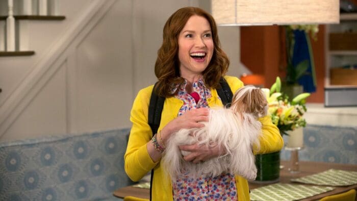
In Crazy Ex Girlfriend, dark subject matter is often juxtaposed with a cheery tone (example: the cartoon sun in the intro that joyfully sings “She’s so broken inside”). The general color scheme of Crazy Ex Girlfriend provides the same kind of optimistic contrast to Rebecca’s serious mental health issues. Often, light, bright colors dominate the scene. From the setting of the scene (think the bright green walls of the bar that Greg works at, or Rebecca’s white and airy house) to the clothing the characters wear (like Rebecca and Paula’s work outfits), bright colors can be found everywhere.

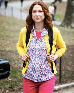
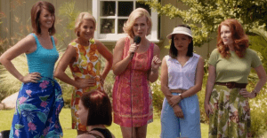
In addition to providing a cheerful visual tone, color is also used symbolically, especially in the outfits worn by the women of the show. For example, in Episode 6 My First Thanksgiving With Josh!, Rebecca and Valencia display their clashing personalities and methods through the clothing they wear. While Rebecca wears light blue throughout the episode, symbolizing her thoughtfulness and how she strategizes winning over Josh’s parents in order to win over Josh, Valencia wears a dark red dress that connotes her vibrant sexuality and how she uses sex to win Josh over after a fight. In the same episode, Josh’s mother Mrs. Chan wears a light pink sweater which corresponds perfectly to her nurturing personality.

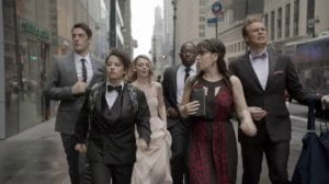
In all honestly, the direction is very standard for a TV show. Quick cuts are used during conversations to display a person’s face as they speak; long shots are usually reserved for a character’s pensive expression as they mull something over or have a realization. Where the show really takes off directorially is during the musical numbers, which are shot in a variety of ways. Earlier in the show, when Greg sings “Settle For Me,” the sequence is shot in the style of ‘3os musicals, a la Ginger Rogers and Fred Astaire, with uninterrupted shots of them dancing in black and white. In Episode 6, which features a lovely number named “I Give Good Parent,” however, the show goes a more MTV route, with shots where the camera rotates around a still figure, and shadows are used to convey power and sensuality. The musical number are where the true talent (as well as often the true feelings of the characters) of the show’s cinematography comes out.

Another stunning example of Crazy Ex Girfriend’s directorial versatility


The Evolving Cinematography and Direction in Kimmy Schmidt

After being trapped in a bunker for a decade, Kimmy finally experiences the lively world she has been missing out on for the past ten years and the lighting and direction style certainly reflect this situation throughout the entire series.  In this post, I will be analyzing the cinematography and direction in the episode titled “Kimmy Goes to a Party!” (Season 1, Episode 7)  of Kimmy Schmidt: Unbreakable, and more specifically how this episode provides a stark contrast to those previously in the first season.

Early on in the season, the first episodes are filled with quick, snappy cuts that make the viewers feel almost overwhelmed. This is deliberately done to make the viewer feel as Kimmy does living in the overwhelming city of New York after being locked in a bunker for 10 long, tedious years.  However, after Kimmy gradually adjusts to this lifestyle episode by episode, the direction changes as cuts become longer and more problematic situations start to thicken the plot of the series. This episode is filled with suspense as Kimmy attempts to impress a guy she likes and Jacqueline Voorhees faces paranoia regarding a possible affair her husband had.  Naturally, this episode is filled with some of the longest shots of the whole series as the characters must face these issues and invoke a sympathetic response in the audience toward the character’s issues (which is nearly impossible to do with the short shots that are common throughout the show).

In regards to the lighting, the show is filled in this episode, and the whole series for that matter with vibrant color as Kimmy is re-experiencing life in the lively New York City after being held captive in a lifeless, gray bunker for the previous 10 years.  The costumes within this episode, like all episodes in the series, are vibrant, appealing to the visual eye of the audience.  Kimmy is the perfect example of the vibrant color scheme of the show as she is always wearing some sort of clothes with highlighter pink, yellow or blue coloration.  Even with the very bright lighting of a show set in New York City, the director makes it an apparent goal to make sure to go the extra mile by creating a vibrant wardrobe and including other items with playful colors to enhance the jubilant, open lighting of the episode to contribute to the warm-feeling shots of the episode.

Even with the bright lighting, this episode is not to unique from the whole series as a whole.  The entire series is filled with the aforementioned color schemes and lighting in this episode.  With that being said, it should be re-emphasized that the lighting in this series is wholly unique. I have never watched a show that was this visually playful and it truly contributes to the jubilant experience that the show is meant to be for the viewing audience.

Image result for kimmy schmidt bright lighting

Kimmy Schmidt showing her true 1996 kid style with the iconic bright yellow kids button down sweater

The Visuals Behind Unbreakable Kimmy Schmidt

I decided to analyze the second episode of Unbreakable Kimmy Schmidt to study the show’s cinematography and direction. The show utilizes a diverse array of takes to enhance the scenes’ ability to convey different moods to the audience. For example, if the scene depicts a bonding moment between Kimmy and Titus or a motivational talk given by Kimmy to Titus, there tend to be fewer cuts and smoother transitions between takes. However, when conflict arises in the scene, the transitions are jarring and the takes are much shorter. This can be noticed in the scene where Kimmy reattempts grounding Xanthippe. The camera quickly cuts back and forth between Xan and Kimmy as Xan tries to verbally attack Kimmy and Kimmy fights back by threatening to expose Xan as a fraud to her friends. Unbreakable Kimmy Schmidt uses the combination of long takes and short cuts to sharpen the contrast between different moods.

Another interesting aspect of the show’s visuals is the lighting  The lighting is always bright in the show, regardless of the setting. Even in Kimmy’s underground loft which she shares with Titus, it is always well lit. I feel that this is in large part to convey Kimmy’s positivity towards any situation. Her personality is always cheerful even when her situation does not reflect this. This can also be noticed in the brightness of her clothes and lipstick. In Kimmy’s confrontation with Xan, Xan tears Kimmay apart for her light up Skechers. This colorful color scheme is also seen when Kimmy throws the birthday party Mrs. Voorhees calls for. Mrs. Voorhees complains that the party color scheme will not match her dress, but the color scheme is predictable as the entire show follows this color scheme. Lighting and color scheme play a major role in the show’s portrayal of Kimmy’s character and that is especially evident in this episode. The party Mrs. Voorhees requested was Kimmy’s outlet to express her personality to the family. It is no secret that Kimmy is not self-conscious, rather she embraces her vibrancy.

Kimmy Schmidt’s colorful clothing choice, a common outfit of hers

A New Safety, Scenery, Screwdriver

For this blog entry, I will be focusing on the cinematography of the episode “Imaginary Enemies”. In this episode, there are a lot of major plot twists and surprises. Piper is struggling especially adjusting to prison life, she seems to be at a low point, hallucinating, but is pulling through day by day. We get a glimpse of Piper’s new roommate Mrs. Claudette and her backstory of how she got here. At first, Piper was afraid of Mrs. Claudette as a result of her serious demeanor and brevity to call out whoever she likes. Mrs.Claudette is well-known for her seemingly wise personality and courage as a person. Piper’s issue with the screwdriver and constant memory loss suggests her mental health may continue to decline and suffer as the show goes on. One of the inmates Mercy has gotten an appeal accepted for her case and was released at the end of the episode, creating a flush of emotions and change throughout this entire plot. This helped the prisoners see that there is possible hope in their cases, and to never give up.

With the cinematography, scenes in the prison were shot pretty blandly. There are numerous long takes when focusing on a specific person’s important commentary, likely shot to help viewers concentrate more on each individual’s traits and details they contribute to the overall plot. However, in the midst of sensitive scenes dealing with racism or stereotyping where the details aren’t as important to the whole plot, I noticed that there are much more quick cuts and switches to different parts of the environment.

A large detail noticed in this episode is the lighting of various scenes. In the prison scenes, the lighting was dull and it was clear enough to see items clearly and distinguish faces easily, yet it was obvious those scenes weren’t well-lit or anything like that. On the other hand, in the scenes where they throw it back to Mrs.Claudette’s past, the house present in the scene was extremely bright, and immediately lightened up the mood of the plot. Also, in Mercy’s farewell scene at the end of the episode, the lobby room was unusually more lit up than the other scenes in the prison. I believe the screenwriter intentionally did this to signify two different scenarios and that emphasize the fact that although all of these women are dangerous and potentially bad characters, the portrayal of these scenes reminded the viewers that the women had a previous happy life and the actions that led them into where they are right now(prison) are not necessarily just.

Boo with Piper’s stolen screwdriver

‘The Bold Type’ Changes Its Colors in for a More Somber Hue

During the binge-worthy first season of The Bold Type, the audience is constantly provided with an array of color and various objects in the background of the show’s predominant scenes. Light pastels and trendy patterns always seem to be floating around behind the characters’ faces and in their wardrobes. The show is filled with natural light and warm tones, and these entities add both interest and comfort while watching the show.


However, in “The Breast Issue”, the sixth episode of the series’s first season, this story changes. For example, Jane’s usual peppy, colorful-yet-professional outfits have been replaced by an all-black ensemble for this episode. This episode features more artificially-lit spaces, and there are definitely more struggles and personal issues presented across the board in this episode than in comparison to others.


In this episode, Jane has been assigned to write an article about a female health professional who is adamant about performing breast cancer-related tests on women at very early ages. The audience later learns that Jane lost her mother to breast cancer, and this provides an uneasy feeling as the episode progresses.


Flash forward, and Jane interviews the doctor in her office for the article. Careful observation of this scene gives a feeling different than in other episodes. The doctor’s office is a bland, off-brown color. This is a stark contrast to the abundance of color seen in the Scarlet headquarters building, a popular setting in the show. This purposeful occurrence changes the happy-go-lucky theme of the show, and the sheer importance of this scene is established by the lack of natural light. A cold manner is observed in the ambience of the room in which Jane and the doctor sit, and a coldness is equally seen in the women’s interaction.


On the other hand, the actual mechanics of the show change in this episode. This being a show about female empowerment and all, there is definitely enough extended shots to go around. However, in this episode especially, there comes a point where Jane loudly expresses her opinions to her boss. As the screen focuses on Jane, the manner in which she gets more and more upset as she cries builds upon the suspense that the shot places on her. This suspense is equally augmenting for the other characters as they come across struggles within this episode — Kat knows that she must fire a worker, and Sutton realizes that she misplaced a $5,000 necklace in a cab. The screen’s intentional, extended focus on the women in the midst of their struggles and fear connects the audience to their feelings and struggles throughout the episode.


Image result for jane the bold type crying gif

A drearily colored Jane apologizes to her boss after yelling at her in front of the rest of the company.


As compared to the previous episodes in the show, one ultimately sees that the unusually lengthy shots of the characters and their altered presentations through darker color schemes set this episode apart from the others in terms of importance and ominousness. But hey, of course, the girls resolve their issues as always, and we’re still on the hook for watching the next episode.

One Fish, Two Fish, Red Handmaid, Blue Wife

Wow, it’s so blue. Both metaphorically and physically. That was the first thing I noticed about The Handmaid’s Tale. The show begins in a whirlwind, with a woman, later known to be June, running away with her child and husband. In an instant, the cinematography built immense tension and already had me on the edge of my seat, waiting to see what would happen.

The beginning of the show is definitely confusing. Is this the US? Is it the future or past? What are they wearing? What’s going on? The show is mostly chronological, and it gives very little backstory all at once. Instead, the directors incorporated the use of flashbacks to fill in the gaps yet make you more confused all at once. The transitions between the present and the flashbacks of the past are always very jarring. You see June and Moira enjoying a run one morning and standing up to sexist barista, then the next thing you know, June is sitting silently while the world beats her up. The sexist barista represented the slow shifting of society, which clears things up. But also, it makes you wonder what was the last straw, what made society snap?

Another thing I noticed was the use of a blurry background, or sometimes foreground, in the shots. To me, this conveyed isolation and the unknown, like women weren’t allowed to “see” what was going on around them. Physically, this could be shown by the Handmaids’ wings, a bonnet-like hat that covered the sides of their faces, preventing them from seeing out and others from seeing in.

The blue filter over the whole show makes June/Offred’s characters stand out above the rest and exemplifies societal divisions.

Speaking of clothes, the colors each social group wore added to the visuals and expressed the hierarchy and contrasts the overall color scheme. As I mentioned, the show is very blue, which of course creates a depressing mood. However, blue is also a very calm color, and this society seems to revolve around passive aggressive but calm tension. The Wives wear blue, the Marthas wear green, and the Handmaids wear an especially contrasting red. Red is often seen as a provocative color, and this labels them as whores and outcasts them from society.

Unlike books, where the words must convey visuals that each individual puts together in their head, TV shows rely on visuals to convey emotion- this is what a good show does. And The Handmaid’s Tale does just that.

Everyone Must Wear Black!

The color scheme of this show is easily characterized as black. The three main characters all wear black. Boss lady Jacqueline wears all black. Supporting characters wear black. Even blurry figured extras in the background wear black. Day in and day out, the characters dress as if they are going to attend a funeral. Occasionally, characters do run out of funeral attire and begin to experiment with other colors.

Are they at an office or a funeral? The world may never know. I can only provide guesses to why the characters in the Bold Type are so opposed to wearing colors.

Aside from what the characters wear, the background typically displays a normal color scheme (grass is green, water is blue, taxis are yellow, etc.); indoors typically favors more neutral colors. In The Bold Type, cinematographic decisions are made to keep the focus on the characters because it concentrates on character development. The characters likely wear black the majority of the time so that their outfits don’t outshine them. The typical shots, in episode four especially, are long and follow the characters as they move within their environment, the audience sees what the main character sees. By doing these long, sweeping shots, the show has a smooth flow and the audience can really connect with the characters. Another way that the show keeps the characters highlighted is by shooting in shallow depth of field, meaning that the foreground which typically contains the characters is in focus whereas the rest of the scene is blurry. In terms of the lighting of this episode, the company building is always shown glistening in the sun, and unless it is night time, the characters are always well lit. Episode four stands out due to the way that it manipulates the lighting and shooting style during several critical plot points. One example of such cinematography is when Sutton had just found out that she is likely out of the running for the job she wanted, the lighting changed in such a way that it washed her out with almost a screen of fog, and there was bokeh ( typically appears as circles of unfocused light) all over the screen.

The circles of light in this picture are called bokeh if my description in the parentheses was not enough to understand what bokeh is.

This change in lighting is not only for dramatic effect but also to symbolize how things are unclear for Sutton because she rejected the stable job, but now the dream job has rejected her. Another moment that stood out in this episode is the series of quick shots that flashed between Sutton working on her mood board and Kat in the city at night. It was done partially to create of sort of montage of Sutton completing her project and partially to create a sense of suspense and mystery around where Kat was and what she was doing because the short takes only gave slight glimpses. The last element of unique cinematography is when Kat and Adena kiss, a sort of heavenly light shines down upon them. The episode concludes with this scene, this light, but heavenly light in the middle of the night cannot be trusted…

This moment is super important plot-wise, character development-wise, and of course cinematography-wise.

“One of the most jaw dropping scenes in television”

Sense 8 is one of television’s most ambitious shows. With eight main characters and storylines spanning four continents, the show is a tremendous undertaking by Netflix. This is reflected in its astonishing $9 Million budget per episode. The actors in the show must constantly step in and out of each other’s lives, resulting in a world-tour production process. There are so many places for the show to go wrong, and yet somehow Netflix managed to pull it off- especially in the visual category. Case in point, Season 1 Episode 4 is visually stunning and cinematically effective, containing one of the most jaw dropping scenes in all of television.

The show has a very unique style, partly due to the nature of it’s story, and partly due to it’s intent focus on capturing the human experience. The main characters are a special species of human that has evolved to share each other’s emotions and experiences. This lends itself well to the major theme of the show: what does it mean to be human? The cinematography and production reflects this. The intro to every episode is long. Over two minutes. During this time, broad establishing shots ripped straight from Planet Earth capture cities, mountains, oceans, people, and everything in between. None of the characters in the show make an appearance in the intro. Instead, the show opts to give a broad overview of Earth and the people on it. By prefacing every episode with this, the show ensures that the viewer understands the broader context of the show. It may be about eight people, but it’s really about the experiences that we can all relate to, regardless of who we are or where we are from. Sense 8 is a show for the world.

When the show begins, one notices that shots in Sense 8 are long, often going seconds without dialogue and lingering on the faces of the main characters. The performances of the actors are put under a microscope in the show. There are many close ups and intensely emotional scenes, interspersed with little relatable moments.

In S1E4, we begin to see how each of the characters are beginning to blend into one another’s lives. It starts small, cuts between locations occur at moments when characters are in similar positions. This allows the show to perform the ultimate breaking of the 180 rule: cutting to a different continent. Scenes take place thousands of miles apart but are linked by the characters in them, seamlessly blending locations and characters through smooth cuts and clever compositing.

Above: Sense 8 season 1 episode 4 delivers a beautifully shot testament to the joy of living.

This all comes to a head with the scene I referred to as “one of the most jaw dropping scenes in all of television” above. The scene begins with Wolfgang being pressured into doing karaoke. Simultaneously the show shows us Riley escaping a rough night and going out in the early morning to listen to music and clear her head. As Riley begins to play “What’s up” by Four Non Blondes, we see each character slowly begin to hear the music. As they do, they each start to sing along. The camera seamlessly cuts from location to location as each character, in various states of frustration, begins to sing along. The music swells as the eight people begin to break into a happy, shower-style, singalong. The shots increase in their grandness, with Kala dancing on a rooftop overlooking an Indian city at dusk, and slowly comes back down to a less ‘cinematic’ and more relatable shot of Wolfgang and Kala dancing in a colorful bedroom. It’s emotional, beautiful, complex, and still relatable- capturing the raw joy of simply being alive.


The Cinematography of Glow

Cinematography is, in many ways, the unsung hero of television and movies. The lighting, colors, and shot choice can play a plethora of roles beyond the obviously important fact that the choices made with cinematography sculpts how the director portrays the show to their audience. These elements can also be used for character development, foreshadowing, and as a plot device, among many other important aspects that impact how the audience perceives the show.

In this post I will take a look at some of the ways that the first episode of Glow utilized cinematography to introduce the series to the world.


Ruth delivers the wrong dialogue

The show begins with this long, close-up shot of Ruth as she demonstrates her acting chops and masterfully delivers a dialogue intended for the male lead. Ruth is kept centered and as the clear focus of attention throughout this extended shot. We don’t know where she is, or she is with while delivering this shot. For all we know, since this is the very first shot of the series, Ruth is running some business and this is not a dialogue delivered from a script, but in fact her very own words. This is because the director focuses not on providing exposition here, but instead focuses on developing Ruth. We can see the strong emotions she’s attempting to portray easily since she is the clear center of attention in this introductory shot.


Ruth enters the gym

There are also a number of deliberate lighting and color choices made throughout this episode. In this shot, where Ruth first walks into the gym where the casting for Glow is taking place, the lighting is deliberately dim, and the colors deliberately muted. This gives the impression that the setting, and the people inside of it, are in a destitute state of affairs similar to Ruth, and appear to be desperately seeking work just as Ruth is.

These are just a few examples of how the first episode of Glow utilized cinematography as a means of characterization and exposition.

A Colorful View of American Culture – Or Not?

This week I started Fresh Off the Boat, and had no idea what I would write my blog post about. It wasn’t until my second viewing that I started noticing all the little details about the cinematography that are actually worth talking about

In terms of the shots, there is a pretty steady mix of long and short shots. While during conversation there are long steady shots, there were often short shots in between. These shorter shots were used to flash images of other characters faces to gage their reactions to the conversation. These shots help the viewer take the conversation less seriously and highlight the absurdity of the conversation. These are mostly used for comedic effect, but the more interesting analysis can come in the choice of color and lighting in the episode.

The first thing I noticed were the colors and lighting. At the start of the episode, as the Huangs arrive at Orlando, the colors and lighting are bright. In flashbacks to Chinatown, the colors are very dim. This creates a very positive image about white, American culture in the viewers mind. For example, upon arrival at the house a gang of moms wearing a bright neon assortment of colors approaches Jessica Huang (the Huang family mom). When Eddie is eating lunch on the first day, he looks around and his eyes skim over the bright colors on other children’s lunchables.

Note here all the busy patterns and colorful nature of the attire worn by the other moms

.

However, as the episode progresses forward, colors surrounding the American culture begin to become more dim and lighting becomes dark. The colors don’t become dim because they are different, but rather because the darker lighting makes the colors see that way. The next time we see this gang of moms roller skating with Jessica, they are in the shade and their colorful activewear suddenly looks much more dim. This shows that the realization is setting in that American life is not as appealing as it looks. This same strategy is repeated in the supermarket scene. It is night time and dark out, but the colorful sign for “Food for All!!!” is glowing in the darkness. When they walk inside on the other hand, it is fully monochromatic and bland looking. Jessica even refers to it as looking like a hospital. At the end of the episode, as the Huang family walks away from Eddie’s middle school, their surroundings seem dull in color while their clothes are bright enough to stand out in this scene. This signifies the Huang family’s realization that the true happiness does not lie in conforming to American culture, but rather through acceptance of their own.

The Huang family had to learn to accept their culture like this man loves himself


New Girl: Shooting The Funny, The Awkward, and The Normal

Cinematography is one of the primary ways that an idea or feeling is expressed in a video without the use of dialogue or music. The angle of the camera, the length of the scene before a cut, the lighting, positioning of actors, colour scheme, and even additional filler footage are all used to set the stage and set the mood in a TV show. And New Girl uses all of these to their full extent, specifically with shots to contrasting the different characters and create comedic effect.

Examining the episode “Cece Crashes” (Se1Ep5), the cinematography is used to describe different characters and their personalities. For example, cutting to several short shots of Nick, the show’s Everyman, alone on the couch sarcastically commenting on how he wanted to be alone on Friday, and alternating this with shots of his friends and Cece dancing to LMFAO’s “I’m Sexy and I Know It,” demonstrating his relatable normality as he just wants to relax after a long week and his weird friends are bothering him (I’m writing this despite usually being the weird friend). This is also used with Jess in the opening of the episode when she’s at a nightclub, alternating short shots of Jess awkwardly dancing her way through club-goers and Cece in a row with her current fling, showing her awkwardness, or with Schmidt on the roof alone waiting for Cece (who forgot about him), sunburnt, and hiding from a cat in a bird’s nest, because… Schmidt.

Another way that these short shots are used is for comedic or dramatic effect. This is best used at the way beginning of the episode after Schmidt is “Sheepdogging” Cece to his room. After a series of very confusing shots that build up the awkwardness that New Girl thrives off of, it breaks the slight tension with a short shot of just Cece falling into Schmidt’s bed as Schmidt says “Goodnight, Cece,” to continue this awkwardness by bragging to the other guys that he now has to sleep on the uncomfortable couch. This is also seen relieving the awkward tension between Schmidt and Cece again when she has just woken up and he is blacking out because he is hanging on a pull-up bar doing crunches, and Cece pushes him out of the way and runs off and we’re left with Schmidt asking for a coffee while  comedically blacking out as his attempt at getting attention has failed.

Cece fainting into Schmidt’s bed after a night of drunken… Cece, Se1Ep5

These short shots of the characters reactions and actions through the shenanigans of New Girl demonstrate their individual personalities and quirks in a way that cannot just be done through dialogue or acting. By contrasting things like the awkward dancing with Cece and the normal calmness of Nick, or seeing Cece simply fall into bed alone, New Girl is using cinematography to display the comedic aspects of the show and its characters.

Schmidt cornered by a cat on the roof. Se1Ep5


All In One Take

After watching the first season of Broad City, the episode that stands out the most for me in terms of its visual design is the eighth episode of season 1, titled “Destination: Wedding.” Right from the beginning, the episode opens with a long sequence of Abbi, Ilana, and some friends frantically running in formal wear down a New York street, late for Abbi’s friend’s wedding in Bridgeport, CT. The opening scene continues in one uninterrupted take, and the camera frames Abbi’s and Ilana’s exhausted faces with the skyscrapers of the city. Broad City usually employs long scenes in each episode because the scene flows more naturally, so the opening scene naturally sets the storyline, and we are drawn in with curiosity to see if the group will reach their destination. It is like we as the viewers are running alongside Abbi and Ilana, making the situation more personal even if we are not physically with them.

Opening scene of “Destination: Wedding”

Another example of these natural long takes occurs within the same episode when Abbi and Ilana board a sketchy bus to Bridgeport. Although Abbi is initially relieved to be on the bus, her relief fades as she observes sick passengers, live animals on the loose, and a tank of frozen fish. The camera takes the place of Abbi’s eyes as the viewer sees the monstrosities on the bus. This perspective camera movement is used in this episode because it elevates the comedy of Abbi’s disbelief without the necessity for dialogue. Instead of hearing Abbi bicker, we as viewers can see what she sees, and subsequently understand her disgust for being on the bus. Therefore, the inclusion of long takes in Broad City, especially in episode 8, helps to make a more natural, flowing, and comfortable scene where the viewers can easily recognize the humor and emotions of Abbi’s and Ilana’s characters.

While Broad City utilizes long, uninterrupted scenes to elevate its humor, the show also uses light to solidify the realistic nature of their situation. In episode 8, the opening scene and the bus scene are normally lit with daylight, implying a passage of time as well as a tone of familiarity with the situation. Abbi and Ilana are late to a friend’s wedding, a very relatable situation to most young people. Also, the color scheme of the show does not pop with certain colors to signify a certain mood. The colors of each scene are relatively neutral, even Abbi’s and Ilana’s dresses in episode 8, because the show is trying to make the lives of these women mimic reality, along with added humor and craziness.

Overall, Broad City has a visual design that plays into the understated yet wacky comedic situations of its two protagonists, Abbi Abrams and Ilana Wexler. Whether they are late for a wedding or having a seriously improvised conversation, the cinematography and direction of each scene exude the natural, realistic atmosphere of these two women’s lives. 

Broad City title card

Wynonna Earp: The Bad, and The Ugly

Wynonna Earp does not put its best foot forward on the first episode, especially regarding the cinematography. If I could pick one word to define the cinematography of the show it would be “bland.” When it comes to how the show is shot and how it looks, Wynonna Earp does nothing to stand out from the crowd.

The way Wynonna Earp is shot is incredibly boring. This is illustrated best in how the show handles dialogue. There are, for the most part, two way the show shoots its dialogue. The first way is what I will call the “play method”. This is when dialogue is shown with a wide shot from the front which is basically what one would see if one was watching a play. This way of shooting dialogue is the most uninspired way possible. It’s how movies one hundred years ago were shot before people figured out how to movie. It’s also the same way High-schoolers do it for school projects. Plain and simple, the play method is incredibly lazy, even for TV standards.

The “play method” is dialogue shot as if the viewer were watching a play.

The second way the show shoots dialogue is the classic shot reverse shot. This is a film technique where the camera faces one direction towards a character and then the opposite direction towards another character. Most commonly, the character being filmed is the one speaking. In Wynonna Earp, whenever the dialogue is not the play method it is shot reverse shot, usually over the shoulder. With this method of shooting, Wynonna Earp succeeds in using an actual film technique. Congratulations! Unfortunately, this technique has become stale because it is so ubiquitous. However, that is not to say it cannot be innovated upon. For example, the Coen brothers are famous for filming the reaction of the character not speaking as the other character speaks. Unfortunately, once again Wynonna Earp makes no such innovations.

Shot reverse shot: One character is filmed from one direction and the second character is filmed from the opposite direction.

Overall, Wynonna Earp lacks any creativity when it comes to how the show is shot. None of the shots are original or even cool in any way. All the shots seem the same which is terrible for the show. It makes the show boring to look at, regardless of how interesting the dialogue is. Simply put, the look of the show is totally bland.

‘I really am going crazy’

Sense8 is an American science fiction drama series that has an incredibly multinational cast. The beginning episodes take place in 8 different parts of the world. Amazingly, the show is filmed almost entirely on location which means that it was filmed all across the world. This is an incredible feat for the crew of the show, and it makes me appreciate it a lot more.


The show has 8 main characters are all linked together emotionally and physically. This means that each character has to share a lot of screen time and there are many subplots within the main one. Filming this in such a way that the audience does not get lost must have been very challenging, but they did a great job. They made this show very enjoyable to watch and very captivating so I don’t have to go crazy.


Longer takes with more dialogue give background into each of the respective characters lives. Contrastingly, many shorter shots are used to instill a sense of curiosity and confusion into the viewer to resonate with the confusion of the characters as they try to understand their experiences while we do. These shorter shots also tend to have a darker color scheme to symbolize the distress of the characters while portraying the thematic topic of magical realism.


At this point in the show the color scheme during the times that the characters interlink seems to remain stark and dull. I don’t know if this is because they seem to become connected during times of distress. If it is because they are confused and scared by the physical and emotional connections between them because it’s purpose is unknown? Or if it is simply because their connection is something bad. I don’t think it is because their connection means darkness or foreshadowing of bad events because their respective connections seems to make them stronger, more insightful, and may even represent inclusion as a whole. Regardless, the show has captivated me the whole time. Can’t wait to keep watching. 10/10 recommend so far!

-Sierra Villarreal

Jessica Jones has a Dark Past, and a Dark Show

Six episodes into season 1 of Jessica Jones and I feel like I have barely scratched the surface. There is so much left to learn about the characters’ pasts, the extent of Jessica’s abilities, and the message the producers wanted to convey to the viewers. However, something that was made clear as soon as the intro sequence of the pilot episode came onscreen was this show’s visual style. Within the first minute of the first episode, it is clear that Jessica Jones will deviate from the cheerful, vibrant visuals of your typical Marvel blockbusters like The Avengers. The intro features a dark scenes contrasted with bright streaks of color on which silhouettes are depicted. And while not every scene is as somber as the opening sequence, the rest of the show echoes a new trend in television: dark and moody visuals.

The visual style of the show is one of its distinguishing features, and it is prominent in every scene. Much of the show takes place in dimly lit apartments, whether it be Jessica’s or one of her client’s. When’s she not inside, she’s interacting with a gray, gloomy New York. These visuals not only establish the scene, but are consistently setting the mood. The visuals represent Jessica’s attitude and perspective that the world is a dark, depressing place. This idea is also reinforced by recurring images of Jessica drinking alone in her apartment and of her somberly looking at herself in the mirror. Everything considered, the visuals is part of what makes this show different from mainstream TV; Jessica Jones isn’t afraid of showing you a world painted in grayscale. This, in my opinion, is one of its strengths and one of the factors that made me choose it.

See below for a series of shots from Jessica Jones‘ intro sequence that demonstrate the type of gloomy images employed by the animators.

Page 3 of 4

Powered by WordPress & Theme by Anders Norén