Early Start to Record-Breaking 2020 Hurricane Season (author: Patrick Astorga)

Weeks before the start of the official hurricane season, early signs of a tropical cyclone appeared over the Florida Straits. The record breaking 2020 hurricane season was already off to the races.

Figure 1: NHC 48-hour Tropical Weather Outlook reports 1400 UTC May 14 – 1800 UTC May 16. Combination of satellite, radar, and aircraft surveillance utilized to provide most informative predictions. Precursor storm system can be seen hovering over southeast Florida

A stalled cold front over eastern Florida, the precursor to Tropical Storm Arthur, brought severe weather to the region for days, including heavy thunderstorms and hail. Maximum rainfall in Florida reached almost 10 inches, according to the National Hurricane Center (NHC). As a disturbance moved in from the Gulf of Mexico, satellite and radar began to pick up a low pressure system developing. The NHC first identified the possibility of a cyclone forming 15:00 UTC May 12, almost three weeks before the official start of the hurricane season.

Because Arthur’s path never took it closer than 20 miles from the East Coast, remote measurements of the storm’s intensity and track were made primarily via satellites. Conditions in the upper atmosphere as the storm develops, convective flow in the atmosphere, cloud top heights, and position/motion of the storm are all critical measurements given by satellite technology. These technologies allowed authorities to give the North Carolina coast tropical storm warnings by 2100 UTC 16 May, 32 hours before the effects of the storm began.

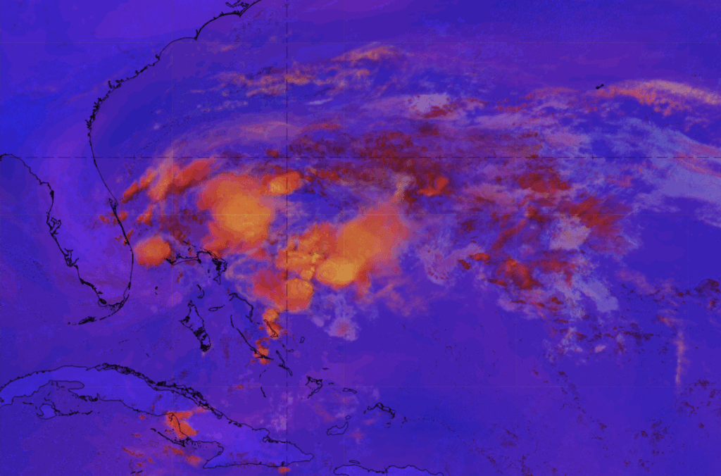
Figure 2: GEOS-16 Convection RGB detects early signs of deep convective flow 1200 UTC May 16, indicating severe storm forming. Orange represents convective flow.

As Arthur moved north, the Gulf Stream quickly took control. Enhanced flow around the circulation of Arthur produced rip currents across the East Coast. On 17 May in Volusia County, Florida, there were 70 water rescues due to these rip currents (NHC). The warm waters and moist air of the Gulf Stream provide critical ingredients for a powerful cyclone. As Arthur moved closer to the North Carolina coast, radar imagery played a more crucial role in monitoring precipitation around population centers. Doppler radar base reflectivity images provide a real-time view of precipitation across the coast.

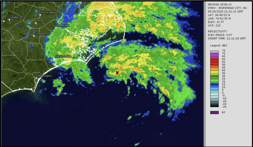
Figure 3: WSR-88D base reflectivity from Morehead City, NC (1111 UTC 18 May) as Arthur produces heavy rainfall in eastern North Carolina . The center of the storm is marked with an X

Arthur became extratropical and reached peak intensity (50 kt winds/990mb pressure) near North Carolina at 06:00 UTC May 19. “When Arthur moved near eastern North Carolina, it produced a swath of 3 to 5 inches of rainfall primarily across Carteret, Craven, Pamlico, and Onslow Counties, with the highest reported total of 5.01 inches,” according to the National Weather Service. The path of the storm turned eastwards and dissipated over the next few days. 2020 went on to receive 30 named storms, a record breaking year.

NHC National Weather Outlook
https://www.nhc.noaa.gov/archive/xgtwo_5day/gtwo_archive_list.php?basin=atl

NHC Tropical Cyclone Report
https://www.nhc.noaa.gov/data/tcr/AL012020_Arthur.pdf

Satellite RGB Images
http://212.232.25.232/ng-maps/

Events of 4/13/22 Over Mississippi (author: Madison Richardson)

SPC Storm Report showing tornadoes, high wind and hail


On April 11th 2022, an intense low in the Northwest United States evolved over the next few days to produce blizzards in the north and an impressive squall line in the south. The 13th was perhaps the most eventful for the south as a total of 34 tornadoes were reported and in two states (Mississippi and Arkansas), there were winds recorded over 65kts.

CAPE map hours before strongest tornado spawning in east Mississippi, initialized 18Z


As can be seen in the map of convective available potential energy (CAPE), this system had ample energy and instability in the atmosphere to take advantage of. CAPE values of 1000J/kg are enough to support severe weather but anything over 2500J/kg is very significant and there are certainly portions of Louisiana and Texas that cross this threshold according to the map. CAPE directly correlates with instability in the atmosphere which is a main drive for severe convective activity.

250mb map of thickness values and the upper level jet over the continental U.S.


This 250mb map depicts where the jet is located and is strongest. The jet diverges and forms a ‘v’ shape right at the western border of Louisiana. This directional divergence of the jet points directly to there being dynamic instability in that region. The jet also curves northward, wrapping around the bottom of the trough feature.


Perhaps the clearest depiction of the trough feature is on the 500mb vorticity map. The axis of maximum curvature runs from Mississippi up to North Dakota so there is a clear negative tilt. A negative tilt trough axis maximizes the advection of counterclockwise spin so this furthers the instability of the atmosphere over the south. The blue boxes mark where there is air rising and are clustered over Mississippi at 0Z on the 14th which is approximately 7pm on the night of the 13th. The strongest tornado to spawn in the state spun up at approximately 9pm.

Surface Analysis of the continental U.S. issued at 01:28Z APR 14 or 08:28CST APR 13


The surface low over North Dakota was at an impressive 991mb, getting as low at 989mb hours after this map was created. The system has a cold front spanning the width of the U.S. moving eastward with a clear squall line out front denoted by the red dots and dashes. The surface map shows a clear difference in moisture east of the front and west of the front. The difference between the dewpoints and temperature behind the front are substantial while the difference out front is minimal with some showing a completely saturated atmosphere (where dewpoint and temperature are equal). The
wind barbs are also showing that there is a southerly wind from the Gulf of Mexico providing warm moist air for the dryer air behind the front to interact with.

GOES Visible and Infrared Satellite loop depicting the evening of April 13th


This satellite loop shows clear signs of a strong upper level jet as well as strong updrafts from the squall line in the south. There is transverse banding over eastern Iowa indicating that the jet is in the same place as depicted in the 250mb jet map above. There are also overshooting cloud tops over Louisiana and western Mississippi where the squall line is progressing.

Base reflectivity imagery starting at 8:50CST of Squall Line


The radar loop above shows the main line of storms responsible for producing a majority of the 34 tornadoes that spawned that day. The strongest tornado touched down around 9pm just south of Meridian, MI.

Base Velocity Loop of Tornado South of Mississippi Around 9:00pm April 13


The base velocity loop above depicts a clear coupling indicating the location of winds wrapping around each other. The deep red and light gold are clearly wrapping around each other indicating that the winds are moving both eastward and westward, not just following the trajectory of the squall line. The tornado signature is difficult to see in a squall line on base reflectivity and is made much more apparent using base velocity images.

A Look Back to the Past: Hurricane Floyd (1999) (author: Nathan Warner)

On September 16th, 1999, Hurricane Floyd made landfall in southern North Carolina with wind speeds of 105 miles per hour (mph). This hurricane brought devastating rainfall and flooding to an area of the United States that was already in disarray from Hurricane Dennis, which impacted the same area just weeks prior. Although the GOES-16 satellite technology we use today was not in place at the time, tools that allowed meteorologists to monitor this tropical cyclone still existed. Below shows a general overview of the path this cyclone took (Fig. 1).

Figure 1: Map showing the track Hurricane Floyd took during its lifespan. Deeper yellow and orange colors indicate a higher category on the Saffir-Simpson Hurricane Scale. (Source: NOAA)


As seen in the figure above, Hurricane Floyd actually reached category 4 on the Saffir-Simpson scale two separate times, the first on September 13th while north of Hispaniola, and the second on September 15th while north of the Bahamas. Hurricane Floyd reached a peak pressure of 921 millibars on September 13th, and a satellite view of the cyclone during this time can be seen below (Fig 2.).

Figure 2: Satellite view of Hurricane Floyd from 13 September 1999 at 1415Z, while at peak intensity of 921mb. (Source: NOAA)


Fortunately for the eastern United States, Floyd would weaken to a category 2 hurricane before making landfall. One perspective of this can be seen in the figure below, which shows that the cyclone weakened prior to making landfall in North Carolina (Fig. 3). This can be seen through the destruction of the eye closer to landfall, as well as a weakening of the structure of the cyclone in general.

Figure 3: Infrared satellite view of Hurricane Floyd as it moved north along the east coast of the United States and made landfall in North Carolina. Deeper red colors indicate thicker clouds.


As stated previously, Floyd brought excessive precipitation to the eastern United States, amplified by the storm’s interaction with a cold frontal boundary. A large portion of North Carolina received upwards of 15 inches of rain, which, when combined with up to 10 feet of storm surge in some areas, led to widespread flooding in the region. Hurricane Floyd caused 51 fatalities in North Carolina alone, most of which were a result of said flooding.

Figure 4: Radar reflectivity loop from 15-16 September 1999. Yellow and orange colors indicate higher rates of precipitation.


Figure 4 above shows how widespread the precipitation created by this system was. Due to Hurricane Dennis just weeks earlier, the soil in a lot of these areas was already saturated with water. This made the flooding even worse, as there was nowhere for the excess water to go. As seen below in Fig. 5, several rivers across the state overflowed and caused even more flooding issues. Some rivers even exceeded 500-year flooding levels as a result of Floyd.

Figure 5: Aerial views of the same region of North Carolina, before and after Hurricane Dennis/Floyd. This shows the flooding of rivers across the state caused by these storms. (Source: NOAA)

Blog Post (author: Sydney Hopkins)

On 12 April 2022, at 1800 UTC, a mid-latitude surface cyclone was present in the central US centered over Nebraska, Colorado and Kansas. At this time, observations showed the system reaching pressures as low as 986 mb over Nebraska. Multiple fronts were present extending outward from the center of the surface cyclone. These included a strong cold frontal boundary which extended southwest down through Arizona, and a warm front which extended eastward through the Ohio Valley. There was also a dry line present which extended from near the low-pressure center southward all the way down through southern Texas (Fig 1).

Figure 1: Surface Analysis on 12 April 1800 UTC


At this time, the surface cyclone was centered downstream a well-developed upper-level trough. At 1800 UTC, radar imagery showed there was low levels of precipitation present along the aforementioned cold front in regions of western Nebraska and eastern Colorado. Additionally, there was moderate levels of precipitation present in the northern states of the Dakotas, Minnesota, and Michigan. At this time, most of this precipitation was occurring in the form of snow which could be assessed due to the reflectivity appearing “smoothed out” with less definition. Moderate to heavy levels of precipitation can be observed occurring in central Texas along the dry line present (Fig 2).

Figure 2: Radar imagery showing base reflectivity from 12 April 1800 UTC – 13 April 0200 UTC


From 1800-0200 UTC, mid-level water vapor imagery shows a dry line moving eastward from central to eastern Texas. On this figure (Figure 3), the dry line can be identified as the dividing line between the dryer body of air to the west (yellow) and the moister body of air to the east (blue and white). To the east of this line, storm cells can be observed forming and strengthening as the dry line moves east during this time period (Fig 2). Additionally, infrared imagery shows convection occurring in this region as cloud top temperatures can be observed shifting to much colder temperatures in a short period of time (Fig 4). This convective activity is a result of dry line dynamics. As the dry, more-dense body of air moves east, it wedges underneath the moist, less-dense body of air to the west producing a lifting mechanism. As the dry line continues moving east, single-cell storms can be observed strengthening into super cells and multicellular storms.

Figure 3: Mid-level water vapor imagery from 12 April 1800 UTC – 13 April 0200 UTC (note: snapshot shown above since .gif file too large to upload to blog website)


Figure 4: Long-wave infrared imagery from 12 April 1800 UTC – 13 April 0200 UTC (note: snapshot shown above since .gif file too large to upload to blog website)


At 2200 UTC 12 April, infrared imagery shows convective initiation occurring in western Iowa as cloud top temperatures drop rapidly. Cloud top temperatures can be used to identify convection because the rapid drop in temperatures represent strong upward vertical motion of moist air. The drop in temperature is a direct result of these upward vertical motions because the cloud temperatures become much colder as the clouds rise in the atmosphere. From 2200-0200 UTC, a large amount of additional convection can be observed occurring from southern Minnesota all the way south through Kansas. The convection is a result of the eastward moving cold front producing a strong lifting mechanism as it forces the warmer air to the east upward. A really cool view of this convection can be observed on night-time microphysics imagery which shows the convection in red color filled with many yellow spots. On night-time microphysics imagery, this type of color pattern represents high, thick, very cold clouds. As previously mentioned, the formation of these thick and cold clouds is evidence of convection as these clouds push higher up into the atmosphere. Another interesting feature which can be observed is the black color outlining the red and yellow feature. The black color represents high, thin clouds which occur as a result of the formation of anvil clouds (Figure 5). Anvil-shaped clouds form due to rising clouds hitting the tropopause boundary which clouds can not push past. As air continues to rise, the cloud tops begin to push outward causing the clouds to take on the shape of an anvil. This is further evidence of the high-levels of convection occurring during this time period.

Figure 5: Night-time microphysics imagery from 12 April 1800 UTC – 13 April 0200 UTC (note: snapshot shown above since .gif file too large to upload to blog website)


Another Perspective on the March 21-23, 2022 Severe Weather Outbreak (author: Faria Panwala)

March 21, 2022, marked the beginning of a severe weather and tornado outbreak that affected Texas and the Southeast United States. This 3-day event produced 78 tornadoes in total, including 12 EF-2 and 3 EF-3 tornadoes. Figure 1 shows the low-pressure system associated with this outbreak, centered over southeastern New Mexico with a center of 1000 mb. The dryline extending southward from the center through west Texas divides two air masses: a warm, dry air mass to the west of the feature likely originating from the surrounding desert, and a warm, moist air mass to the east of the dryline originating from the Gulf of Mexico. This feature contributed to the unstable atmospheric environment responsible for producing deadly tornadoes.

Figure 1: Surface Analysis Plot valid 1200 UTC 21 March 2022. Brown contours represent mean sea-level pressure in mb. Red “L” represents low pressure centers; Blue “H” represents high pressure centers. Red lines with semi-circles are warm fronts; blue lines with triangles are cold fronts. Orange line with semi-circles represents a dryline feature.

Credit: NWS Weather Prediction Center


Cyclonic relative vorticity can provide information on the vertical structure of surface cyclones, and how they are expected to change over time. Figure 2 shows the surface cyclone centered over eastern New Mexico, and the respective upper-level vorticity maximum positioned to the west of the low center. This implies a westward tilt with height, so we should expect to see an upper-level trough base to the west of the surface cyclone center. This leads to upper-level divergence and subsequent upward vertical motions to the east of the surface cyclone. Air should converge at the surface, lowering the mean sea level pressure and strengthening the surface cyclone.

Figure 2: 500 mb Vorticity plot valid at 1200 UTC 21 March 2022. Solid black contours represent geopotential height in dam. Red dashed contours represent temperature in Celsius. Blue contours represent ascent/upward vertical motion in units 5*10^-3 hPa/s. Cyclonic relative vorticity represented by color bar on the bottom of figure in units *10^-5 1/s; darker colors represent larger values of cyclonic relative vorticity; lighter colors represent lower values of cyclonic relative vorticity. Wind barbs are wind in knots. “L” represents surface low relative to 500 mb; “X” represents vorticity maximum.

Credit: Alicia Bentley Maps


As expected, over the next 48 hours, the surface cyclone strengthened as it propagated northeastward. Figure 3 shows the cyclone over southeast Iowa with a center of 996 mb and a cold front extending southward from the center into the southeast United States.

Figure 3: Surface Analysis Plot valid 1200 UTC 23 March 2022. Brown contours represent mean sea-level pressure in mb. Red “L” represents low pressure centers; Blue “H” represents high pressure centers. Red lines with semi-circles are warm fronts; blue lines with triangles are cold fronts.

Credit: NWS Weather Prediction Center


We can use mid-level water vapor imagery to identify the type of cold front, and what conditions to expect from it. Figure 4 shows the brightness temperatures of water vapor in the mid-troposphere. There is a clear gradient between temperature values over Georgia, with warmer values to the east of the gradient, and colder values to the west. This is known as a deformation zone. By looking at Figure 3, we see that the cold front of interest extends southward into Mississippi, and the deformation zone is located in front or ahead of the cold front. This implies a katafront, and we should expect to see precipitation ahead or along the cold front.

Figure 4: Mid-Level Water Vapor Imagery valid at 1200 UTC 23 March 2022. Warmer colors represent higher brightness temperatures in Celsius; Cooler colors represent lower brightness temperature values in Celsius

Credit: RAMMB at Colorado State University


Figure 5a shows radar reflectivity as two EF-0 tornadoes touched down in Snook, Texas around 8:00 pm CDT on March 21st. Moments before the tornadoes touched down, the band of reflectivity over Snook can be seen “bowing” inward. This is known as a bow echo which can produce straight-line winds and tornadoes. We can estimate the general direction of the tornadoes using Figure 5b, which shows storm relative velocity. With the radar site being located in College Station, we can see that the green signature, which indicates motion towards the radar site, is located southwest of the radar site. The red signature, which represents motion away from the radar site, is located north of the radar site. Given these signatures, it seemed like both tornadoes were headed northeast towards College Station, but luckily, dissipated after being on the ground for about 1 mile and 0.3 miles respectively.

Fig 5a                                                                        Fig 5b

Figure 5a: Radar Reflectivity valid at 0100 UTC 21 March 2022. Color bar represents intensity in units dBZ. Warmer colors represent more intense precipitation; Cooler colors represent less intense precipitation.

Figure 5b: Storm Relative Velocity valid at 0100 UTC 21 March 2022. Green indicates motion towards the radar site; Red indicates motion away from radar site. Color bar represents velocity of wind in knots. Warmer colors represent positive values; Cooler colors represent negative values.

Credit: National Weather Service

Severe Weather in the South (author: Jordan Murdock)

March 30 – 31, 2022, multiple states in the southeast region experienced severe weather roll through due to a squall line. Over 8 states including Louisiana, Mississippi, and Alabama were under tornado watch. Figure 1 shows the SPC Storm Reports show the total wind and tornado reports from March 30, 2022. The amount of high wind speed reports demonstrate the severity of the storm that rolled through. It also led to 113 tornadoes reported that caused damage as the squall line moved east.

Figure 1: SPC Storm Reports map for March 30, 2022 where the blue dots represent high wind reports and the red dots represent tornado reports extending over the southeast region.


The squall line that moved across the south causing the severe wind speeds and tornadoes was a result of a squall line that developed in front of an extensive cold front. The cold front extended from Indiana south through Louisiana at 06Z March 31, 2022 is seen in Figure 2a. The severe storms form ahead of a cold front because wind shear combined with unusually widespread lifting of the lower atmosphere causes convection to become arranged in a banded structure. Figure 2b shows a good depiction of the squall line over the south at the same time, 06Z March 31, 2022 when the high level clouds where the convection is occurring is shown in white on the Airmass RGB. As the storm moves east smaller portions of the high clouds break off over southern Louisiana and Mississippi and the severity of the storms in these isolated areas increase.

Figure 2: a. WPC surface analysis map at 06Z March 31, 2022 showing an extensive cold front across the southeast. B. Airmass RGB map from 06Z March 31, 2022 showing thick, high level clouds in white


The banded structure caused the highest wind speeds and tornadoes the evening of March 30, 2022. The area in red in Figure 3 shows the areas of highest severity and precipitation. The night of March 30, 2022 tornadoes tore across Louisiana, Mississippi and Alabama resulting in two people being killed and extensive damage. There was also and EF-3 tornado with winds up to 145 mph that tore through Springdale, Arkansas, on March 29, injuring seven people and inflicting heavy damage to an elementary school at the beginning of this severe convection.

Figure 3: Radar reflectivity map at 21Z March 30, 2022 of the squall line and isolated thunderstorms that produced tornadoes and high speed winds.


The damage mostly came from the tornadoes that resulted from the squall line that occurred ahead of the cold front. The tornadoes were able to be measured using the Significant Tornado Parameter (STP) which is a multiple component index that is meant to highlight the co-existence of ingredients favoring right-moving supercells capable of producing F2 – F5 tornadoes. Some ingredients used to determine STP include 0-1 km storm relative helicity and CAPE. Figure 4 shows a map of the STP values at 21Z March 30, 2022 when the storm was intensifying into the morning of March 31, 2022. This point of the storm is when the severe weather including the high winds and tornadoes really began to affect the south before eventually dissipating many hours later.

Figure 4: Map of the significant tornado parameter(STP) values for 21Z March 30, 2022

Blog Post 2 (author: Kevin Lu)

Taiwan is the perfect case study when it comes to understanding how tropical cyclones interact with terrain. Taiwan is a small island nation east of China located in the most active tropical cyclone basin of the world. The island is only 250 miles in length but gets hit by 2-3 typhoons per year on average. Taiwan has the notorious reputation of being the “kryptonite” of typhoons because of how every storm seemingly disintegrates shortly after making landfall. It’s not surprising considering that the mountain ranges in Taiwan have a peak elevation of 12,000 feet.

The following example below is Typhoon Soudelor (2015) which made landfall as a Category 3 equivalent with estimated 1-minute sustained winds of 115 mph. The center made landfall around 4:00 AM. A weather station that went through the northern eyewall (labeled as white dot) observed 10-minute sustained winds of 75 mph gusting up to 150 mph. The weather station also recorded minimum air pressure of 953 mbr which supports the satellite intensity estimation at the time. By 5:00 AM, the eye had collapsed and was no longer visible on both radar and satellite imagery.

(Source: https://rdc28.cwb.gov.tw/TDB/public/typhoon_detail?typhoon_id=201617)


Surface wind observations along the west coast were much lower. The strongest winds occurred in Chiayi city (labeled as white dot) where the center passed 20 miles north. The station observed 10-minute sustained winds of 31 mph gusting to 76 mph with a minimum pressure of 963 mbr. Although the central pressure has not risen significantly, the surface wind observations do imply significant weakening due to the mountain terrain.

(Source: https://rdc28.cwb.gov.tw/TDB/public/typhoon_detail?typhoon_id=201617)


It’s also evident from the radar imagery that there’s a large difference in precipitation between the windward and leeward side of the Typhoon. As the storm nears landfall, the wind direction north of the center will be from the east. Precipitation will be concentrated toward the northeast quadrant of the island. The south side of the storm receives little to no precipitation because most of the moisture wrapping around from the northeast is blocked by the central mountain ranges. The dry westerly winds from the typhoon and steep terrain create the perfect condition for foehn wind in the southeast quadrant of the island. The figure below is the observation data of Taitung city which was located approximately 100 miles south of the landfall location. The data reveals a temperature spike from 27c to 36c once the wind direction shifted from N to SW around the time of landfall.

(Source: https://rdc28.cwb.gov.tw/TDB/public/typhoon_detail?typhoon_id=201617)


The dynamic reverses once the center crosses the mountain range. The southwest quadrant of the island is now on the windward side and receives the bulk of the precipitation. Sometimes the typhoon can amplify the southwesterly monsoonal flow. The moisture colliding with mountains can potentially dump significant amounts of rain. Typhoon Morakot (2009) for example dumped 112 inches of rain in southern Taiwan which caused massive landslides that wiped out villages and killed hundreds.

Terrain can often influence the track of Typhoons. It’s not uncommon to see Typhoons near landfall wobble outside of the cone of probability. In cases of weak steering currents, a slow-moving Typhoon can fail to cross the mountain range and stall which was the case for Typhoon Saola in 2012. It eventually retreated offshore and looped around the northern coastline of Taiwan as shown in the figure below.

(Source: https://rdc28.cwb.gov.tw/TDB/public/typhoon_detail?typhoon_id=201209)


Typhoons that make landfall in central Taiwan usually deviate south after landfall toward the narrowest part of the mountain range. Once the center has crossed, it recorrects north to its original trajectory. Notable examples include Typhoon Soudelor 2015 (Fig 2), Typhoon Dujuan 2015, and Typhoon Megi 2016.

(Source: https://rdc28.cwb.gov.tw/TDB/public/typhoon_detail?typhoon_id=201617)

The Perfect Storm: An Examination of the March 24-28th, 2021 Tornado Outbreak (author: Nadiyah Williams)

The March 24-28th, 2021 tornado outbreak in the southern United States saw 43 confirmed tornadoes across 11 states. The three supercells on March 25th were particularly damaging, with one being a rare EF-4 tornado in Newnan, GA. The second supercell began in Mississippi and strengthened just west of Greensboro, AL, producing a large EF-3 wedge tornado (Fig. 1).

Figure 1. Storm track of the second supercell in Alabama on March 25th. The triangles represent the location of the tornado and the colored lines are an interpolation of those points. The tornado went through five counties.


The base reflectivity product shows a strong hook echo signature, which usually signifies a tornado (Fig. 2). Using this product in conjunction with the base velocity product, we can see that there are fast, rotating winds in the area of the tornado. The higher values in the center as well as the compactness of the radar pulses going away and coming towards the radar mean that there is low-level rotation.

Figure 2. Base reflectivity (left) shows hook echo signature. Base velocity (right) shows low-level rotation with higher values in the center and red (radar pulses going away) and green (radar pulses coming towards the radar).


The winds from the updraft of the supercell were powerful enough to cause a hole-like feature to appear on radar, where precipitation was suspended in the air (Fig. 3). This is called a bounded weak echo region (BWER), an area of local minimum radar reflectivity surrounded by higher reflectivity values higher in altitude.

Figure 3. Bounded weak echo region (BWER). “Hole” feature that appears on base reflectivity that indicates strong updraft.


We know that this system continued to strengthen because it produced an EF-4 tornado hours later, but we can prove it by using the mid-level vorticity and surface map. When the center of maximum mid or upper level vorticity is west of the center of the surface low pressure system, the weather system tilts west (Fig. 4). This allows for a region of upper-level diverging winds to be above the surface low, further strengthening the system and supporting vertical wind shear. For this event, the maximum vorticity center is located approximately west of the surface low. We can see in th

Figure 4. When the upper-level divergence is aligned with the center of the surface low, the low pressure system will become stronger.


We know that this system strengthened over time because it produced an EF-4 in Newnan, GA hours later, but we can prove this using the mid-level vorticity and surface map. At 21 UTC, the surface low pressure system is 1004 mb (Fig. 5.). We can see from the surface map that the converging winds are carrying warm, moist air from the Gulf into the system. This would generate more lifting and instability, but we should take a look at the upper level dynamics to confirm this observation. In the 500 mb vorticity advection map, we can see that the maximum vorticity center is located approximately west of the surface low (Fig. 6). We can see in the next figure that the weather system strengthened to 999 mb low the next day at 00 UTC (Fig. 7).

Figure 5. 12 Z run of a surface analysis of the low pressure system. Circled is the center of low pressure.


Figure 6. 12 Z run of a vorticity advection map. Circled is the center of maximum vorticity on the longwave trough.


Figure 7. 00Z run from the next day of the same weather system. Circled is the new center for the surface low.

April 2020 South Carolina Tornado Outbreak (author: Blake Berge)

Early into the pandemic in the United States, a major tornado outbreak occurred in the southeast. To set the stage for this event, prior to April 12th and 13th, an elongated region of low pressure moved across the United States. This low-pressure area, called a trough, had a fast jet stream to its east in the mid-levels of the atmosphere. Farther down in the atmosphere, the air was not moving quite as swiftly. This difference in wind speed with height is called speed shear and is conducive for tornadic development. Below are two depictions of the upper tropospheric wind speeds on the left and the mid to lower tropospheric wind speeds on the right. The red-to-white colors indicate faster wind speeds.

Figure 1. Wind speeds and geopotential heights at the 500 millibar level in the troposphere at 11:00 UTC on April 13, 2020.


Figure 2. Wind speeds and geopotential heights at the 850 millibar level in the troposphere at 11:00 UTC on April 13, 2020.


These factors, coupled with abnormally warm Gulf of Mexico water temperatures, allowed for a dangerous and highly active storm event. Over 36 tornadoes were recorded in South Carolina alone, with 9 total deaths. One area of interest is the Central Savannah River Area (CSRA), which saw 5 EF-3 tornadoes, including one that killed two people. A doppler radar located near Columbia, SC saw several of these tornadoes. Below is a depiction of several radar images that show the tornadoes. The tornadoes may be differentiated from rain by noting the bluer colors in the bottom right image. This radar product allows for differentiating types of precipitation and can also indicate debris picked up by tornadoes. The debris shows up as blue here.

Figure 3. Radar images showing two EF-3 tornadoes during the outbreak. The products shown are: Top left: Base Reflectivity Top right: Relative Velocity Bottom Left: Normalized Rotation Bottom Right: Correlation Coefficient


These tornadoes occurred at roughly the same time, causing a path of destruction in their wake. Extending across three counties, both the Springfield and Livingston tornadoes brought with them 135 mph+ winds, with widths of up to 800 yards. By traveling to these areas after the destruction and observing the damage along with observing radar data such as in Figure 3, meteorologists can obtain the track of the tornadoes. In Figure 4, the track of several strong tornadoes is shown across the CSRA.

Figure 4. Strong tornado tracks across the CSRA on 13 April 2020.


In some cases, the track of the tornado may be seen in satellite imagery thanks to comparing photographs before and after the event. One satellite, which has an image mode that is designed for imaging vegetation growth and development, was able to do this. In Figure 5, the destruction of trees and other vegetation is apparent as a black color. Using imagery like this can allow meteorologists to better understand how these tornadoes evolved and developed and provides insight into their behavior.

Figure 5. Imagery that shows how the two EF-3 tornadoes destroyed trees and vegetation.

Blog Post Assignment (author: Sydney Hopkins)

On 20 December 2021, Hunga Tonga, a submarine volcano, erupted after nearly seven years of inactivity. The volcano, located in the southern Pacific Ocean, continued exhibiting volcanic activity for a few weeks until Tonga Geological Services declared the volcano dormant on 11 January 2022 after activity on the island decreased. A few days later, 14 January 2022, the volcano once again erupted and on the next day, 15 January 2022, the volcano violently erupted in what was described as a once-in-a-thousand-year event for the Hunga caldera. The massive eruption sent ash over 36 miles into the atmosphere setting a world record in regards to the historical documentation of volcanic eruptions. The eruption produced destructive tsunamis in the Tonga, Fiji, American Somoa, and several other regions around the Pacific rim. Tsunamis also reached as far as the Pacific coast of the US, Chile, Peru, and the Russian Far East.

RGB True Color satellite imagery produced by Himawari-8: Shows massive explosion beginning on 15 January 2022 0410 UTC


The massive eruption of 15 January 2022 produced an ash column that pushed all the way into the mesosphere which is a very rare event. Most volcanic eruptions produce ash columns that top out at the tropopause, an atmospheric boundary separating the troposphere and the stratosphere. This boundary is also where severe, convective weather systems top out as well. This atmospheric boundary layer is usually the cap for most forms of rising air due to the temperature profile of the stratosphere. Unlike the troposphere, temperatures increase with altitude in the stratosphere making it very hard for air to continue rising in this atmospheric layer. Since air rises when it is warmer than the air surrounding it (via buoyancy), it is very hard for air to continue rising in the stratosphere where temperatures rise with height. Due to the high altitudes this eruption’s ash column was able to rise, the volcano was estimated to have ejected an estimated 400,000 tons of sulfur dioxide into the stratosphere. This large quantity of injected sulfur dioxide is expected to have a cooling effect (0.1-0.5 °C) on the entire Southern Hemisphere for months.

GOES-17 Infrared Imagery: Shows extremely cold brightness temperatures of the Hunga Tonga volcanic ash column as the column pushes high into the atmosphere


Stereo Height Retrieval produced by NASA using GOES-17 and Himawari-8 satellites: Using different infrared images from different satellites NASA was able to produce this graphic showing how high the ash column of the Hunga Tonga eruption rose


Ash RGB from GOES-R series satellites: Shows high levels of volcanic ash (red and orange) and sulfur dioxide (yellow) being injected into the atmosphere by the Hunga Tonga eruption


According to preliminary data, the eruption of Hunga Tonga is believed to be the strongest/largest volcanic eruption since the 1991 eruption of Mount Pinatubo. NASA declared the eruption of 15 January 2022 was “hundreds of more times powerful” than the first atomic bomb. Booms from the massive eruption could be heard over 6,000 miles away in Anchorage, Alaska. The eruption produced atmospheric shockwaves that were able to travel around the entire globe. Alterations in pressure (due to pressure waves) were observed in weather stations across the world. The event also produced major levels of lightning which is a result of static electricity produced by colliding particles of volcanic ash. Over 200,000 lightning flashes were recorded in just one hour between 0500-0600 UTC 15 January 2022.

GOES-17 Mid-level Water Vapor Imagery: Shows atmospheric shockwaves propagating around the globe


Large volcanic eruptions, such as the Hunga Tonga eruption, are incredibly powerful events and can lead to devastating consequences across the globe. The eruption of Hunga Tonga injured 18 people and resulted in 5 deaths. Additionally, the event caused an estimated $90.4 million in damages.