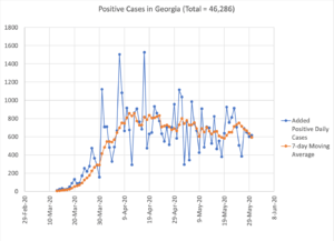
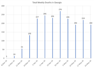
– The charts show that we have been in a plateau for all of May. We need to start seeing this trend downward faster. 7-day average daily death count has been around 29. Imagine this continues for two more months, that’s about 1,700 more deaths.
– One thing to note if you are noticing a difference in the trends when compared to the Georgia Department of Public Health charts. I am plotting the data when reported. GDPH plots data points based on occurrence date, which is a problem when there is a long lag between “occurrence” and “reporting”. Their charts would be more accurate in the long run.


