English 1102: Television and Feminism

Dr. Casey Alane Wilson • Georgia Institute of Technology

Tag: Color and Lighting

Blue and Yellow: Wynonna Earp

This post I’d like to focus in on the color choices the show uses. Wynonna Earp primarily uses two colors for lighting: blue and yellow. Contrary to my previous reviews, Wynonna Earp actually makes successful use of these lighting choices, even if they are rudimentary. The different lighting makes the scenes feel different and adds a slight accent so the show does not constantly look the same. In addition, the two colors do not have a constant meaning, which I think is good. Instead, each scene is colored in a way that complements the scene. In addition to lighting, Wynonna Earp frequently uses to color as symbolism.

In Episode 10 we can see examples of Wynonna Earp successfully using color to match the scene. Early in the episode Wynonna tracks Dolls to find where he keeps going. This scene is outdoors during the night, and it is cast in a yellow glow. Yellow matches well because it makes the scene darker than a blue hue would. Also, streetlights typically have a yellow glow, which matches the kind of lighting a city during the night would have. Another prominent example of color use is when Wynonna first arrives in Lou’s convent. This scene is cast in a blue glow, which makes it seems as if Wynonna has entered a spiritual world. She even remarks that she thinks she has died. Overall the lighting of the show is limited in color, but effective.

The night scene is cast in yellow to add realistic context to the scene.

The scene following Wynonna’s entrance into the convent is also an excellent example of color usage. So far, everyone in the convent has been wearing white, but here Wynonna wears black. This color choice is simple, but it reinforces the fact that Wynonna does not belong and that she is there to kill Lou. This black color for Wynonna is a constant motif through the show and often serves to emphasize her rebellious attitude. Overall, although its color choices are basic Wynonna Earp uses them effectively to convey meaning or add context to a scene.

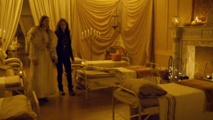
Wynonna is shown in black to separate her from the rest of the women at the convent

The Evolving Cinematography and Direction in Kimmy Schmidt

After being trapped in a bunker for a decade, Kimmy finally experiences the lively world she has been missing out on for the past ten years and the lighting and direction style certainly reflect this situation throughout the entire series.  In this post, I will be analyzing the cinematography and direction in the episode titled “Kimmy Goes to a Party!” (Season 1, Episode 7)  of Kimmy Schmidt: Unbreakable, and more specifically how this episode provides a stark contrast to those previously in the first season.

Early on in the season, the first episodes are filled with quick, snappy cuts that make the viewers feel almost overwhelmed. This is deliberately done to make the viewer feel as Kimmy does living in the overwhelming city of New York after being locked in a bunker for 10 long, tedious years.  However, after Kimmy gradually adjusts to this lifestyle episode by episode, the direction changes as cuts become longer and more problematic situations start to thicken the plot of the series. This episode is filled with suspense as Kimmy attempts to impress a guy she likes and Jacqueline Voorhees faces paranoia regarding a possible affair her husband had.  Naturally, this episode is filled with some of the longest shots of the whole series as the characters must face these issues and invoke a sympathetic response in the audience toward the character’s issues (which is nearly impossible to do with the short shots that are common throughout the show).

In regards to the lighting, the show is filled in this episode, and the whole series for that matter with vibrant color as Kimmy is re-experiencing life in the lively New York City after being held captive in a lifeless, gray bunker for the previous 10 years.  The costumes within this episode, like all episodes in the series, are vibrant, appealing to the visual eye of the audience.  Kimmy is the perfect example of the vibrant color scheme of the show as she is always wearing some sort of clothes with highlighter pink, yellow or blue coloration.  Even with the very bright lighting of a show set in New York City, the director makes it an apparent goal to make sure to go the extra mile by creating a vibrant wardrobe and including other items with playful colors to enhance the jubilant, open lighting of the episode to contribute to the warm-feeling shots of the episode.

Even with the bright lighting, this episode is not to unique from the whole series as a whole.  The entire series is filled with the aforementioned color schemes and lighting in this episode.  With that being said, it should be re-emphasized that the lighting in this series is wholly unique. I have never watched a show that was this visually playful and it truly contributes to the jubilant experience that the show is meant to be for the viewing audience.

Image result for kimmy schmidt bright lighting

Kimmy Schmidt showing her true 1996 kid style with the iconic bright yellow kids button down sweater

‘The Bold Type’ Changes Its Colors in for a More Somber Hue

During the binge-worthy first season of The Bold Type, the audience is constantly provided with an array of color and various objects in the background of the show’s predominant scenes. Light pastels and trendy patterns always seem to be floating around behind the characters’ faces and in their wardrobes. The show is filled with natural light and warm tones, and these entities add both interest and comfort while watching the show.


However, in “The Breast Issue”, the sixth episode of the series’s first season, this story changes. For example, Jane’s usual peppy, colorful-yet-professional outfits have been replaced by an all-black ensemble for this episode. This episode features more artificially-lit spaces, and there are definitely more struggles and personal issues presented across the board in this episode than in comparison to others.


In this episode, Jane has been assigned to write an article about a female health professional who is adamant about performing breast cancer-related tests on women at very early ages. The audience later learns that Jane lost her mother to breast cancer, and this provides an uneasy feeling as the episode progresses.


Flash forward, and Jane interviews the doctor in her office for the article. Careful observation of this scene gives a feeling different than in other episodes. The doctor’s office is a bland, off-brown color. This is a stark contrast to the abundance of color seen in the Scarlet headquarters building, a popular setting in the show. This purposeful occurrence changes the happy-go-lucky theme of the show, and the sheer importance of this scene is established by the lack of natural light. A cold manner is observed in the ambience of the room in which Jane and the doctor sit, and a coldness is equally seen in the women’s interaction.


On the other hand, the actual mechanics of the show change in this episode. This being a show about female empowerment and all, there is definitely enough extended shots to go around. However, in this episode especially, there comes a point where Jane loudly expresses her opinions to her boss. As the screen focuses on Jane, the manner in which she gets more and more upset as she cries builds upon the suspense that the shot places on her. This suspense is equally augmenting for the other characters as they come across struggles within this episode — Kat knows that she must fire a worker, and Sutton realizes that she misplaced a $5,000 necklace in a cab. The screen’s intentional, extended focus on the women in the midst of their struggles and fear connects the audience to their feelings and struggles throughout the episode.


Image result for jane the bold type crying gif

A drearily colored Jane apologizes to her boss after yelling at her in front of the rest of the company.


As compared to the previous episodes in the show, one ultimately sees that the unusually lengthy shots of the characters and their altered presentations through darker color schemes set this episode apart from the others in terms of importance and ominousness. But hey, of course, the girls resolve their issues as always, and we’re still on the hook for watching the next episode.

Powered by WordPress & Theme by Anders Norén