English 1102: Television and Feminism

Dr. Casey Alane Wilson • Georgia Institute of Technology

Tag: color scheme

Nothing to See Here – Cinematography in Fresh off the Boat

After watching many episodes of “Fresh off the Boat,” it’s still hard to decide if there any elements of its cinematography that distinguish it from its counterparts. For the most part, the show follows similar shoot patterns as other ABC comedy shows (except for “Modern Family,” which mostly uses shaky shots to simulate a reality show). Conversations are shot with quick cuts between the talking characters, and with most of the show being conversations, we rarely see any continuous shots. For a show that is so unique, it’s a shame that its editing is essentially a carbon copy of its channel-mates.

The use of color, however, is a bit more interesting. Most of the show is filmed in well-diffused daylight. The walls are always a pastel color, and this combination of color and light create a constant “warm” feel to the scenes. This mundane warmth could be representative of their new, cookie-cutter life in the American suburbs. It could also represent their new comfortable lifestyle thanks to the restaurant’s success. Another interesting color scheme difference in the show is not quite related to cinematography but is still interesting enough to be noted: clothing. Throughout the show, the white women in the neighborhood are always shown wearing brightly colored clothing with very unique patterns, a trademark of the early 1990s. In contrast, we see that Jessica almost always wears plain, light-colored clothes. This is likely a note of the cultural difference between the two parties; a direct symbol of the Huang family’s conservative values. It also shows that in spite of how well the Huangs have immersed themselves in their surroundings, they still remain different and not entirely a part of the community yet. This is especially apparent in S2E2 (my current episode), during which the neighborhood women (Honey included) make several more appearances alongside the Huangs than a typical episode.

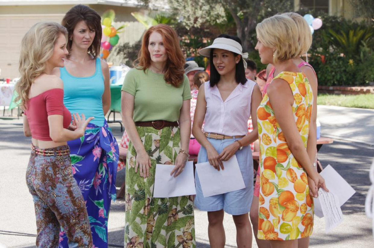
Note how Jessica stands out from her neighbors. A clear example of color scheme differences used in the show.

I am far from a cinematography expert, so it’s safe to say that I am missing something, but as far I can see, “Fresh off the Boat” does not attempt to be unique in terms of cinematography. I believe the show-makers are aware that a majority of their audiences take cinematography for granted (myself included), so they focus more on the uniqueness of the plot. While it’s a little disappointing that the show does not innovate in this aspect, it doesn’t take away from it as a whole. “Fresh off the Boat” makes it place with unique writing and casting, not with camerawork.

Everyone Must Wear Black!

The color scheme of this show is easily characterized as black. The three main characters all wear black. Boss lady Jacqueline wears all black. Supporting characters wear black. Even blurry figured extras in the background wear black. Day in and day out, the characters dress as if they are going to attend a funeral. Occasionally, characters do run out of funeral attire and begin to experiment with other colors.

Are they at an office or a funeral? The world may never know. I can only provide guesses to why the characters in the Bold Type are so opposed to wearing colors.

Aside from what the characters wear, the background typically displays a normal color scheme (grass is green, water is blue, taxis are yellow, etc.); indoors typically favors more neutral colors. In The Bold Type, cinematographic decisions are made to keep the focus on the characters because it concentrates on character development. The characters likely wear black the majority of the time so that their outfits don’t outshine them. The typical shots, in episode four especially, are long and follow the characters as they move within their environment, the audience sees what the main character sees. By doing these long, sweeping shots, the show has a smooth flow and the audience can really connect with the characters. Another way that the show keeps the characters highlighted is by shooting in shallow depth of field, meaning that the foreground which typically contains the characters is in focus whereas the rest of the scene is blurry. In terms of the lighting of this episode, the company building is always shown glistening in the sun, and unless it is night time, the characters are always well lit. Episode four stands out due to the way that it manipulates the lighting and shooting style during several critical plot points. One example of such cinematography is when Sutton had just found out that she is likely out of the running for the job she wanted, the lighting changed in such a way that it washed her out with almost a screen of fog, and there was bokeh ( typically appears as circles of unfocused light) all over the screen.

The circles of light in this picture are called bokeh if my description in the parentheses was not enough to understand what bokeh is.

This change in lighting is not only for dramatic effect but also to symbolize how things are unclear for Sutton because she rejected the stable job, but now the dream job has rejected her. Another moment that stood out in this episode is the series of quick shots that flashed between Sutton working on her mood board and Kat in the city at night. It was done partially to create of sort of montage of Sutton completing her project and partially to create a sense of suspense and mystery around where Kat was and what she was doing because the short takes only gave slight glimpses. The last element of unique cinematography is when Kat and Adena kiss, a sort of heavenly light shines down upon them. The episode concludes with this scene, this light, but heavenly light in the middle of the night cannot be trusted…

This moment is super important plot-wise, character development-wise, and of course cinematography-wise.

Powered by WordPress & Theme by Anders Norén