2020’s Hurricane Zeta Brings Strong Winds and Snow Across the Eastern United States (author: Daniel Lamprea)

On October 28, 2020, Hurricane Zeta made landfall as a category 3 hurricane in Louisiana with winds of up to 115 mph and a pressure of 970 mb. It originally formed in the Caribbean Sea and tracked across the Yucatan Peninsula before rapidly intensifying in the Gulf of Mexico. After making landfall, the storm raced across the southeastern United States, at times moving up to 40 mph. Because of this, tropical storm conditions and winds were brought unusually far inland.

Figure 1. Visible imagery of Hurricane Zeta making landfall. (Source: NOAA)

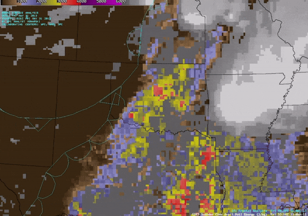
As Zeta approached landfall, a large storm system was in place over the western United States. A very deep trough was situated in the Southwest, centered over New Mexico and Texas, bringing cold air far south. A strong cold front was attached to this system along with a stationary front extending to the Northeast. As this storm moved east, Zeta was forced to accelerate northeastward as well. As Zeta approached landfall, sea surface temperatures were decreasing and wind shear was increasing, which generally would weaken a tropical cyclone. However, the other system provided favorable upper level dynamics for Zeta and allowed it to intensify until it made landfall.

Figure 2. 500 mb heights and wind speeds. Contours represent height in meters. Lighter blue shades indicate higher wind speeds. Zeta is the area of blue over the Gulf of Mexico. (Source: SPC Mesoscale Analysis Archive)

Figure 3. Infrared satellite loop of Hurricane Zeta nearing landfall. The orange and red areas on the storm indicate the coldest cloud tops and the deepest convection. The red lines indicate unfavorably high wind shear. Despite this, strong upper level dynamics helped Zeta further intensify. (Source: CIMSS Satellite Blog)

Because Zeta was moving so quickly, tropical storm force conditions persisted much farther inland than normal. Winds gusted as high as 60 mph even as the storm approached the Georgia-Alabama border. In Georgia, wind damage in Metro Atlanta led to $1.1 billion in damages, making the storm one of the top five costliest tropical cyclones for the state. As shown in the radar loop below, areas of high rainfall did not dwell on any areas for too long, so flooding was not too large of an issue.

Figure 4. Radar loop of Zeta making landfall. Areas of yellow and orange indicate the highest rainfall rates. The loop covers October 28, 20:55 UTC to October 29, 11:55 UTC. (Source: UCAR Radar Archive)

As seen in the radar loop above, as the storm began to move to the northeast, a band of storms formed over southern Alabama and Georgia. This marks the formation of a frontal feature and the transition of the storm from a tropical cyclone to an extratropical cyclone. Eventually, the storm became caught within the stationary front and fully lost its tropical characteristics. The remnant low pressure and moisture was able to interact with the cold air behind the front and bring an early season snowstorm to parts of New England. The overall snow totals for the area are shown below.

Figure 5. Snow totals over New England. (Source: NWS Boston)

Feb 10th – 11th 2024 Northern Texas Snow (author: Emily Melvin)

Remnants of the atmospheric river storm system that dumped several inches of rain on southern California earlier this month made their way into Northern Texas over the weekend. The storm began with rain in the evening on February 10th before transitioning to snow overnight. Heavy snow bands persisted into the night before tapering off around midnight on February 12th.


The synoptic set-up of this storm was not ideal for producing a deep low pressure system on account of the positive tilt to the trough axis. This caused the low pressure system to be disorganized and the wind speeds to not be very intense, thus there was no blizzard associated with this event. Despite this there was sufficient positive vorticity advection to provide a lifting mechanism that, along with the ample supply of moisture, produced heavy precipitation over the area with snow totals reaching 14 inches in some areas.

GFS 300mb heights in dam (black contours) and winds in kt (barbs, and fill pattern), accessed from pivotalweather.com .

As previously mentioned there is an overnight transition from rain to snow that occurs in Northern Texas. This occurred due to cold air being advected into the area on the cold north west corner of the low pressure system. While the transition between rain and snow can be observed and measured on the ground there is also evidence of this transition in radar reflectivity plots! Due to the shape and size of snow flakes, they appear much smoother on radar than rain does. As shown in the plot below the region where snow was present is far smoother than the area to the south where it was still raining and individual storm cells could be discerned. As the day progressed the snowfall rates increased and several bands of heavy snow set up which lead to an area of 8+ inches of snow surrounding Plainview, TX.

Radar image from 6:35 AM Feb, 11th in Lubbock, TX showing the rain to snow transition. Accessed from the NWS Lubbock X page.

Unofficial snow totals from 5 PM Feb, 11th within the range of the Lubbock TX NWS forecast area showing the heavy snow received in Northern Texas. Accessed from the NWS Lubbock X page.

Super Bowl Showers (author: Ashton Sims)

Figure 1: Photo by WSBTV News Staff, “Heavy rain causes wrecks, rescues across parts of metro Atlanta”. Image accessed through WSBTV website: https://www.wsbtv.com

The torrential downpour across Georgia impeded on Super Bowl Sunday and into Monday afternoon. This multi-day rain storm occurred for numerous reasons, first being the significant moisture being supplied by the Gulf. The loop below is from the GOES-16 satellite, this is a satellite that stays positioned over the Western Hemisphere to provide imagery for meteorologists and weather enthusiasts. This specific loop is on the infrared channel that detects water vapor in the upper atmosphere, where the cooler colors indicate high levels of moisture aloft. This loop cycles from February 10th at 7:00 am to February 12th at 2:00 pm so that it records the times with the most significant precipitation in regards to this case. In this loop, the majority of the water vapor begins over central Texas and it begins to quickly migrate east but notably slows down as it approaches the east coast. The moist conditions in combination with the stationary nature of this event lead to hazardous flash flooding across central and north Georgia

Figure 2: Upper-level 6.2 micron Visible satellite loop from the GOES-16 visible imager from 1200 UTC February 10, 2024 (7:00 am EST) to 1900 UTC February 12, 2024 (2:00 pm EST). Imagery loop downloaded from Colorado States satellite imagery website: https://rammb-slider.cira.colostate.edu/?sat=goes-16

The slowing down of the atmospheric moisture alludes to the next atmospheric condition that made this seemingly inconsequential amount of precipitation such a hazard for Georgia residents. The image below depicts a surface analysis recorded on February 12th at 1:00 pm. A surface analysis is useful in determining frontal patterns and viewing current weather conditions that are close to the surface. The solid lines represent isobars which are measurements of pressure at the surface. The red and blue patterned lines are stationary fronts, a stationary front is the boundary between a cool and warm air mass that is not moving significantly. This frontal boundary is important pertaining to the showers this weekend because the precipitation was able to gather over the state of Georgia and provide continuous rainfall for almost three days. If this frontal boundary had been a cold front, it would have moved much more quickly through the state and given the infrastructure in place a chance to drain all of the excess precipitation. This slow-moving front working jointly with the considerable amount of moisture in the atmosphere created a continuous downpour that led to flash flooding across the state.

Figure 3: Surface Analysis of the Southeast United States at 1800 UTC (1 pm EST) on February 12, 2024. Image accessed through the WPC Severe Weather Archive Page: https://www.wpc.ncep.noaa.gov/html/sfc-zoom.php

These two factors operated in tandem to produce a havoc-wreaking weather system. Below is a radar base reflectivity map. This type of meteorological product is helpful in determining the strength and location of rainfall. Radar works by emitting electromagnetic radiation in all directions from the radar site, the radiation waves deflect off of objects in the atmosphere. When the radar receives the deflected radiation it is able to determine the amount of energy returned and thus the type and intensity of precipitation in the atmosphere. The warmer yellow and orange colors depict stronger precipitation while cooler greens and blues signify weaker precipitation. This specific image shows rainfall covering almost all of Georgia at 1:00 pm on February 12th, a significant portion of this rainfall being moderate. The precipitation seems to halt abruptly where the stationary front was indicated in Figure 3, this is not abnormal as stationary fronts generate upward vertical motion on their western sides. The upward vertical motion causes divergence aloft which can lead to cloud formation, thus creating a likelihood of rain at the surface if there is enough moisture in the atmosphere.

Figure 4: Base reflectivity radar imagery from 1800 UTC February 12, 2024 (1:00 pm EST). Image accessed through NOAA NCEI Radar Mosaic: https://www.ncei.noaa.gov/maps/radar/

These key atmospheric conditions led to days of rainfall across the Southeastern United States and cost hundreds of thousands of dollars in damages. Although separately, these conditions may be unassuming, together they generate intense amounts of precipitation and work synchronously to generate rain at the surface. Fortunately, the only damages encountered were those to houses, cars, and other property. No one was harmed in a flash flooding event which is certainly in part to the forecasters that issued flood watches and warnings throughout the Southeast United States.

Post 1: The 2013 El Reno Tornado (author: Nicolas Miranda)

Photo of the El Reno Tornado at 6:28 p.m. CDT, when it was near peak strength. By Nick Nolte, taken on May 31st, 2013; accessed through Wikimedia Commons.

The EF3 tornado that struck Oklahoma farmland just outside of El Reno on May 31st, 2013 was the largest tornado ever recorded in U.S. history. As David Neal described in his earlier blog post, this tornado was devastating in many ways – killing 8 storm chasers, frightening an area that had experienced the killer Moore tornado 11 days prior, and narrowly missing suburbs within the densely populated Oklahoma City metro area. But just how strong was this record-breaking tornado?

700 mb and 850 mb isobaric surface maps of wind flags and isopleths of heights of each surface over the ground over CONUS from 12 UTC (about 7 a.m. CST), May 31st 2013. Map 1 from https://www.spc.noaa.gov/obswx/maps/700_130531_12.gif, Map 2 from https://www.spc.noaa.gov/obswx/maps/850_130531_12.gif.

David already discussed the meteorological ingredients that were abundant enough to produce a storm of this magnitude; ample heat and moisture, a stationary frontal boundary, and a dry line near the Oklahoma City metro created an area primed for explosive instability on the afternoon of the 31st. The maps above show how the upper levels of the atmosphere supported unstable conditions that day. The data plotted on these maps were collected by weather balloons and show 2 dangerous ingredients for thunderstorm development: wind shear and cold temperatures aloft. First, there was both directional shear (change of wind direction with height) and speed shear (change of wind speed with height) over central Oklahoma. Second, the decreases in temperature (22 ℃ to 12 ℃ from 850 mb to 700 mb) indicate a cooling upper atmosphere, which helps warm surface air rise further and produce more powerful storms. Ultimately, these factors (along with other helpful factors at even higher levels of the atmosphere) combined to support the storms that developed in Oklahoma that afternoon.

6.3 micron Visible satellite loop (from 2:15 to 8:15 p.m. CDT) from the GOES-14 visible imager over OKC the afternoon of the 31st and a 12 micron infrared still image of the same area from the POES AVHRR imager taken at 22 UTC (5 p.m. CDT). Both images downloaded from Scott Bachmeier’s satellite blog at https://cimss.ssec.wisc.edu/satellite-blog/archives/13130.

Strong storms certainly developed over central Oklahoma that day. You can see, in the visible satellite loop, small cumulus clouds combining and eventually becoming huge cumulonimbus clouds – the boiling clouds covering most of central Oklahoma as the loop progresses. David described the dynamics that led to these storms eventually developing out of the raw ingredients, but these satellite images help show just how powerful the OKC thunderstorms were. Their overshooting tops (the tallest parts of a severe thunderstorm, located directly over its updraft) are identifiable in both the visible and infrared imagery, designated by wrinkly and churning spots on the cloud tops in the visible loop and dark red/black colors in the high-resolution POES image. Since infrared imagery directly measures cloud temperature, that image is proof just how high surface air was carried by the cumulonimbus’ updrafts through the atmosphere (thus cooling the air proportional to its altitude) and therefore how strong these storms were.

Radar loop of the El Reno tornado’s base reflectivity (left) and base velocity (right). Captured between 6:13 -6:15 p.m. CDT on May 31st, 2013. GIF from the SPC’s Publications Page archive, courtesy of Jeff Snyder/ARRC, at https://www.spc.noaa.gov/publications/edwards/st-anim.htm.

Given these favorable conditions, it was likely that supercell thunderstorms would form and there would be some tornadoes that afternoon. The El Reno tornado took full advantage of the favorable conditions and became a monster, clocking in at a maximum 2.6 miles wide per National Weather Service damage surveys. The above radar loops were taken by the University of Oklahoma’s Rapid-scan X-band Polarimetric Radar (RaXPol) mobile radar, providing a high-resolution look inside the beast. These scans were also taken at an angle of 2° above the horizon, meaning they represent conditions significantly above ground level. Each dotted-line circle on the maps represents 2km in distance from the radar. On the left is a reflectivity loop, showing how dense the clouds, precipitation, or other material in the atmosphere is at certain locations; on the right is a velocity loop, which shows the motion of air in the atmosphere towards (green) or away from (red) the radar, with a small (or in this case, 2 mile wide) “couplet” of the two colors indicating the tight and incredibly fast rotation of a tornado. The scans show how large, strong, and well-structured the tornado was at these higher altitudes, even including an eye in the gigantic tornado’s center and a smaller satellite tornado rotating inwards towards the main tornado (the small velocity couplet appearing NW of the main rotation in the relative velocity loop). In fact, the tornado was so immense that the mobile radar had to flee to a safer distance as the storm moved towards them (seen as the tornado’s apparent jump in the last 3-4 frames).

Visible satellite images by MODIS of the OKC metro before and after May 31st, 2013. GIF taken from Scott Bachmeier’s satellite blog at https://cimss.ssec.wisc.edu/satellite-blog/archives/13130.

Ultimately, the record size of the tornado is what killed 3 storm chasers – Paul Samaras, Tim Samaras, and Carl Young – as they thought they were far enough away from the small, visible tornado funnel while driving directly into the much larger, invisible, and still tornadically strong wind field. They were tragically struck and killed by a sub-vortex in that larger wind field while trying to avoid the visible funnel. The above true-color satellite image betrays the true size of the tornado and the extent of its strong winds on the scale of the OKC metro area. In all, this tornado was a textbook case of ingredients coming together for a dangerously perfect storm, and the above satellite images show that while the storm chasers’ fatalities were tragic, this record-breaking tornado could have had a much more violent impact had it tracked a few more miles to the east instead of dissipated while still over farmland. Oklahoma City and El Reno dodged the largest bullet the meteorological community has ever recorded, and we can keep analyzing the record-breaking tornado to be prepared if a similarly perfect setup ever happens again.

“Pineapple Express” Brings Extreme Flooding to Parts of California, February 4th – February 5th Analysis (Author: Madeline Laesser)

An atmospheric river is a long and narrow region in the atmosphere that transports water vapor from the tropics. “Pineapple Express” is the name of a recurring atmospheric river that brings moisture from the tropics around Hawaii to the west coast of North America. On February 4th, 2024, the “Pineapple Express” powered a storm that brought life-threatening wind and flooding. We can look at mid-level water vapor imagery to visually understand the advection of water vapor into southern California. By looking at the grayish-white colors in the imagery below, you can see the narrow river of water vapor that impacted southern California at 6:20 PM local time on February 4th.

Fig. 1: Mid-level tropospheric water vapor satellite imagery GOES-18 valid at 2:20:22 UTC February 5th, 2024, which is 6:20 PM on February 4th PST. The warmer colors represent dryer regions with less water vapor. The cooler colors represent regions with more moisture in blue.

Credit: Colorado State University CIRA RAMMB Slider Page

Below, there is a video of radar imagery that shows California from 11 AM PST on February 3rd to 1 PM PST on February 5th. Radar technology, based on ground stations, emits microwave radiation and measures the power of this radiation scattered by precipitation particles back to the radar. This information can be used to measure precipitation location, movement, and intensity. This method, though highly effective over land, has its limitations over open water due to the lack of radar coverage. In the radar video, the green color signifies lighter precipitation, and the red and deep orange colors signify more intense precipitation. It is clear in Fig. 2 that California was impacted by precipitation for a long period of time. This is almost a two-day loop, and some areas were constantly getting rain.

One thing to note about this video is that the radar imagery does show some “clutter” on the imagery. For example, west of San Jose over the ocean, there are some light blue colors that are not moving or changing in intensity. This is sea clutter, which occurs whenever the radar picks up energy from waves or sea spray, and it was most likely so prominent on the radar at this time because of the high wind speeds that created larger waves and more sea spray. It is important to understand that this is just clutter and not part of the storm, and you may notice some other parts of the video that have low reflectivity (blue colors) and seem to have some of the same characteristics as the sea clutter, just on a smaller scale. This could be ground clutter.

Fig. 2: Radar Imagery from a NEXRAD Level II Radar Station in San Francisco, CA. The imagery is valid from 19 UTC February 3rd, 2024, to 21 UTC February 5th, 2024, which is 11 AM PST February 3rd, 2024, to 1 PM PST February 5th, 2024. The scale is on the right-hand side. The gray and blue colors represent less intense precipitation, and the orange and red colors represent more intense precipitation.

Credit: NWS Bay Area Twitter

When an atmospheric river makes landfall, the water vapor releases into the form of precipitation, so this low-pressure system powered by the “Pineapple Express” brought extreme flooding and wind to California. Most regions in California are not used to the amount of precipitation that was brought by this storm. For example, Los Angeles receives, on average, around 12 inches of rain per year. Below is an image of the observed precipitation from February 4th at 4 AM PST to February 5th at 4 AM PST. Los Angeles received 6.06 inches, which is half of their yearly average in only 24 hours. Between Santa Maria, CA, and Los Angeles, CA, some locations observed around 15 inches of precipitation.

Fig. 3: Observed precipitation in inches from February 4th at 4 AM PST to February 5th at 4 AM PST. The purple colors exhibit the highest amounts, and the light green colors exhibit the lowest amounts.

Credit: National Weather Service Sacramento, California River Forecast Center

This storm brought devastation to California. The event led to the destruction of many properties and, sadly, claimed lives. The rain created landslides and life-threatening flooding, and there were strong winds that created the danger of falling trees and debris. That being said, the forecasting for this event did help prepare communities. Meteorologists and governing officials were able to warn people in advance, and there were some mandatory evacuations that were ordered.

“Pineapple Express” moves south, bringing thunderstorms and flooding to San Diego (Author: Miriam Guthrie)

“Pineapple Express” is another name for a specific and reoccurring type of atmospheric river that transports water vapor out of the tropics near Hawaii, and dumps it over the west coast of North America. The “Pineapple Express” made landfall on Sunday, February 4th, 2024, causing extreme flooding and mudslides. As the week progressed into February 6th, this system moved south, still producing lots of rain, thunderstorms, and even tornado watches for San Diego.

As the system continued throughout the week, there was still lots of strong convection and upward vertical motion, causing storm activity. This convection can be seen in Figure 1, which is the GOES-18 Cloud Top Phase Satellite, taken on February 6th, 2024 at 08:00 UTC. The brighter colors correlate with colder temperatures, and since the troposphere cools while going up in the atmosphere, the colder temperatures correlate to higher cloud tops. Lots of southern California, including the San Diego area, still had high cloud tops and storms present at that time.

Figure 1: GOES-18 Cloud Top Phase Satellite Imagery valid at 6 Feb 2024 08:00 UTC (12 am PST). The brighter colors represent cooler temperatures, and thus, higher cloud tops. Credit: Colorado State University CIRA RAMMB Slider.

There was also tons of moisture in the clouds in southern California. As the system moved down to San Diego, the water vapor turned into precipitation which then poured on the land, causing flooding. This water vapor is seen in Figure 3, which is the GOES-18 Mid-Level Tropospheric Water Vapor Satellite Imagery valid for 6 Feb 2024 at 8 UTC (12 am PST). The white and blue colors are where water vapor is present. We can also see how moist the air was in the atmosphere, specifically in San Diego, in Figure 4. Figure 4 is a sounding analysis where the y-axis is pressure in millibars and the skewed x-axis is the temperature in Celsius. The red line is the air temperature and the green line is the dew point temperature. The closer the dew point temperature line is to the temperature line, the more moisture there is in the air. These two lines are very close to a significant portion of the atmosphere, which highlights how moisturized the air is.

Figure 3: GOES-18 Mid-Level Tropospheric Water Vapor Satellite Imagery valid for 6 Feb 2024 8 UTC (12 am PST). The warmer colors are associated with dry air, and the white and cooler colors are associated with moist air where water vapor is present. Credit: Colorado State Univeristy CIRA RAMMB Slider.

Figure 4: Sounding Analysis for NKX (San Diego) valid for 6 Feb 2024 12:00 UTC. Credit: NOAA/NWS Storm Prediction Center

Although the days following the atmospheric river hitting landfall did not result in significantly as much rain, there were still a few inches and lots of thunderstorms. The warm, moist air, as well as the location of the upper-level trough, caused lots of upward vertical motion and storms. Only a week before, San Diego had just gotten a few inches of rain, so with the additional rain from the “Pineapple Express” and the city not having great flood drainage systems, these additional inches of rain caused serious flooding and mudslides.

Record-Breaking “El Reno Tornado” Leaves 8 Dead Amidst May 2013 Oklahoma Outbreak (author: David Neal)

Just 11 days after the Moore, Oklahoma tornado left 25 dead, 7 of them elementary school children, the Oklahoma City metro area held its breath a second time this month, particularly those around the small town of El Reno. The record-breaking 2.6 mile wide “El Reno Tornado” ensued, veering through mostly unpopulated areas, yet killing 8 people: how did this happen?

The Right Fuel For This Storm
Three air masses came together to fuel this dangerous tornado-producing storm. Cold arctic air from Canada in the north and northwest, dry air from the west and southwest, and warm, moist, and unstable air from the Gulf of Mexico all converged in the state of Oklahoma. The cold air advection via a cold front had stalled, indicated by the stationary front seen in Figure 1. The warm and cool air meeting had nowhere to move horizontally, so the warm air overtook the denser cooler air and rose as day-time heating at the surface occurred.

Figure 1. Surface Analysis of Oklahoma at 0900 UTC (4 a.m. CDT) on May 31, 2013, from WPC Severe Weather Archive Page

A Storm Is Born
Indicated in Figure 2, surface CAPE (Convective Available Potential Energy) values soaring over 5000 J/kg extended over much of the state of Oklahoma east of the dry line, or front of dry air. The deep purples and reds indicate this instability, with more orange colors representing drier and stable air, mainly west of the dry line. In short, there were mass amounts of instability and potential for severe thunderstorms, tornadic activity, and large hail to occur.

Figure 2. CAPE Values from 1200-2200 UTC (7 a.m. – 5 p.m. CDT), from WPC Analysis Fanning

By 4 p.m., the CIN (Convective Inhibition), the “capping mechanism” preventing the increasing hot air at the surface to rise, finally gave way, resulting in the extremely warm air rising very quickly, producing convective thunderstorms as seen in visible satellite imagery in Figure 3. The wrinkle-like characteristics of these cloud tops indicate rising air hitting the tropopause, creating overshooting cloud tops of cumulonimbus clouds. As time progresses, these thunderstorms grow over much of eastern Oklahoma, not traveling much due to the stationary front parked over the state, further fueling these storms and unleashing mass amounts of rain.

Figure 3. Visible Satellite Imagery from 2100 UTC – 0100 UTC (4 – 8 p.m. CDT), from GOES-14 0.63 micrometer channel

Rush Hour Becomes Rushing For Cover
Conditions continued to deteriorate over Oklahoma into the late afternoon and early evening hours. The convective thunderstorms continued to mature, with one supercell producing the El Reno Tornado just after 6 p.m. Side by side radar imagery from a base reflectivity radar (left) and velocity radar (right) indicate the lifespan of this tornado in Figure 4.

Figure 4. Base Reflectivity (left) and Velocity radar (right) during the El Reno Tornado’s lifespan, from https://storymaps.arcgis.com/stories/9895d535c2a247e4997fb85493428be8

The hook-shaped precipitation on the southern end of the supercell, also known as a “hook echo”, is indicative of tornadic activity. This hook is also visualized with a swirling green and red pattern in the same spot on the velocity radar, with green colors meaning wind blowing towards the radar and red indicating wind flowing away from it. The presence of red amidst green, or vice-versa, is indicative or rotating motion in the atmosphere, strongly suggestive of tornadic activity. Amidst this tornado, already congested rush hour traffic spanning several interstates was exacerbated by false messaging from local meteorologist Mike Morgan, who erroneously suggested to the public to drive south away from the storm. He has since apologized for these statements. Rather than trying to outrun a tornado, meteorologist and now professor at Ohio University Jana Houser gives insight into what her family does in the event of a tornado: “Our safe place is in the central bathroom in the bathtub with a mattress placed over us to protect from falling or flying debris.”

8 Dead, Including 3 Storm Chasers, From Historic Tornado
The tornado dissipated prior to interacting with populated subdivisions sprawling the outskirts of Oklahoma City, but many people were caught off guard. Heavier than usual rain shielded the tornado from view, making it difficult for storm chasers and drivers alike to see. Also, as seen in Figure 5, the 2.6 mile wide wind field of this tornado, compared to the only 0.3 mile wide condensation funnel, the visible part of the tornado, further misled people into believing they were safe from winds up to 290 mph. By the tornado’s dissipation, 8 people had lost their lives, all 8 being in their vehicles, with 3 being storm chasers: Paul Samaras, Tim Samaras, and Carl Young.

Figure 5. Condensation Funnel and Tornado Edge (span of winds) Comparison at 6:13 CDT, from https://www.skip.cc/chase/130531/ (courtesy of Skip Talbot)

The Classic Comma: a Mid-Latitude Cyclone Blankets Eastern US (author: Anna Liu)

A large storm system, commonly known as a mid-latitude cyclone, began its path on Saturday, January 27th from the Gulf to northeastern US, showering many states with rain or snow over the next few days.

Figure 1: A shortwave IR image (at night) mixed with enhanced color visible imagery (during the day) of the storm, taken at 10 AM EST Saturday, January 27th. (RAMMB CIRA)

The potential severity of this low pressure system didn’t bypass the eyes of the NWS, prompting widespread warnings and watches for a large swathe of the East Coast.

Figure 2: NWS’ national severe weather outlook and warnings for Saturday, Jan. 27th. Much of the East Coast and Midwest were under monitoring, following the storm’s path. (X)

It takes quite a few “ingredients” to form these cyclones; a collaboration between upper air, lower air, and temperature dynamics. As for last weekend, a smaller system around the Texas/Oklahoma border rode on the upper air currents – jet streams where air flows much faster – on its southward trajectory, joining with the warm-air storms forming in the Gulf of Mexico. The meeting of these two systems then grew rapidly in size, developing into the cyclone of interest.

Additionally, with the sharp dip in the jet stream, the dynamics of wind-flow direction, also known as vorticity, assisted in forming and maintaining the storm structure. With the U-shape the jet stream forms, the air follows along, wrapping around in a circular motion. With such, the circulation sustains upward airflow, the main proponent of cloud and precipitation formation.

The satellite imagery below helps to exemplify its development, where the warmer colors signify higher, cooler cloud tops – a typical trademark of high-rising storm clouds.

Figure 3: Storm development between 11 AM Saturday, the 26th, to 5 PM Sunday, the 27th (EST), using longwave IR satellite imagery from the GOES-16 satellite. Warmer colors indicate higher-altitude cloud tops that rise through the atmosphere. (College of DuPage)

Though the majority missing Atlanta, the most intense weather gave states spanning Alabama and Florida, to North Carolina inches of rain in a matter of hours, and eventually heavy snow in the northern states as it grew in strength. Additionally, a stray thunderstorm split off from the structure, forming an EF-1 tornado in South Carolina.

With the warmer colors representing increasing precipitation intensity, the radar system demonstrates another facet of the storm. It showcases the sheer scale of the precipitation spanning across many states in an organized “leaf” structure. A line of yellow and green-colored thunderstorms near the center, called the squall line, also happened to form in the system along the cold front, providing an additional chance for severe weather following the main system. With the complexities of these atmospheric interactions, each storm proves to be an interesting one for the many states these cyclones span.

Figure 4: A composite radar image of the storm’s precipitation structure and distribution at 7 PM EST on the 27th. Rain intensity spans green to red, with warmer colors being more intense. Snow is primarily cyan and darker blues, with the deeper colors meaning heavier snowfall. (MRMS)

Analyzing the Storm System from January 27, 2024 (author: Genaro Soto Valle)

As the Spring gets closer, the first month of the year has not been particularly calm regarding weather activity. On one hand we have had considerable storm activity all across the state of Georgia, and on the other hand we have reached temperatures as low as 15°F, which is not usual. Last weekend, from Jan. 26th to Jan. 28, Atlanta residents received multiple warnings for severe weather activity and flooding. However, it turned out not to be that severe, receiving rain mostly on Saturday Jan. 27, 2024. By looking back at different meteorological data, we can obtain more about what was happening in the southeast region.


One of the most common types of satellite images is the infrared (IR) image and they are helpful to identify storm activity based on their ability to measure differences in temperature. Figure 1 shows an animation of the IR images from Jan. 27 01:00 UTC to Jan. 28 05:00 UTC. The color scale is associated with different temperatures; the red colors correspond to colder temperatures and the blue colors to warmer temperatures. Since the temperature decreases with height, colder clouds are an indication of clouds at higher altitudes, which are typically associated with stronger convection and storm activity. We can observe how the storm system originates in the Gulf of Mexico and extends northeast, with strong activity in Luisiana that later moves up to Georgia and the East coast.

Figure 1. Series of IR Longwave Window images from Jan. 27 01:00 UTC to Jan. 28 05:00 UTC, showcasing the development of the storm system and its transition over Georgia. Yellow tones indicate colder temperatures, whereas blue and gray tones indicate warmer temperatures Source: RAMMB-CIRA of NOAA/NESDIS.

Radar imaging is another useful tool to obtain valuable weather data. In contrast with satellite, radar sensors are located on the Earth’s surface, and they are particularly useful to obtain more information about precipitation, storm severity, and even cloud speeds. Figure 2 and Figure 3 show two types of radar images, corresponding to composite reflectivity and quantitative precipitation estimation (QPE), respectively. Figure 2 is helpful to determine the storm intensity and track its process over time. Radars work by sending a signal to the environment and reading how much of the energy is reflected back at them (the name for this quantity is reflectivity). Clouds reflect more or less signal depending on how dense they are, which is also related to storm activity. Therefore, higher reflectivity values are correlated with more intense activity. In the animation, we can observe how the storm activity had more intense storms in the western coast of Florida and then advanced northeast, reaching Virginia and Pennsylvania. It can be noted how there is clear cyclonic activity by the end of Jan. 27, in the region North of Tennessee, part of the same storm system. Regarding precipitation, radars have the capability of integrating measurements over one-hour periods, resulting in estimation of precipitation rates, as it is shown in Figure 3. The darker blue regions show the locations that received more rain, coinciding with the reflectivity and IR imaging information. As mentioned, southern Georgia received more precipitation.

Figure 2. Composite reflectivity radar imagery from Jan. 27 09:00 UTC to Jan. 28 02:00 UTC. Source: Multi-Radar Multi-Sensor, NSSL-NOA. Yellow tones indicate the highest reflectivity values, whereas blue and gray tones indicate small reflectivity values.

Figure 3. Q3 Radar Quantitative Precipitation Estimation (QPE) radar imagery from Jan. 27 09:00 UTC to Jan. 28 02:00 UTC. Stronger blue shades indicate precipitation rates in the order of 0.2 – 0.4 in/hr, and the lightest blue shades 0.01 in/hr. Source: Multi-Radar Multi-Sensor, NSSL-NOA.

As its name indicates, surface weather maps give valuable information about what is happening at the surface level, something that can is challenging to obtain from satellite and radar images. Figure depicts two surface weather maps corresponding to before and after the storm system moved over Georgia. Here we can see how the cold front advanced to the East, extending from the Gulf of Mexico to the coast of North Carolina, coinciding with the cloud formation seen in satellite and radar images. Multiple low-pressure points are also observed before the storm system developed over Georgia, indicating strong points of convection activity that contributed to the heavy storm development that occurred later.


The combination of multiple weather imagery products allows us to obtain a clearer understanding of weather phenomena that we experience on a daily basis, and also to predict future events.

Figure 4. Surface weather maps measured before the storm system passed over Georgia (top image) and after the storm passed (bottom image). Source: WPC-NOAA.

Flash Back to The Past: Tropical Storm Arthur (author: Connor Richardson)

The official hurricane season for the Atlantic starts on June 1, but tropical storm Arthur decided to challenge that. As an upper-level disturbance from the Gulf of Mexico makes its way towards a stalled front in the Florida straits, the East Coast is about to get an early start to a record-breaking hurricane season.

Surface Analysis of the continental U.S. was issued at 1000z on Sunday, May 10, 2020. A stationary front over the Florida Straits that kickstarted the storm.

In the image above, there is a stationary front stalled over the Florida Straits around May 10th, which caused showers and thunderstorms over the next few days. “On 14 May, an upper-level trough moved into the central Gulf of Mexico and began to interact with the front, increasing the coverage of convection over the Florida Straits,” said Andy Latto of the National Hurricane Center.

Weather.us Historical Doppler Radar Imagery MAY 18th 1:33 am EST. A small corner of the developing storm is just visible off the coast of Florida.

Because the storm never veered closer than 20 miles to the coast, satellite imagery played a crucial role in identifying and predicting this storm. NOAA’s GEOS-16 satellite provided crucial measurements of the upper-level atmospheric conditions during the formation of Arthur. The limitations of the Doppler radar’s distance in the image above can be seen; this is the most visible storm on the radars of Florida. However, in the satellite imagery below on May 17th, it can be observed that the Doppler radar only provides a glimpse into what is happening offshore. A storm is seen brewing inside the Gulf Stream.

GOES-16 “Clean” Infrared Window (10.35 µm) loop May 17th, 2020 starting at 10:00Z. The developing storm is just outside of Florida in the Gulfstream.

At the beginning of this infrared window, the red indicates very cold cloud tops, suggesting vigorous updrafts and strong convection. However, towards the end, some of these cold cloud tops disappear, as indicated by the green and blue colors. The reason for this, as explained by Latto of the NHC, is that “Arthur’s north-northeastward motion offshore of Georgia and South Carolina briefly took it away from the Gulf Stream, resulting in little change in intensity through May 17.” Eventually, the Gulf Stream quickly regained control of the storm, and Arthur became extratropical, reaching peak intensity (50 kt winds/990mb pressure) off the coast of North Carolina at 06:00 UTC on May 19. “The heaviest rain fell across the southern coast, where as much as 3″ to 5″ of rain occurred. Heavy rain spread northeast, with 1″ to 3″ falling from near Swanquarter and Columbia, eastward across the Outer Banks,” said the National Weather Service.

Weather.us Historical Doppler Radar Imagery May 19, 10:03 am EST. Arthur made its closest approach toward North Carolina. dBZ levels ranging from 5-50 indicate moderate rainfall.

On May 19th, Arthur attained its peak intensity, reaching 50 knots and officially classifying as a tropical cyclone. The closest proximity of Arthur to land is evident in the Havelock Doppler radar imagery. Notably, Cape Hatteras and the lower Virginia areas faced storm surges along with substantial rainfall. In the radar image, shades of blue and green correspond to lower dBZ levels ranging from 5 to 35, indicating light to moderate precipitation, while yellow and red signify higher dBZ levels ranging from 35 to 50, representing heavy precipitation.

NWS SPC maps:
https://www.spc.noaa.gov/exper/archive/event.php?date=20200517

Weather.us historical radar
https://weather.us/radar-us/north-carolina/reflectivity/KMHX_20200518-063322z.html

NWS statement
https://www.weather.gov/mhx/tropicalstormarthur

NHC National Weather Outlook
https://www.nhc.noaa.gov/archive/xgtwo_5day/gtwo_archive_list.php?basin=atl

NHC Tropical Cyclone Report
https://www.nhc.noaa.gov/data/tcr/AL012020_Arthur.pdf