Late-Winter Bombogenesis Event Leads to Moderate Severe Weather Outbreak in Florida (author: Nathan Warner)

From March 12th to March 13th, 2022, a late winter season low-pressure system developed over the southeastern United States. While not abnormal for this part of the world this time of year, this particular low-pressure system would end up developing into a significant Nor’easter that brought lots of precipitation across the eastern United States (including a lot of snowfall for the New England states), below-freezing temperatures to areas as far south as central Georgia and Alabama, and the primary focus of this discussion, a moderate severe weather outbreak to Florida. Due to modern radar and satellite technology, it is possible to identify elements related to the development and life cycle of both surface low-pressure systems and severe weather events from multiple perspectives.

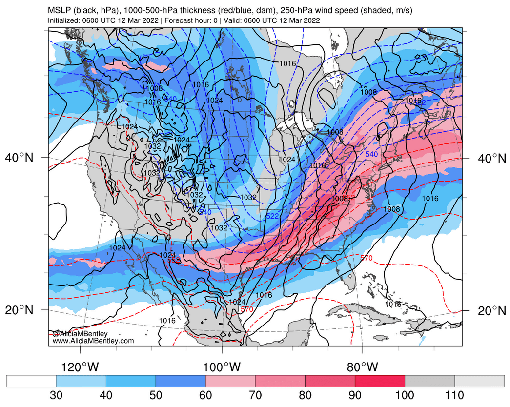
Figure 1: 250 millibar jet stream map from 0600Z 12 March 2022, where the higher values of wind speed (in m/s) are shown in pink. Sea-level pressure is also shown in the black contours every 4 mb, and 1000-500 thickness contours are shown in the dashed red and blue contours every 6 meters. (Source: Alicia Bentley)


Due to factors such as a strong trough/ridge structure associated with this system, this Nor’easter was able to rapidly strengthen due to significant upward vertical motion in the mid-troposphere, which resulted in this surface cyclone undergoing bombogenesis on March 12th, 2022. Figure 1 above shows this system at an early stage of its development, at 06Z (1 a.m. EST) on March 12th. At the time, while the exact minimum pressure measurement is not displayed, Fig. 1 shows that this system was at a modest sub-1008 millibar (mb) low, something that would quickly change over the next day and a half. Figure 2 below shows the system 24 hours later, at 06Z (1 a.m. EST) on March 13th. During this time, the system had dropped to a sub-960 mb low, which was a pressure decrease of around 48 mb in 24 hours, far exceeding the threshold for a system to be declared a bombogenesis event, which is a pressure drop of 24 mb in 24 hours.

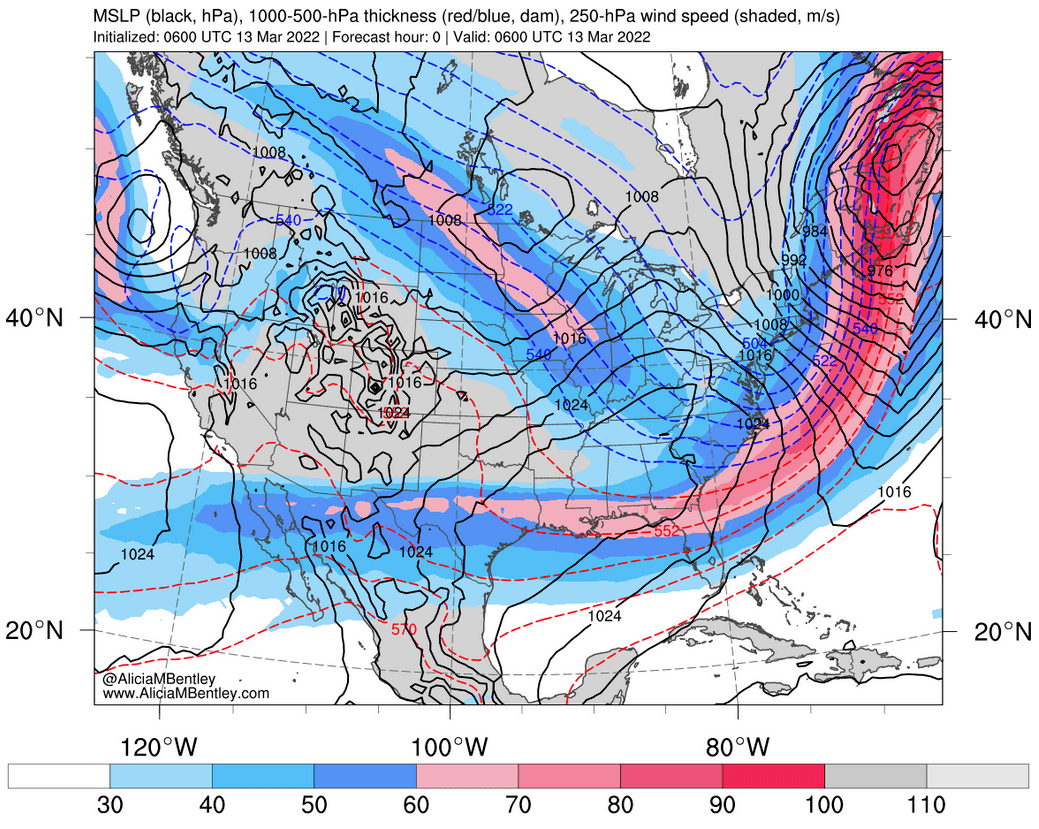
Figure 2: 250 millibar jet stream map from 0600Z 13 March 2022, where the higher values of wind speed (in m/s) are shown in pink. Sea-level pressure is also shown in the black contours every 4 mb, and 1000-500 thickness contours are shown in the dashed red and blue contours every 6 meters. (Source: Alicia Bentley)


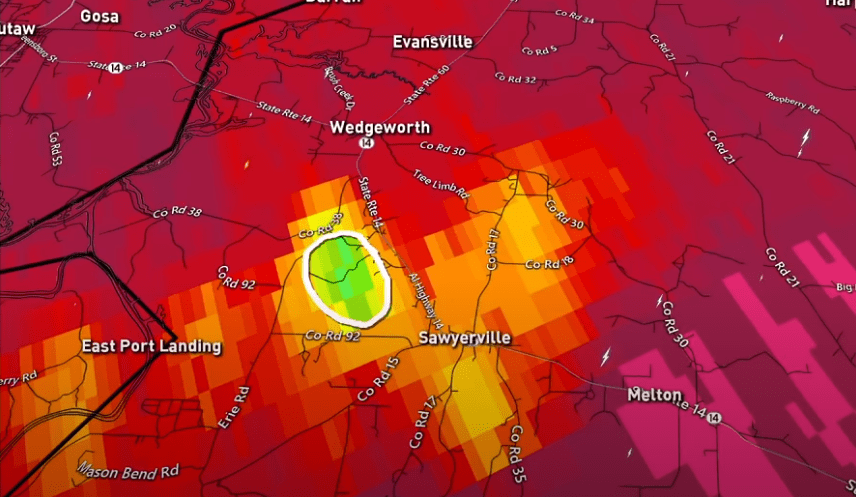
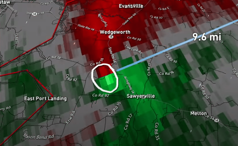
As mentioned previously, this rapid developing system led to a moderate severe weather outbreak in Florida, which included 4 tornadoes and many additional high wind reports, which can be seen in Fig. 3 below. This outbreak consisted of 3 EF1 tornadoes and one EF0 tornado. Fortunately, no fatalities or injuries as a result of these tornadoes were reported, but there were still other effects such as property damage, downed trees, and downed powerlines.

Figure 3: Storm reports for 12 March 2022. (Source: SPC)


Figure 4: Sounding/Skew-T data from Tampa Bay, taken at 1200Z 12 March 2022. (Source: NWS)


Figure 4 above shows sounding data of the Tampa Bay area (on the western coast of Florida) from 12Z (7 a.m. EST) on March 12th. There is quite a lot of data that can be interpreted from these plots and tables, specifically in the bottom left, that all ultimately highlight the unstable environment that was present in Florida just before and during the severe weather outbreak. First, we can see that there was over 2200 Joules per kilogram (J/kg) of Convective Available Potential Energy (CAPE) present, with minimal Convective Inhibition (CIN) to counteract this. A Lifted Index (LI) value of -4 was also measured. All of these factors point to a moderately unstable environment. This is further supported by the environmental lapse rate values in the very bottom left of Fig. 4. They were measured to be between 4.8 and 5.9 degrees Celsius per kilometer, which is higher than the moist adiabatic lapse rate (3.3 degrees C/km) but lower than the dry adiabatic lapse rate (9.8 degrees C/km), which is an indication of a conditionally unstable environment. In the lower center of the figure, we can see that a highly sheared environment was present, with values between 40 and 80 knots throughout the troposphere, which is ideal for severe weather development. Lastly, the “Supercell” value in the bottom left of the figure was measured to be 19.9, which is a very significant indicator for the possibility of supercell-inclusive severe weather. To summarize, there was significant instability present in the region along with a moist environment leading up to the severe weather event, which enabled atmospheric lifting and rapidly developing convective activity.


Figure 5: Base Radar reflectivity map from 1250Z 12 March 2022. Blue and green colors are lower values of reflectivity (in dBZ) while yellow and red colors are higher values of reflectivity, which correlates to a higher precipitation rate. (Source: National Severe Storms Laboratory)


Using radar reflectivity, it is possible to view precipitation data from this event. Figure 5 above shows an archived base reflectivity map from 1250Z (7:50 a.m. EST) on March 12th. Using this map, we are able to see the line of severe storms that are just starting to impact Florida at this time due to their red and orange colors associated with a higher reflectivity value. Heavier rain and some storms are also present on this map in the Mid-Atlantic region during this time, and if we reference Fig. 3, we can see that there were many high wind reports in North Carolina associated with this. Also worth noting is the smoother blues and greens to the northwest side of this system, which is indicative of snow impacting the rustbelt states and much of the northeast during this time period, along with some minor snow bands affecting areas as far south as Alabama and Georgia. Overall, the precipitation that stemmed from this bombogenesis event affected almost the entire eastern portion of the United States.


Figure 6: GOES-16 upper-level water vapor RGB product from 1250Z 12 March 2022. White and blue colors are areas with higher atmospheric water vapor content, while orange and black areas are areas with lower water vapor content. (Source: CIRA)


Using satellite data, we can get additional insight about this system. Figure 6 above shows the water vapor content of the upper troposphere at 1250Z (7:50 a.m. EST) on March 12th. On this map, blue and white colors show higher water vapor content, while black and orange colors show lower water vapor content. With this in mind, we can see that there was significant water vapor present in the atmosphere in the same area where the severe weather outbreak that impacted Florida developed (along with much of the northeast US), which, as stated before, provided an ideally unstable environment for convection to occur. Another thing worth highlighting on this map is the clear gradient from light gray/white to black/orange over northeast Georgia and central Alabama. Referencing Fig. 1, this is the approximate location of the 250 mb jet streak at this time. A jet streak can typically be identified from this type of brightness temperature gradient in water vapor satellite imagery, so this is expected.


Figure 7: GOES-16 Geocolor RGB product centered over Florida from 1250Z 12 March 2022. (Source: CIRA)


Figure 7 above shows a Geocolor map from the same time, 1250Z (7:50 a.m. EST) on March 12th. As this is a natural color imagery product, clouds are depicted in white. From this image, we can see an area just off the west coast of Florida with “bubbling” clouds associated with higher cloud tops, which is another indicator for convective activity being present in a region. Figure 8 below shows the same phenomena from a different viewpoint. In this case, the blues and purples are high cloud tops. Again, we are able to see an area just off the western coast of Florida with very high cloud tops in associated with convection. This is important, as due to satellite technology, we are able to see convective activity associated with severe weather, in some cases, before it impacts land. This allows meteorologists to provide warning to people living in areas that may be affected by severe weather events before they occur.


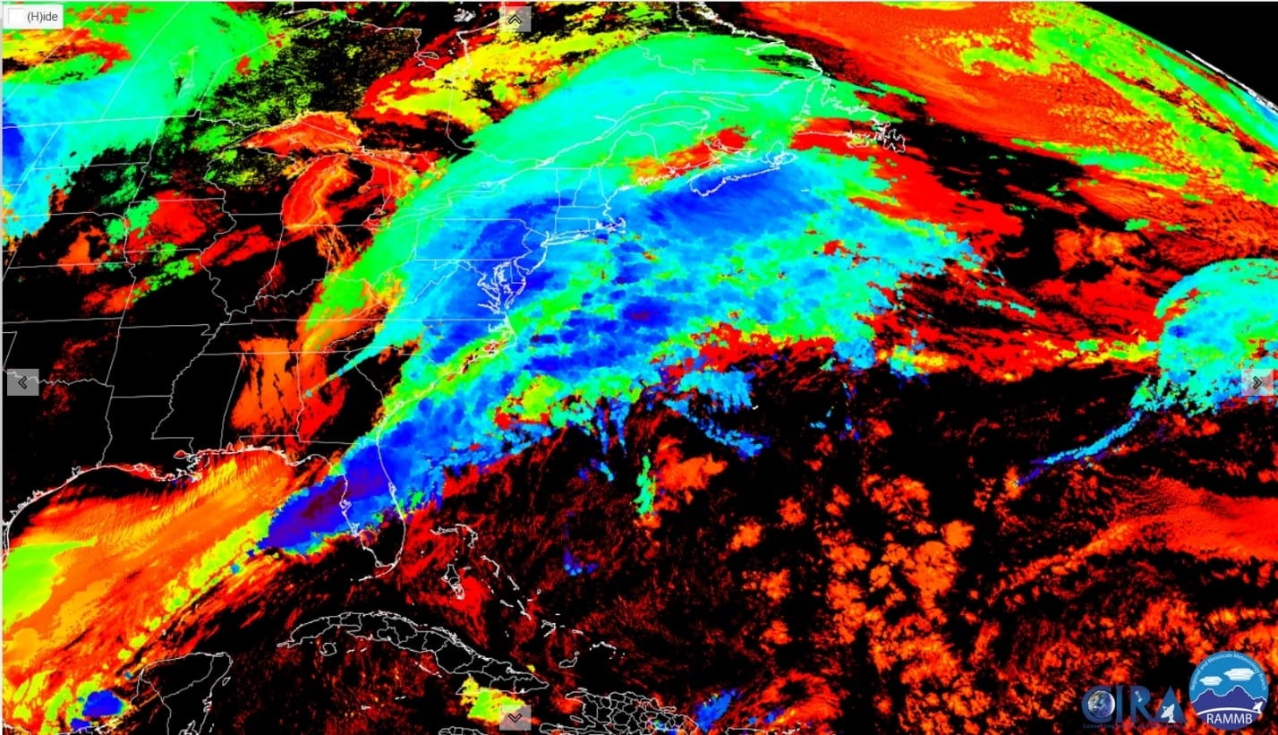
Figure 8: GOES-16 Cloud Top Height RGB product from 1250Z 12 March 2022. Blue and purple colors are higher altitude clouds, while orange, red, and green colors are mid-level or lower altitude clouds. (Source: CIRA)


Below is another very useful satellite RGB product, the Day Cloud Phase product. Figure 9 below (from 1650Z, or 11:50 a.m. EST, on March 12th) shows ice clouds in pink and yellow colors. Ice clouds are typically associated with clouds higher in altitude, as the higher you go in the troposphere, the colder it becomes. Especially in the warmer region near Florida, these ice clouds are another great way to tell that there are tall clouds present in the area which can be further indication of present convection. This satellite product also allows us to see snow cover on the ground, which is shown in green. In this case, we can confirm that this low-pressure system led to widespread snow cover across the Midwest and into the northeastern United States, along with the severe weather outbreak in Florida covered previously.


Figure 9: GOES-16 Day Cloud Phase RGB product from 1650Z 12 March 2022, where yellow and pink colors are higher level ice clouds, and cyan colors are mid-low level water clouds. (Source: CIRA)

A Snowy Mess in Chicago due to Lake Effect (author: Jordan Murdock)

On January 28, 2022 a total of over 8 inches of snow was suddenly dropped on parts of Chicago, Illinois beginning in the late evening of January 27, 2022 and continuing throughout the night into the next morning. The snow fell at a rate of 1-2 inches per hour and was formed due to lake effect. Lake effect snow formation is caused when colder, drier air masses move across the lake. As the cold air moves across the warmer lakes, the air warms and becomes more humid and less dense. This causes the air to rise and then cool which is where it forms into clouds and precipitates. It turns to snow once over land when the moisture in the air condenses into snow creating lake effect snow (Figure 1).

Figure 1: Diagram showing the formation of lake effect snow and the factors that cause it. (Source: weathernet)


Looking at the nighttime microphysics RGB from January 28, 2022 while this lake effect snow was occurring, at 2:41 a.m. EST (0641 UTC) the cooler, water clouds can be seen by the greenish/ yellow color on the RGB map (Figure 2). The redder areas are higher, thick clouds and a clear distinction between the cooler clouds contributing to the lake effect snow and the higher clouds present that are not associated with the cooler air. The first map (Figure 2a) shows nighttime microphysics RGB without 0.5 radar reflectivity present but Figure 2b shows where the snow registered on radar (measured in dBZ). It shows the snow present in the blue/white colored areas over the greenish/yellow area. This lake effect snow event was a product of a single snow band over Chicago, Illinois which is shown accurately on this overlay (Figure 2b).

Figure 2: (a) Nighttime Microphysics RGB of 0641 UTC January 28, 2022 without radar and (b) with radar (source: CIMSS Satellite Blog)


Another RGB map used to view where the lake effect snow was present is Day Cloud Phase Distinction RGB. In this RGB, the blacker areas depict water surfaces and therefore Figure 3 depicts Lake Michigan clearly. Figure 3 shows the lake effect snow still occurring later in the day than the nighttime microphysics RGB at 11:36 a.m. EST (1536 UTC) on January 28, 2022. In this RGB, thin high-level clouds with ice particles or snow are shown in redder/ orange areas and glaciating clouds / snow is depicted by green. Looking at the Day Cloud Phase Distinction RGB map below, it highlights the narrow nature of the band as it moves inland over Chicago.

Figure 3: (a) Day Cloud Phase Distinction RGB of 1536 UTC January 28, 2022 without radar and (b) with radar (source: CIMSS Satellite Blog)


The WPC surface map below (Figure 4) depicts the surface at 10 p.m. EST (0300 UTC) January 27, 2022 (a) and 4 a.m. (0900 UTC) January 28, 2022. The two maps show the progression of a cold front extending south from Canada over the great lakes southwest to Illinois before curving north again towards Montana at 0300 UTC moving south across the great lakes and Illinois and lingering over Illinois. This cold front caused the greater temperature difference between the warmer, moist air over the lakes and the colder, drier air coming with the cold front. As stated earlier, lake-effect snow is formed by cold air moving over warm water, so the longer the cold air moves over that warm air, the greater the precipitation will be which is how the snowfall amount reached such high levels.

Figure 4: NOAA surface analysis map on January 28, 2022 (a) at 0300 UTC (b) 0900 UTC


This lake effect snow event led to high amounts of snowfall in the Chicago area with as high as 9 inches being reported in Evanston 1 E. The highest totals are listed below in Figure 5. The snowfall rates were on the order of 1 to 2 inches per hour and created dangerous travel conditions during the Friday commutes due to rapid changes in visibility and snow-covered roads. The visibility dropped to as low as ½ of a mile. This localized snow fall is unique to lake effect snow which is shown in Figure 5 as the highest totals were near the edge of Lake Michigan. Though lake effect snow is very common coming off of the great lakes, this January 28, 2022 snowfall was a high one that caused a messy day in Chicago.

Figure 5: Map of Chicago area with recorded amounts of snowfall (source: NWS)

Cataclysmic Disasters: The Dust Storm and Fire Outbreak of December 15th-17th, 2021 (author: Nadiyah Williams)

Between December 15th and 17th of 2021, a squall line of severe thunderstorms produced over forty-five confirmed tornadoes across the Great Plains and Midwest. Most deaths related to this outbreak occurred in the state of Kansas, where residents in affected areas also received a powerful dust storm and damaging fires. Depicted below is the squall line over Kansas and part of southern Nebraska that later strengthened over the Midwest.

[Figure 1. A squall line of dry severe thunderstorms that later strengthened over the Midwest shown on GR2Analyst. (Source: AWS & GR2Analyst)]


This unprecedented and historic event was very unusual for this time of the year. Dust storms will typically brew when unsettled dust or dirt meets with an outflow boundary (cooler surface winds produced by the downdraft of a severe thunderstorm). These will usually occur in dry, arid climates because there are large amounts of dry soil and sand. In North America, dust storms may occur in the summer if the topography allows for it. In this case, not only was there loose dirt, but the unseasonable thunderstorms were also dry thunderstorms, producing only 0.19’’ of rain. The warm base at the bottom of these clouds may have been warm enough to evaporate the rain before it could reach the surface. In the Dust RGB image, the dust is depicted as magenta or violet while the mid-level clouds appear as a moss green. The dust storm caused power outages and near-zero visibility.

[Figure 2. The outflow boundary forms from the downdraft of a severe thunderstorm and brings a swath of cooler surface winds, which are strong enough to move dust and dirt at high speeds. (Source: University Corporation for Atmospheric Research)]


[Figure 3. This Dust RGB satellite image shows dust blowing across western Kansas. The dry air is to the left of the comma-shaped cloud while the moist air at the lower levels is to the right and appears blue. (Source: NWS)]


Combined with lightning, parts of Kansas, Colorado, and Nebraska experienced scattered fires after the dust storm. According to the National Weather Service, primary fire warning criteria requires that the relative humidity be less than 15% with 25 mph sustained wind speeds for at least three hours in a 12 hour period; however, the relative humidity requirement does not need to be met if the area of interest experienced hot and dry conditions preceding the thunderstorm. Lightning from dry thunderstorms was enough to ignite fires, and with the high wind speeds in Kansas, the fires were enhanced, resulting in damaged pastures and multiple injuries.

[Figure 4. Depicted is the mid-level jet stream responsible for the fast winds aloft. These will commonly cause wildfires if there is a dry air mass near the surfac for the jet to spread. This setup, along with dry thunderstorms that produced lightning, was more than enough to cause a wildfire outbreak in south central Kansas. (Source: NWS)]


[Figure 5. This shortwave infrared satellite image shows the fires in western and central Kansas within a three-hour period. The highest brightness temperatures (black) are associated with higher brightness temperatures, which means that the object is absorbing radiation instead of reflecting it (white). For this reason, these spots are much warmer than the surrounding area, which means that the black spots are indicative of fire outbreaks. (Source: NWS)]

Weather Discussion Round 1 Blog Post (author: Faria Panwala)

Tropical Storm Fred originated as a tropical wave out of the west coast of Africa on August 5, 2021, travelling through the East Caribbean sea and making landfall as a tropical depression over Santo Domingo on August 12, 2021. As it moved northwestward, it weakened to a tropical wave as it passed over northern Cuba. However, the system re-organized into a tropical storm as it passed over the Gulf of Mexico, before heading northward for the Florida Panhandle. It made landfall on the Panhandle of Florida on August 16, 2021, at 20 UTC (4:00 pm EDT). This is when the storms maximum wind speed of 65 mph and minimum pressure of 992 mb were recorded. After making initial landfall, the system quickly weakened back into a tropical depression and eventually became an extratropical low after it propagated northeastward through Georgia before dissipating off the east coast of Massachusetts on August 20, 2021. Tropical Storm Fred resulted in 7 fatalities and $1.3 billion in damage with 36,000 customers without power in Florida. Some cities along the Panhandle coast reported between 8-12 inches of rain in 24 hours.

Figure 1: Projected Storm Track for Tropical Storm Fred, originating August 14 at 8:00 am to August 19 at 8:00 am. The symbols represent the classification of Fred as it moves into the Panhandle. Circulation symbol with “L” in the center over Eastern Cuba and Alabama represents Tropical Depression. Symbols along western coast of Florida signify Tropical Storm. “L” symbols over the southeast represent extratropical low
Credit: AccuWeather


An interesting phenomenon of this system is its continuous reclassification due to the constant strengthening and weakening throughout its life span. Factors that can affect the structural integrity of a tropical storm include land interactions, sea-surface temperature, and vertical wind shear. Typically, a tropical system will weaken as it passes over land, as it is no longer taking advantage of warm moist ocean air. If the sea surface temperature is around 27 degrees Celsius or above, as was the case over the Gulf of Mexico, the tropical cyclone can strengthen.
The third factor is vertical wind shear, which is the difference in wind speed and/or direction between two atmospheric layers. For a tropical cyclone to strengthen, it needs to have no to “low” amounts of shear, as vertical wind shear can destabilize the center of a cyclone. This is because if the wind speed or direction in the top layer of an air column is inconsistent with the bottom layer, the system can become asymmetrical or lopsided. The shear scale is as follows:
“No Shear”: 0-5 m/s
“Low Shear”: 5-10 m/s
“Shear”: 10-15 m/s
“High Shear”: Greater than 15 m/s

Figure 3: 850-200 mb Wind Shear (m/s) plot for August 15, 2021. Darker blue colors represent lower shear values, warmer colors represent higher shear values. Wind vectors represent direction of wind between 850 mb and 200 mb.
Credit: NOAA Physical Sciences Laboratory


Figure 3 shows the wind shear between 850 mb and 200 mb. The tropical storm was located just south of the Florida Panhandle on August 15 (shortly before making landfall). This region has vertical wind shear values of 15 m/s which is a considerable amount of shear, enough to destabilize the structure of our tropical cyclone. The reason we do not see an immediate weakening of the tropical storm, and rather a strengthening, is because of the warm, moist air from the Gulf of Mexico fueling our system, which counterbalances the negative effects from vertical wind shear.

Satellite imagery can tell us what is occurring inside the eye of the system:

Figure 4: GOES-16 EAST Satellite Imagery Loop on August 16 from 11 UTC-19 UTC . Uses two channels: Visible “Red” and “Clean” Infrared Window. Measures cloud top brightness temperatures. Rainbow colors represent higher temperature values, black/gray colors represent lower temperature values.
Credit: National Weather Service


We observe on this loop that the center/eye of the storm has lower cloud-top brightness temperatures (as seen in the black color). Cloud-top brightness temperature tells us the temperature of the top of a cloud, and the rate at which it cools can provide information on updraft strength and convection. Fred’s center had a cloud-top brightness temperature of about -80 degrees Celsius just before landfall. In this area, we notice “bursts” of white color on the satellite loop. These are bursts of convection associated with the colder temperatures within the eye of the tropical storm, providing ample fuel to the system.

Radar Reflectivity data can be used to show precipitation intensity:

Figure 5: Radar Reflectivity Loop on August 15 from 12 UTC-14 UTC . Higher reflectivity factor (in dBz) indicated by warmer colors; lower values indicated by cooler colors.
Credit: GR2Analyst


Radar reflectivity represents the power returned to the radar after reflecting off of precipitation. This color bar shows dBz (decibels of reflectivity) values, which measure the strength of reflectivity, so a larger dBz value indicates stronger precipitation in that region. The maximum dBz value here is around 54 dBz associated with the orange/red color, which corresponds to where we saw intense precipitation.

Landon Brings Winter to Texas (author: Chelsea Bekemeier)

Levelland, TX February 3, 2022


7” of snow in Jayton, TX – Feb 3, 2022


To kick February off this year, Winter Storm Landon or “Groundhog Storm” as aptly named by Twitter brought everything from snow, ice, freezing rain, and hail to 5 tornadoes (3 EF2). This system was quite the start to a La Niña winter, in which the southern United States typically sees warm, dry winters due to the high-pressure system in the Pacific (exacerbated in-part by ocean circulation) driving the Polar jet stream more north during this time. After a rough winter last year, Texas was hopeful that this La Niña winter would not bring the same snow/winter/ice mix. However, the polar jet had some tricks of its own.


Figure 1

300mb Jet Analysis Map – Storm Prediction Center Archive NOAA – Feb 3 2022


In Figure 1, we can see the polar jet had indeed decided to grace the lower latitudes and the subtropical jet with its presence, as we can see a large trough axis over west Texas with a slight negative tilt (see red dashed line). This tells us that the polar jet is bringing that cold air from the north along with strong wind speeds and shear aloft as evidenced by the wind barbs. The negative tilt suggests that the cold air is advecting over the warm air below, which leads to thermodynamic instability and vertical movement of air which produces strong thunderstorm and precipitation events.  The negative tilt also indicates that the Low-Pressure System  we see in Figure 2 has reached maturity.


Figure 2

NOAA Surface Analysis Map February 2-4, 2022


In figure 2, we can see the strong high-pressure system (HPS) in the North driving the low-pressure system (LPS) southeast, through Texas and all the way up to Maine. From February 2nd to the 3rd, when most of the snowfall and wintery mix prevailed, we see the cold front ahead of the LPS crossing through TX. At 1631 Zulu (10:31 AM CST), we can see the wind barbs increasing in wind speed as the system brings in winds from the Northwest. From the tightly packed isobars, we can also see a strong pressure gradient forming, indicating high surface winds as the LPS moves through. From the 3rd to the 4th, we can see the LPS pushed out and the HPS moves over TX, clearing up the wintery mix and bringing warmer temperatures in the coming days.

We can also observe Landon’s winter mix via satellite imagery from the GOES satellites.  In Figure 3, we see the GOES water vapor imagery over TX on February 2nd from 8-9pm. The blue represents moist air whereas the yellow/orange represents dry air. We can see the advection of moist air over the dry air as well as a strong moisture gradient between the moist and dry air masses, adding to thermodynamic instability and vertical motion. The white and greenish colors represent thick, moist cloud tops which display the vertical motion of the air over TX as the LPS blanketed the lone-star state with snow and a wintery mix.


Figure 3

GOES Band 9 Water Vapor Imagery (6.9μm)


We can also see the more traditional satellite view of the GOES-16 GeoColor Visible image of TX on February 3rd at 12:46PM below.


Figure 4

GOES-16 GeoColor Visible(Daytime) – CIRA – Feb 3 1646 UTC [Full timeline link here]


This image shows Winter Storm Landon in all its glory, stretching from Texas to Maine. The white we see are the high cloud tops over the affected areas, which indicates thermodynamic instability and the storm or precipitation type can be inferred from  a combination of local atmospheric dynamics and other satellite products. In other words, this picture is great at showing Landon’s extent, but we need a little bit more information to identify where the snow/ winter mix actually is.

For that, we’ll turn to another GOES product known as DayCloudPhase.


Figure 5

GOES-16 DayCloudPhase – CIRA – Feb 3  1651 UTC [Full timeline link here]

The DayCloudPhase is a helpful tool because it provides insight to the differences between cloud and land reflected temperatures in visible and infrared, which allows us to distinguish between snow/ice on the ground versus cold cloud tops. This image is from the same time as the GeoColor above. The green indicates snow on the ground, which we can see in North TX and the cyan color indicates low level clouds with water droplets, which can indicate precipitation (snow, ice, freezing rain, rain, sleet) depending on the lower-to-mid-level atmospheric processes occurring at the time. On February 3, we saw that most of mid to North TX experienced snow and a wintery mix and we can confirm that by looking at this image along with the dynamics at play. The orange indicates the thin, high level ice clouds. NOTE: The red in this image simply indicates that this image was almost in night mode, as it switches to infrared at night, which is not very useful to us.

We know that the snow and winter mix also occurred during the evenings, with much occurring the night of Feb 2-3. What do we use at night then if the other products are only helpful during the day? For that, we turn to the Nighttime Microphysics GOES channel.


Figure 6

GOES-16 Nighttime Microphysics – CIRA – Feb 3 03:01 UTC [Full timeline link here]


This channel allows us to observe various cloud types in the mid to upper troposphere during the night. The red indicates high, thick clouds and when these also have yellow coloring it indicates that these clouds are very cold, which are indicative of strong vertical development and instability (hint: compare this image to the GeoColor Visible). The light green/yellow indicates mid water clouds, indicative of some type of precipitation in the context of this winter event. From this image and with the prior knowledge of dynamics occurring at this time we can view Landon’s winter mix moving over Texas even during the night.

Finally, we can also confirm Winter Storm Landon’s effect on TX by looking at radar reflectivity.


Figure 7

Base Reflectivity – NOAA SPC – Feb 3 AM


In this radar image in the morning of Feb 3, we can see the snow (light blue to green) and winter mix (blue/green – especially in the streaky areas). We can see how heavy the precipitation is based on the color reflected as well. Blue/green shows light precipitation (in our case snow/winter mix), whereas yellow shows moderate, and red indicates heavy precipitation (in the case you see over Mississippi the red is heavy rain and some thunderstorms), We’ll look more closely at the radar images from Lubbock, TX to get a sense of the precipitation in North TX specifically.


Figure 8 – Lubbock TX

Base Reflectivity – DuPage     Feb 2 2200-2221 UTC

Feb 3 2200-2223 UTC

Lubbock, TX Doppler Radar


From the Lubbock, TX doppler radar on Feb 2 PM (left) we can see the reflectance of snow (blue, possible green) and winter mix (blue/green) as the LPS begins to pass through.  We see the same on Feb 3 PM (left), with some interesting backsliding of snow as the system is moving out. We can also identity some anomalous propagation or “noise” on these radars, with the little circle of (red/yellow) along with some of the stringy grey in the middle of the left image. This is most likely buildings of nearby cities reflecting or bouncing the radio waves back, creating an image that would look like some sort of severe storm formation, but is more likely a false echo due to its size, lack of movement between days, and in context of what we know regarding the dynamics at play. This can be cause by trapping of radio waves in ducts, due to surface inversions or inversions aloft or drastic decreases in water vapor pressure with height.

Overall, Landon brought rain, freezing rain, sleet, ice, and snow to TX, with some areas of North Texas seeing 8”! Certainly, Texas was once again not prepared for this, as many (~350,000 people) did lose power for a brief time, but Landon did not do quite as much damage as last year’s Winter Storm Uri.  Considering this was supposed to be another mild La Niña winter, maybe Texas should really start to winterize in time for next winter.

February 17th, 2022: Alabama Severe Weather (author: Kevin Pinder)

Figure 1: NEXRAD Base Reflectivity image over Huntsville, Alabama on February 17th, 2022 4:15 PM CST. As the dBZ values increase, in the upper right-hand corner of the image, the more intense the rain is. The first tornado occurred in the red box indicating a tornado warning over a supercell west of Birmingham, Alabama. (Source: Iowa Environmental Mesonet)


With a squall line advancing eastward across the central United States, Alabama was in the crosshairs yet again for possible tornadic activity on February 17th, 2022 after just experiencing a tornado outbreak two weeks prior. There were 3 recorded tornadoes that occurred in central Alabama, with the first touching down at 4:14 PM CST in north Tuscaloosa County between Wallace Branch and Old Cheatam Road, lasting only 5 minutes. Overall, these tornadoes were relatively weak on the Fujita scale, with maximum estimated sustained winds peaking at 100 mph. No injuries or fatalities were reported with this system, but the winds were strong enough to uproot trees and overturn semi-trucks.

Figure 2: Tornado report summary on February 17th, 2022. (Source: weather.gov)


A surface analysis map at 3 CST February 17th, 2022 shows different surface parameters just an hour before the first tornado touched down in central Alabama. As the cold front continues to push across the central United States, there is a clear boundary layer between temperatures. Northwest of the cold front in Arkansas, the weather station plots, indicated by circles, show a northwest wind barb bringing in dry, cold air with temperatures getting into the lower 40s. To the east of the cold front, Alabama is experiencing temperatures in the 70s with dewpoints in the lower 60s. There is a south wind bringing in moisture from the Gulf of Mexico. This is a key ingredient for severe weather. The low-pressure strength is depicted by the 1006 mb underlined value over northern Louisiana. Over the next hour, this system will intensify as it moves over Alabama.

Figure 4: Surface Analysis at 6 PM CST over Alabama. (Source: weather.gov)


A special recorded sounding over the KBMX weather station shows a vertical temperature profile of the atmosphere at 5 PM CST. It is important to note the vertical effective shear being 74 kts pointing towards dynamic instability. Wind shear is necessary for vertical rotation within a column of air. When this parameter is within the range of 25-40 kts or greater, the formation of supercells becomes more probable. Regarding the thermodynamics, there is a recorded CIN value of -8 J/kg at the surface with a CAPE value of 191 J/kg. CIN represents convective inhibition which is an area on a sounding it must be overcome for a storm to initiate. When CIN is less than 50, there is a high chance for thunderstorms to develop. CAPE represents the convective available potential energy in the atmosphere where parcels can be lifted to its level of free convection. CAPE does not need to be high (>1000 J/kg) to fire off supercell like structures if the CIN is low. Therefore, we can consider this atmosphere to be thermodynamically instable. Additionally, the atmosphere is saturated due to the positioning of the temperature and dew points lines (red & green) being so close to each other. The warm, moist Gulf of Mexico air is the reason for this. It is depicted by the south surface wind barb at 1000mb.

Figure 5: Sounding image of KBMX at 5 PM CST. (Source: weather.gov)

Investigation of Small Tornado Event on December 31st, 2021 (author: Jacob Hinson)

To ring in the final day of the year, some interesting elements came together to make an interesting day for some people in the Southeast. A few sporadic cells came together and managed to find enough shear (change in wind speed/direction as you go up in the atmosphere) to initiate tornadic conditions.

Fig. 1 – Radar loop from 1755Z to 2325Z (12:55pm to 6:25pm EST) on December 31st, 2021


In Figure 1, we see the radar loop of the Southeast during our region of interest. The storms that produced the most damage were within the “marginal” risk category as provided by the Storm Prediction Center (Fig. 2) at 20Z (3pm EST).

While this risk generally means there is low change of anything happening, it does not exclude it entirely. This day definitely exemplified that case, as there are limitations to forecast ability as well as representation to the public about severe weather threat.

Fig. 2 – SPC Day 1 Categorical Outlook for 12-31-21 at 20Z


Another thing to consider when looking at the forecast for these storms is that severe weather is not typical in the winter months for the southeast. Some tornadoes may occur during early winter in the rust belt, but the southeast can generally expect to stay free of them, making an event like this even more dangerous.

Fig. 3 – SPC Storm Reports for 12-31-21


There were a total of 4 tornado damage reports on the 31st, one of which garnered a damage survey by the NWS. The damage was categorized as EF-0 to EF-1 on a scale from EF-0 to EF-5, with winds of around 70-100mph.

Fig. 4 – Damage from early in the Carroll county tornado (EF-0) (Credit: NWS)


Despite the low rating, these events can still manage to destroy people’s lives. Homes can be destroyed by trees or water, and someone’s car could be their only form of transportation to their job.

Fig. 5 – Tornadic damage from the end of the Carroll county tornado (EF-1) (Credit: NWS)


The tornado lifted a carport off of its foundations and collapsed it on top of itself.

Fig. 6 – Damage path from the Carroll county tornado
The tornado was on the ground for about 2.5 miles, doing EF-0 and EF-1 damage the whole time.


Fig. 7 – Screengrab from GRLevel2 of Carroll county cell further along in its life (Credit: Sammy Maggio)


The WSR-88D in Peachtree City had a good look at the storm as it approached Marietta, GA. In the top right the dual-polarization product Correlation Coefficient is picking up that are not uniform in nature, alluding to debris being lifted and thrown around. While this data is low resolution, you can still see the velocity couplet in the bottom left image. The bottom right image shows Spectrum Width, a more advanced dual polarization product that compares the range of wind motions that are observed. It increases, becoming gray, then orange, then yellow to white as it sees higher turbulence. This is telling us that the environment around the storm is not just wind flowing in one direction, but wind twisting around in the atmosphere.

Fig. 8 – RadarScope Super-Res Reflectivity and Velocity scan (Credit: Jacob Hinson)


The typical supercell structure with a well defined hook echo cannot be identified, but thanks to doppler radar, we know that the storm is rotating. On the bottom of Fig. 8, we can see a velocity couplet, identified by wind coming toward the station (green) and going away from the station (red) right next to each other (just above Powder Springs). This wind can be measured as “gate-to-gate velocity” to get an idea of how fast the storm is rotating. These measurements are not the best analog for windspeed at the surface however. Most radar beams are curving away from the surface of the Earth. At the current 0.5 degree tilt, the radar is imaging the storm at 2700ft above the surface. Inferring tornadic strength from radar imagery can be a slippery slope, especially for a fringe case such as this where the parent storm hasn’t even reached a 50dBZ reflectivity return.

Combined with the information from Fig. 7, we can tell that the tornado that this had produced was lifting small debris at least that high. I had started to record the storm and alert friends at Kennesaw State University of its arrival. You can see KSU as a blue dot on both of the radar images.

Fig. 9 – Sounding from KFFC (Peachtree City) on 12-31-21 at 12Z (7am EST)


The atmosphere did not have much instability to create such an event, so much that the NWS even discredited the chance for severe potential in their mesoscale discussion #2089. However, even with surface-based CAPE (Convective Available Potential Energy) at a meager 5 J/kg¬3 (meteorologists are only ever paying attention to values above 1000 J/kg¬3), the storm found enough shear to become unstable. Shear can help a storm begin to rotate and form a supercell structure, and this can come from change in wind direction with height, or simply change in wind speed with height. Evidently, there was enough shear this day to cause the initiation of tornadoes, which is why everyone needs to stay vigilant and have a way to get alerts. The storm that produced these tornadoes was captured by Stu Ostro in the Tweet below.


The January 28th to 29th Winter Storm and its Effects (author: Blake Berge)

On January 29th Boston, MA saw nearly two feet of snow in a day, nearly breaking an all-time daily record of 23.6”. This storm is not unusual, however, as it took the shape of the classical nor’easter. A nor’easter is a strong storm system that sweeps up the coast of the eastern U.S, typically resulting in a severe or winter storm threat. These storms gather energy by pulling in moisture from the relatively warm waters of the western Atlantic, driving it in an anticlockwise direction. With the combination of moving up the coast and this circulation, nor’easters can create dangerous or life-threatening situations for people along the northeastern U.S. coastline. One interesting aspect of this storm was the negatively tilted trough, or elongated regions of low pressure, seen hovering over North Carolina and Virginia on the morning of the 29th:

Figure 1. 500 Millibar Analysis Map of the Contiguous U.S. at 7 a.m. EST on Jan. 29th.


This trough assists in the main storm system further to the east by allowing for stronger convergence at the surface low. This is because to the east of troughs there is stronger divergence in the upper level, allowing for more air to converge at the surface, strengthening the storm. Additionally, this trough was negatively tilted, which means the trough axis was along a northwest to southeast line. This indicates the storm was strengthening or was near maturity at this point, as the excess movement in the trough at this stage may cause it to dissipate as it becomes more tilted. Moving down through the atmosphere to the surface, the map below shows a combination of satellite infrared imagery with a surface analysis map:

Figure 2. Surface analysis and infrared satellite view of the nor’easter early on the 29th.


The surface low can clearly be seen off the coast of North Carolina in this map. The color scheme indicates the temperature of the object, as seen from a satellite; the redder the object, the cooler it is. This temperature can be useful for determining the strength of some storm systems, and here it is evident that the nor’easter is involved with the large region of cooler clouds. The large swath of clouds and cool cloud tops over New England indicates unsettled weather in these regions. Moving to the southeast, the cold front passing over Georgia and Alabama brought along with it some backside moisture, creating light to moderate snow showers as seen in the radar loop below:

Figure 3. Radar loop of light and moderate snow over the south around midnight on the 29th.


Here, the path of the snow is northwest to southeast, identical to the direction of the cold front. These quick 15–30-minute snow showers brough totals of almost one inch in some places, resembling snow squalls typically seen farther north. This isn’t too surprising considering the modest radar reflectivity seen above, which corresponds to precipitation intensity. Additionally, the snow totals were enough to see using satellite imagery. For example, the specialized red, green, and blue (RGB) imagery called the “day cloud phase” from GOES-16 can pick up the small amount of snow cover. Overall, this event brought wintry weather to much of the eastern U.S., with a surprise snowfall closer to home in the southeast.

Figure 4. Snowfall seen in this RGB satellite product is represented as green streaks over northern Georgia and Alabama.

Hurricane Ida Chase Report (author: Kevin Lu)

Hurricane Ida was a category 4 major hurricane that made landfall in Louisiana on the 29th of August 2021 with 1-minute sustained winds of 150 mph. The author rode out the storm in Morgan City at 29.700N 91.199W. The sea level of the location was approximately 5 feet. Ida’s center passed approximately 35 miles east of Morgan City around 4 PM CDT. The author collected meteorological data with the WeatherFlow Windmeter on a rotating mount and surveyed the damage of regions hit by the eyewall.

Ida had a distinct concentric eyewall feature shown on the radar. Concentric eyewalls are characterized as a double eyewall structure with a dry slot known as the “moat” separating the inner and outer eyewall. The inner eyewall is generally where the strongest winds occur because a narrower eyewall tends to have a steeper pressure gradient. Hurricane Ida maintained a concentric eyewall structure for approximately 6 hours after landfall before a widening of the inner eyewall was observed. Cities such as Houma and Raceland took a direct hit from the inner core.

Radar image of Hurricane IDA at 16:20 pm CDT 29 August— mesovortices likely explain the jagged edges of the eye. (Image: https://weather.us/radar-us/terrebonne/reflectivity/KLIX_20210829-212621z.html)

Morgan City was located on the dry westward side of the storm and did not receive any hurricane-force winds. Conditions started to deteriorate at approximately noon. Morgan City lost power around 2 PM and lost communication around 7 PM. Peak conditions at Morgan City occurred at approximately 3 PM. The author’s device recorded peak sustained winds of 12m/s gusting to 26m/s and minimum air pressure of 992 mbr. Hurricane chaser Josh Morgerman, who was in Houma, recorded pressure of 964 mbr with a Kestrel 4500.

Figure: Air pressure data from Josh Morgerman at Houma

There was no damage in Morgan City except for fallen tree branches. Storm surge did not reach the city despite the low elevation. Widespread catastrophic wind damage was observed between Houma and New Orleans. The author consistently observed torn roofs, shredded gas stations, downed powerlines, and tree trunks snapped in half in those heavily hit areas. The worst wind damage occurred in areas where the front right quadrant of the eyewall passed over. Raceland in particular had entire forests snapped in half and houses that were missing interior walls. New Orleans had wind damage comparable to Houma despite its much further proximity from the center. This is likely due to the movement of the storm contributing to the right front quadrant winds. Louis Armstrong International airport was closed for several days due to heavy damage. The author was able to fly out of Louisiana from cities west of Morgan City that weren’t heavily impacted by the Hurricane.

Source: Kevin Lu

Analysis of the Advancement of a Tornado Producing Squall Line on Feb 3rd in Western Alabama (author: Madison Richardson)

GOES 16 Band 9 (Mid-Level Water Vapor)

On February 3rd 2022, a line of severe storms moved across Mississippi into western Alabama. The storm spawned 5 tornadoes total, with two being EF-2 category twisters. This was notable as it occurred during the winter months instead of during the spring like expected. Above is a time loop of the water vapor images taken of the storm from 7am February 2nd through 7am February 4th. This figure does a wonderful job of depicting the warm, moist air advection from the Gulf of Mexico ahead of the front with dry, cooler air following directly behind it. The moisture from the Gulf helped fuel this storm as it progressed eastward.

Sounding via NOAA/NWS from 3pm CST 3 February 2022

The following sounding measurements were taken via weather balloon at 3pm CST, approximately an hour after the most robust tornado touched down in Forkland, AL and stayed grounded for approximately 26 miles until it arrived in Sawyerville, AL. The solid red line on the right side of the sounding represents the vertical temperature profile while the solid green line on the left side represents the vertical profile for dew point. The temperature/dew point values are plotted on an angled axis seen on the horizontal axis at the bottom of the graph. The more rightward the line on the graph, the higher the value. As can clearly be seen, the dew point line and temperature line are very close, displaying that the air is highly saturated if not fully saturated at some altitudes (when the lines overlap). The warmer air with more moisture near the surface serves to increase instability, because this air has a tendency to rise upward, which is a key component for setting the scene for tornadic activity.

In order to accurately monitor the formation and duration of the tornadoes on this day, meteorologists relied heavily upon dual-polarization (dual-pol) radar stations surrounding the region in western Alabama and east Mississippi. Dual-pol radar provides better estimates of the shape and size of targets the radar picks up on by sending out both horizontal and vertically oriented pulses. Part of the dual-pol upgrade to the existing WSR-88D stations included the newfound ability to measure the correlation coefficient (CC) between the sizes of target objects. This essentially measures the uniformity of the targets measured so rain would have a very high CC while a non-weather related target like a flock of birds or insects would have a considerably lower CC. When trying to determine where a tornado has touched down, it is useful to look for where the CC drops drastically as this often is indicative of debris being uplifted by the tornado. This is known as a ‘debris ball’ and one can spot it on a CC radar image by looking for sharp drops in CC in a concentrated area surrounded by more uniform targets with a high CC (rain, etc.). In the image below, the debris ball is the green portion of the CC image amidst much higher (red) CC values.

Correlation coefficient map indicating ‘debris ball’ from Forkland-Sawyerville EF-2 tornado

Tornadoes are made even more apparent to meteorologists when looking at base velocity maps. These maps color code where wind is moving away from the radar station and where it is moving towards it. The direction can only be measured in relation to the direction of the beam so what is plotted is always an underestimate of the actual wind speeds as it only captures a component of the wind velocity. The green colored areas show where the wind is moving towards the station while red indicates it is moving away from the station. Below is the base velocity map from the exact same time as the correlation coefficient map above. They both have circles around the area indicative of a tornado on the ground. In the base velocity map, a coupling between red and green with a high brightness, meaning that the reflectivity is higher, means there is significant circulation in that area.

Though the tornado was detected and monitored in this way for the duration of the storm, it was difficult to pinpoint its exact location as this area of Alabama is far enough removed from surrounding radar stations that the beams monitoring the area are abnormally high. This is the case because beams are sent out in straight lines angled upward while the Earth is curved so as the beam covers more horizontal distance, it only ‘sees’ what is happening higher and higher in the atmosphere. This means that detected activity closer to the surface is more difficult to measure and it could be that the tornado showing up on radar is actually closer to the station than anticipated because the beam is measuring what is happening at a higher altitude.