The cinematography of Grey’s Anatomy seemed ordinary at first. It’s a hospital drama, not an action movie or romance show. But, at a closer look, the show’s camera angles, quick cuts, and close ups provide a clear way to view these interns’ and doctors’ lives.
Much of the show is focused in Seattle Grace Hospital, with some time spent in the bar and Meredith’s home. Most of the camera shots in all three settings are of characters’ faces and expressions, which highlights their emotions and reactions to the many dramatic situations they are involved in. These shots are often shown at different angles too, and this helps to provide different views into their expressions. Other common hospital shots are of doctors and interns walking down hallways, doctors and patients, and doctors during surgical procedures. The shots are choppy and quick, switching from one character to another to show their reactions as soon as they can react. It also reflects the fast pace of the show; a lot happens in a short period of time, and there’s no time for panning around settings or long, sweeping shots, unless they’re of an important patient or doctor.
The lighting differs in each setting. In the hospital, the light is stark white and harsh, as is expected with hospital lighting. It’s unforgiving, just like the environment. However, the lighting at the bar is darker, as the interns often visit at night. But, this also sets the stage for more personal talk. Finally, at the home, the lighting is warmer and less harsh. The moments that occur in Meredith’s home are usually more homey, and they act like a family (a dysfunctional family, yet still a family).
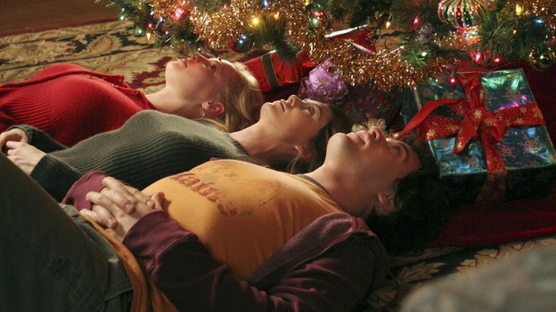
Each episode has a bit of a different theme and focus, but the episode I analyzed was the Christmas Episode. It didn’t have large differences; however, the lighting reflected the Christmas theme. In the hospitals, families had trees and decorations. In Meredith’s home, Izzie decorated the house with as much Christmas related things as she could.

Christmas cheer, right?

Comments are closed.