English 1102: Television and Feminism

Dr. Casey Alane Wilson • Georgia Institute of Technology

Category: Review Topic 3 (Page 3 of 5)

Cinematographic effects used to show Derek’s dark death :( and one of the saddest moments of my life

Grey’s Anatomy, season 11 episode 21… an episode that I think will always stay remembered in our hearts and our minds. This episode, in charge of showing the death of one of the most loved characters, Derek Shepherd, used different cinematographic techniques that made our hearts teared apart little by little.


The episode starts with a bunch of  vanished quick shots that show some of the most important moments of Meredith and Derek Shepherd’s life. In addition to this, there’s a shattering image of police sirens in the background that indicate us, since the beginning, that something is for sure going to be wrong. As the episode goes on, shots go back to normal, some of them tend to be a little longer than others, but they are all shown through different angles (in the case of the car crash we are able to see through both the inside of Sara and Winnie’s car, and through the overall scene of the accident), which makes it interesting and captivating. The first half part of the episode is shot during the day, including bright and natural colors (like blue, green and yellow). However, when Derek (one of the primary characters) gets tremendously injured in a moment that we never expected, the screen goes all black and the cinematography of the episode starts to change immediately after that.

This is one of the quick throw back shots shown at the beginning, middle, and end of the episode  :(

Although it is exactly at the half of the episode that Derek’s accident happened, the transition in cinematographic effects goes back to the same they used at that beginning (a bunch of quick shots that showed some of the most important moments of Meredith and Derek’s life with the shattering image of police sirens in the background), indicating us that since that moment things will just go darker and darker. After this happens, the time of the day changes too, it passes from morning-noon to night, which makes all of the shots darker and sadder. The shots continue to transition from different angles, focusing on the face of Derek when he’s thoughts are being played in the background, and on the general image of the hospital when other important things were going on. Finally,  there are other two important cinematographic moments: when the police goes to Meredith’s house and tells that there’s been an accident (showing again a shattering image of police sirens on top of Meredith’s overwhelmed and shocked face), and when it comes the moment for Derek to pass away (ending the episode again with the remembrance of quick shots that show some of the best and happier moments of Derek Sheperd).


In general, this episode’s cinematographic use is not like all of the others because it is suppose to be a much more dramatic, sad and emotional moment for the show. As sad and resentful fans may feel about this, there’s no denial that lights and special cinematographic effects stand out through the entire episode.

 

Fitting In

One of the biggest themes of this show is about the family fitting in in their new community in Florida after moving from Washington, DC. Every family member has their own issue(s) with their new environment, except Evan of course. Evan fit in just fine and even has a girlfriend when he’s like 10 years old. Eddie, the main character, goes to many lengths to fit in at his school. This is really interesting because it is relatable for so many kids that are a minority. Being the only or one of the only kids in the class of a certain race can definitely be very difficult. From first experience, it’s easy to want to fit in with everyone else, even if it goes against your own values or family traditions. This show does a great job at showing the struggles a minority family without crossing the line with offensive stereotypes. The kids at Eddie’s school think he’s lame because he does not have Jordan shoes, and not going to lie I bought Jordan shoes for the same reason. One lesson of the episode is shown through Eddie’s mother. She’s having trouble finding other women in her neighborhood, Honey, that she gets along with, until one day she meets a neighbor and gets along with her really well. The only problem is that all the other women of the neighborhood hate Honey and this could potentially be bad for the family business. She initially decides to cut the friendship off, but later realizes that she should be true to her real friend, even if she will face adversity in the future for doing so. This scene demonstrates the purpose of staying true to yourself, and the people who care about you. Hopefully Eddie follows the same path as his mom, but that does not seem very likely at the moment.

Image result for fresh off the boat season 1 episode 3

Eddie has high expectations lol

Seeing the real New Girl-Topic 3

Overall, New Girl utilizes a lot of bright and happy colors, this allows the show to maintain its light-hearted and humorous tone. The show is very aware of the fact that New Girl is supposed to be an escape from reality for many people and offer them good light-hearted laughs. The colors, especially ones around Jess, is incredibly fun and energetic. This is because, as a person, Jess is the most bubbly and energetic; she is always in a good mood even in Armageddon.

The lighting in the show is very bright during the happy times. However, there is a noticeable shift in both color and lighting during gloomier moods, the lighting is more dimly lit, and the colors are more browns and grays. Like for example, when Nick was contemplating moving in with Caroline the color scheme is very depressing and consists of a lot of beige and grays. The colors signify how the main characters feel, the colors tend to shift with the atmosphere of the room. In Nick’s case, he was feeling confused, upset, and lost.

In New Girl, the camera usually focuses on only the person talking. This is done so the audience focuses on only the person talking and doesn’t get distracted by the rest of the actors. When there is some major revelation or something bizarre happens, however, almost everyone is in the shot. This is so the audience can see everyone’s reaction.

The set for the show is also very quirky like the characters in the show, and it really does look like four young adults live there, adding to the realism of the show.

I appreciate that there isn’t any laugh-track, it makes the show more realistic. I feel like the soundtrack also complements the visual aspects of the show well. For example, during the sad moments of the show, the sad music creates an atmosphere where you feel what the characters are going through, and the moment is further enhanced by the music. The music also gives cues as to what the audience should feel at the moment.

Example of the bright color themes in New Girl

Eddie’s Creative Yet Purposeful Cinematic Effects

This blog entry discusses the cinematography and direction in the TV show “Fresh off the Boat”. I find episode 13 in season 1 particularly appropriate to discuss this topic as that episode reveals Jessica’s anxiety for their family losing their Chinese identity. Therefore, this episode utilises many cinematic effects to symbolise the respective cultural identities.

However, not all of the effects used in show is designated to symbolise a particular culture, in fact, the cinematic effects contribute significantly to the overall atmosphere of the show. For example, in every episode’s introduction scene, the vibrant, crayon styled layout comes across to the audience as an “easy-watching” show with cheerful connotations. Further elements such as having a bunch of quick cuts instead of lots of long takes mimic a real-life dialogue with lots of back-and-forth comments to help ground the audience with this show’s realistic appearance. However, in occasions, we do see the directors to break the “quick cuts rule” when they are trying to highlight an important point. Particularly, the directors used slow-motion technique to dramatise the motion of Jessica dropping her pot of Macaroni and Cheese onto the floor. Thereby, this helps show Jessica’s trauma of finding out how “Americanised” their family have become.

In hope to remind the children of their Chinese heritage, Jessica decides to refurbish the house with more Chinese elements. It is clear that that the house’s colour tone shifted dramatically towards predominantly red and yellow. Purposefully, these two colours represent the three most important symbols in Chinese culture: wealth, luck and happiness. Therefore, it is interesting how the show utilises different colours to represent various cultures. In contrast, Brock’s presentation on Russian culture often used colours red and black to symbolise communism and conservatism attitude in Russia.

Snapshot of Jessica’s Predominantly Red and Yellow Traditional Chinese Dress, with hints of Chinese Culture in the Background

Fajita Man Brings Home The Bread

Episode 6 from season 1 of Fresh Off The Boat is called  “Fajita Man” and revolves around the theme of hard work. There are multiple different arguments this episode makes about hard work but the most prominent is that first generation children have to work twice as hard for the same reward, a video game. This is consistent with the theme of the the show in general, the challenges of immigrant families in America. When Eddie asks his parents for money for the new game, they do not just give it to him for free like the other children’s parents, and instead they make Eddie start working at the family restaurant in order to instill a good work ethic in him. This reminds me a lot about my children, similar to Eddies’ parents my parents also made me work at the family business. And just like Eddie I too despised having to work and envied the other kids that would get “free hand outs”, but eventually I too realized the true satisfaction of hard work.

Another argument the episode makes about hard work is regarding how it is instilled. Eddies’ farther grows to realize that he does not have to be harsh on Eddie like his father was on him. It is true that that approach did result in Eddie’s father a hard worker, but it wasn’t till he talked to his mother that he realized that approach significantly deteriated his relationship with his father. So in order to perserve his relation with Eddie, Eddie’s farther attempts to use a more amicable approach. The show argues that it is possible for parents to teach their children good skills without burning bridges. Overall, the episode is very consistent with the theme of the show in general, overcoming adversity as a family.

Eddie’s mom is also consistently exemplifying a strong work ethic by juggling her career and job as a mother

“Freedom”

In the world of The Handmaid’s Tale, everything’s changed. We see the oppression, the lack of freedom, the seemingly hopeless world. However, the people running the new society have a different viewpoint. Aunt Lydia claims that beforehand, the girls had “freedom-to” and now they have “freedom-from” unpleasantness.

The theme of freedom is explored thoroughly in The Handmaid’s Tale. Aunt Lydia’s words are true to some extent, but the new Handmaids have neither freedom-to nor freedom-from. Most of the Commanders, Wives, and Aunts have kept a bit of their morals from “before,” but justify their actions by creating lies that seem positive to convince themselves that this is utilitarian.

Serena’s, the wife, character has been developed more in the recent episodes. Similar to Petra in Jane the Virgin, the viewer begins to understand the character’s motivations and reasons for acting the way they do. Before the cultural shift, Serena was a powerful woman- a powerful woman who supported the ambitions of her husband and his fellow officials- and had to watch as her own power was stripped away. Not only did she lose her power, she lost love and her freedom. Although the life of a Wife is not as despairing as that of a Handmaid, they are also prisoners: always forced to watch, but not allowed to participate. I’m not only talking about the Ceremony, but Serena, a woman used to playing a big role in her life, watches as the men and Handmaid decide the path of her own life. She smokes, even though she isn’t allowed to, to gain a sense of control back into her own life especially since she has to rely on another quite rebellious woman to give her fulfillment of her own biological destiny.

In S2 E6, Serena’s past journey is revealed a little bit more and her humanity is revealed with it.

The Handmaid’s with their red capes and white wings, are to be distrusted in the society. The officials convince themselves that they must punish the Handmaids because they are distrustful, but actually, the Handmaid’s are distrustful of the government because all their rights have been stripped away from them. June claims that Gilead is afraid of them escaping, both from Gilead and from life. The society needs them to continue the human race, but also do not respect them. For them, it’s easier to torture a few Handmaids to scare the others than to try to please all of them. Aunt Lydia’s comment that they have freedom-from violence and the unpleasantness of the world is frankly untrue. They outlawed rape, but renamed it to the Ceremony. They outlawed murder, but gave the government permission to do it.

We’ve all heard that saying about how it’s better to die fighting for freedom than to live as a prisoner. But the women in The Handmaid’s Tale live as prisoners, and getting a death sentence is just hard to achieve as freedom.

Nothing to See Here – Cinematography in Fresh off the Boat

After watching many episodes of “Fresh off the Boat,” it’s still hard to decide if there any elements of its cinematography that distinguish it from its counterparts. For the most part, the show follows similar shoot patterns as other ABC comedy shows (except for “Modern Family,” which mostly uses shaky shots to simulate a reality show). Conversations are shot with quick cuts between the talking characters, and with most of the show being conversations, we rarely see any continuous shots. For a show that is so unique, it’s a shame that its editing is essentially a carbon copy of its channel-mates.

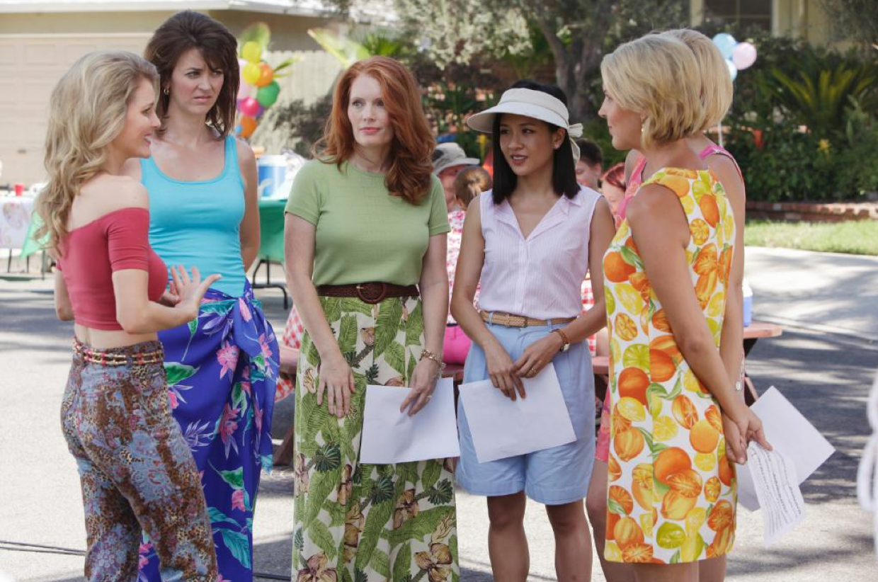
The use of color, however, is a bit more interesting. Most of the show is filmed in well-diffused daylight. The walls are always a pastel color, and this combination of color and light create a constant “warm” feel to the scenes. This mundane warmth could be representative of their new, cookie-cutter life in the American suburbs. It could also represent their new comfortable lifestyle thanks to the restaurant’s success. Another interesting color scheme difference in the show is not quite related to cinematography but is still interesting enough to be noted: clothing. Throughout the show, the white women in the neighborhood are always shown wearing brightly colored clothing with very unique patterns, a trademark of the early 1990s. In contrast, we see that Jessica almost always wears plain, light-colored clothes. This is likely a note of the cultural difference between the two parties; a direct symbol of the Huang family’s conservative values. It also shows that in spite of how well the Huangs have immersed themselves in their surroundings, they still remain different and not entirely a part of the community yet. This is especially apparent in S2E2 (my current episode), during which the neighborhood women (Honey included) make several more appearances alongside the Huangs than a typical episode.

Note how Jessica stands out from her neighbors. A clear example of color scheme differences used in the show.

I am far from a cinematography expert, so it’s safe to say that I am missing something, but as far I can see, “Fresh off the Boat” does not attempt to be unique in terms of cinematography. I believe the show-makers are aware that a majority of their audiences take cinematography for granted (myself included), so they focus more on the uniqueness of the plot. While it’s a little disappointing that the show does not innovate in this aspect, it doesn’t take away from it as a whole. “Fresh off the Boat” makes it place with unique writing and casting, not with camerawork.

Shoot to kill (demons)

Wynonna Earp is by no means a cinematically impressive show – never have I ever watched it and actively thought that the shots were stunning or greatly transitioned. However, through looking carefully, it should be noted that it is presented much better than people give it credit for, allowing the viewer to watch the show with some level of satisfaction.

The show is shot mainly in short to medium length takes, alternating between close ups of character dialogues, sometimes with all characters involved in one shot and other times switching singular face shots between the characters in the conversation, and long distance shots, which can involved a shot of the characters with their dialogue as a voiceover (those typically are very short) or nature focused shots of the Calgary wilderness. And of course, as an action/supernatural/western show, Wynonna Earp includes its fair share of impressive strut shots, with demons blowing up or nature themed scenery in the background. By including a variation of shots, Wynonna Earp is able to really present their genre as a supernatural western, with the fancy fighting and disgusting demons, as well as give the viewers in depth perspectives on the relationships between the characters outside of the action.

No one thinks of happy, bright colors when they think of demon hunting, and the cinematographers of Wynonna Earp agree. Most of the lighting throughout the show comes in dark, blue – yellow – gray hues as opposed white or pink. The writers are great at manipulating or associating colors with individual characters. For example, Waverly Earp, the bubbly sweet younger sister of Wynonna, tends to be in vivid colors while Doc, the gun slinging immortal, tends to be in dark, underworld themed apparel. This use of color greatly adds to the ambiance of the show and often times sets the occasion for the viewers.

Action shot after killing a demon

The episode I am referencing for this blog post, Season 2 Episode 1: Steel Bars and Stone Walls, is not statistically different in cinematography or direction than any other episode. No one is at fault for this, but rather, Wynonna Earp does its best to conform to its genre, and I commend it for that.

The Cinematography of “Fresh Off the Boat”

Unfortunately I don’t have much expertise on cinematography and direction of television production, so I hope to critique to the best of my ability. “Fresh Off the Boat” does well in avoiding the harsh lighting of the sun. It is great at diffusing the sunlight to ensure that everyone is softly lit at all times, so that us, viewers, can always have a good view of the characters’ features and attire. However, the constant soft lighting does make it seem unrealistic as it makes the entire production seem to either constantly be morning or evening. “Fresh Off the Boat” has a lot of moving shots keeping the select character in view making it easy for audiences to follow along with the show. However, the show does seem to have a slightly shaky camera sometimes; that I’m unsure if it’s intentional or not. It does seem to make it perhaps slightly more realistic, if intentional; however, if unintentional, it would make the production seem slightly less professional. Conversions are framed with the speaking character in focus to allow audiences to keep their eye on the target character as well as switching to the listening character for reactions allowing the audience to feel as if they understand each character at every moment. When there are two characters in the same shot that both have lines, the camera focuses in on the character that is currently talking; this allows the viewer to unconsciously change focus to the current subject. The show ensures that audience don’t get caught up with backgrounds by using mostly beige, soft browns, and low intensity yellows. I do admire the close-up of character faces, especially during reaction shots, as it allows the audience to see and understand the emotion of the characters. Each shot is fairly short often changing frames every few seconds; this is likely due to the short attention spans of current audiences that expect to be entertained at every second. These quick back and forth changes are a bit much for me, but it’s what many audiences expect of new shows and films. Something specific that’s done nice are Jessica’s flashbacks which are dulled out to represent the contradiction between her words and her memories. In the first episode, Jessica has a flashback to her time at the Taiwanese markets back in DC; her describes the memory lovingly, but when we’re shown the memory, it’s appears to be rather overwhelming with Jessica screaming and pushing.

In this shot, the camera is focus on Jessica with Eddie’s face slightly in focus so that we can see his reactions. The lighting outside seems to say it’s at least late morning, yet inside the car lighting is still soft.


Typical TV show, but only in terms of cinematography and direction

Fresh off the Boat is not any typical TV show: well except when describing cinematography and direction of the show. Cinematography and direction can have a very important impact on the delivery of a show or movie; it can play a role of how suspenseful the situation is, give a feeling of the environment, and many other impactful roles. Just like any other show, Fresh off the Boat uses the typical shots, for example, shot reverse shot, pan, and zoom, and common environments. It has a mixture of long shots and quick cuts to really show what is going on in the scene.

These details often go unnoticed by the viewer, and to some extent that is the goal of the person filming: to fully immerse one into the experience of watching the show. This goal is surely met. The cinematography matches the environment and setting to where emotions can be displayed from what we see. To display conflict occurring between multiple people, the scene displays a shot reverse shot to emphasize the emotion felt by each person, instead of a single shot where the emotions of two people could be generalized. For the most part, the show has a bright setting, and that is what you would expect from a reality tv show with a family with young kids. So far at least, there have not been any emotionally dark time times and I would imagine that being the case as the show is made for families.

This episode (season 1 episode 2) did not really have any aspects that visually stood out compared to other episodes, but that is probably because I am still very early on in the series. As a side note, I really like this show so far and it has made me laugh multiple times, especially at the parts that are relatable! It’s a good break from the other shows I am watching that are more serious.

CLC reminds me of Kumon lol

The Visuals of Elaine’s Big Day

For the second Blog Entry, I am focusing on the Cinematography and direction of the “Elaine’s Big Day”, the last episode of season 2 of New Girl.

In this episode, there are a lot of major plot twists. For example, Jess’s best friend, Elaine cancels her wedding, and Jess and Nick decide to call their relationship off. These big changes are well represented by the cinematography and direction.

This episode is shot in lots of quick cuts. These quick cuts allow the show to jump from one scene to another in a short time. It matters because these sudden switches of scenes allow two plots to proceed at the same time. This means that the quick cuts add to the dramatic effect of the two huge events, sabotaging the wedding and the conflict between Jess and Nick, that are occurring in this episode.

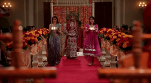
The color scheme of this episode is red and gold. Since it tries to portray a traditional Indian wedding, it has bright colors involved. Especially the red color indicates passionate love or anger. It correlates with the fact that Elaine admits that her true love is Schmidt and the feeling that Jess or Nick felt when they decided to break up.

Elaine walks down the aisle. The main color is red.

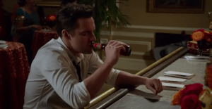
I believe this episode stands out because it had many different bright colors such as red and gold. It defines the importance of the finale of this season and indicates the major changes in their relationships. Also, the lighting of this episode stood out from other episodes of this season. When the wedding was in process, the lighting was very bright. However, after the wedding, the lighting became dull in the scene where Jess and Nick ended their relationship. This dull lighting was also observed when Nick goes to the bartender for a beer. This lighting helps the viewer to interpret the feelings of characters.

Nick is depressed after the break up. Dull lighting is noticed.

The Ugly Christmas Sweater

Cinematography in The Middle has unique elements.  The show emphasizes more quick cuts as opposed to long takes.  Perhaps this is done to depict the rushed and frantic mom life Frankie endures daily.  For instance, one shot may capture a brief conversation between Frankie and her boss, followed by a rapid transition to her supporting Sue at a swim try out.  This exemplifies how quickly the Heck family is to support each other.

Lighting in The Middle is abundant, and it is often bright and sunny outside.  Nothing says Flyover country quite like a blue sky over a cornfield.  There are many colors in the indoor shots, but the colors together are not appealing.  The walls in the house are green and the clothes worn are interesting colors, and somehow The Middle can recreate the home you lived in as a child.  The palette of colors used reminds me of those ugly Christmas sweaters that have a lot of colors and look like a mess.  For some reason you love the sweater, but it’s just so hideous.  My interpretation of this is that it resembles the many great qualities in families yet the imperfections within them.  Many facets of life have flaws, but sometimes flaws make things even more lovable; the family portrayed by The Middle is no exception.

Look at the monstrosity of colors used in this living room…I still somehow feel as if I’ve spent every family gathering in this exact room.

In my opinion, The Middle stands out because of its visual authenticity.  The imagery is not deceptive; they don’t attempt to paint a perfect picture like in sunny California or bustling New York.  Rather, they illustrate a humble Indiana town.  As a viewer, it’s refreshing to be reminded that not everyone lives a superlative life surrounded by beauty and modern luxuries.  The Middle derives its success by allowing most of the country to sympathize with its plot.  Each time I watch the show I’m reminded of the many great family moments I’ve experienced inside similar ugly walls.  The use of convincing cinematography establishes a more accurate representation of families and attaches the audience to the narrative.

The many views from Portland: diversity in cinematography and what it conveys about Portlandia

Good ol’ fashioned patriotism at Portlandia’s “Allergy Pride” parade

Being a show made up of numerous bits that say something different about life in Portland, Portlandia must be analyzed for its individual stories rather than as an episode in its entirety. This remains true for cinematography, as different stories throughout the episode require a different means of expression since they are trying to convey different things. As such, I will analyze the cinematography in Season 2, Episode 2, but I’m going to focus specifically on two bits within the episode: one at Portland’s fictional “Allergy Pride” parade, and one where Brownstein and Armisen’s characters become addicted to Battlestar Galactica.

The opening scene of the episode occurs at an “Allergy Pride” parade in Portland, where Brownstein and Armisen are announcers for the event. As is shown in the image above, the scene is shot to look like a patriotic setting with red, white and blue in the background. The camera also slightly points up at the two announcers, indicating their authority in the scene. There are relatively short takes, going between the commentary by the announcers and visuals of what is going on. The quick shots point to the chaos and absurdity of the event, as many people walk by with posters like “tolerate the lactose intolerant.” This scene is very well lit, as the goal is to make it look like an official event rather than something in an informal setting.

Conversely, a scene later in this episode shows Brownstein and Armisen’s characters procrastinating many duties as they waste away a week of their lives by watching every episode of Battlestar Galactica. The cinematography of this scene is noticeably different, namely because it is trying to convey a different theme to the viewer at home. Whereas the first scene needed to be seen as more formal, with more complex and well-lit shots, this scene’s humor is derived from the messiness of the characters’ situations. The lighting is darker, showing a lack of hope for their situation, and everything around the room is a mess. There is a rapid pace cutting between scenes, with occasional time stamps showing just how long they had been watching the show for comedic effect. The colors in this scene gradually get darker and less diverse as the scene goes on and they spend more time watching the show. Using different strategies, Brownstein and Armisen are able to convey different moods to the viewer in these two scenes.

However, I wouldn’t say that this episode’s strategy when it comes to cinematography is drastically different than any other episode simply because each episode has such a diverse array of strategies. This is truly a very visually interesting show to watch, and I enjoyed how the cinematography (and diversity of it within a given episode) reflected the diverse nature of the show.

The Thinking Behind the Shots of Grey’s Anatomy

Grey’s Anatomy has a lot of cinematographic elements that I think are important to be mentioned. Why? Well Grey’s Anatomy makes use of so many different elements with each having a purpose and relevance to the show that when pointed out, make it much more fun to watch the show. Let’s start with the shots.

Each shot in the TV show is carefully planned. Some shots show a wide view of the scene while some shots zoom in to the action. During very intense parts of episodes, the shots are very short to simulate action and a constant shift of focus. Contrary, if the characters are having long discussions, shots are long and steady to give the audience the feeling of being part of the conversation. The length of each shot invokes a certain feeling in the audience along with background music, dialogue, and the position of the shot.

The lighting is also a key element that’s hard not to notice. The entire show seems to be a bit saturated, especially in shots where there is more blood present or more sadness. Most bright shots in the episodes come at the end where Meredith narrates some lesson that she’s learned as an intern. This is to signify a happy ending or “a rainbow within the rain”. These endings normally also show the sun in some way or another to bring a bit of happiness and sunshine into the episode and the show. The dialogue of the characters fades out, grey’s analogue starts, the music fades in, and the episode ends.

The episode of this blog post’s concern is the 2nd episode in season 1. Most lighting effects/shot styles that are present in this episode also play a role in the majority of the other episodes of the season. These tricks are used by the show’s production team to allow for a stronger connection between the audience, the characters, and the show.

Saturated colors in season 1 episode 2 of Grey’s Anatomy

The Quick Cuts and Cinematography Choices in Grey’s Anatomy

The cinematography and filming style across the first season of Grey’s anatomy is uniform. In the third episode, particularly, the same themes are evident. Since there are so many plot lines occurring throughout Greys, there are many, many quick scene cuts. Everything is shot in the hospital and makes use of a very blue and gray kind of color scheme. Additionally, foreground shots create a more relationship-oriented feel.

This episode takes place during a dangerous bike race that sends many people into the hospital. The interns take the chance to argue with one another over who will be able to deal with the nastiest injuries. Because of this particular plot line, shots are quick and cut in and out of each other. Therefore, the opening sequence being a long shot of Meredith in her house (not the hospital) makes it all the more impactful. This contributes to the differentiation between Meredith’s life as a surgical intern and her personal life, particularly her relationship with Derek.

After the first scene in Meredith’s house, Grey’s transitions to the typical quick sequences in the hospital. As the interns hurry to deal with the excess of patients, the cinematography style tends to also hurry through the different shots. A consistent thread throughout these quick scenes is the color scheme.

All the interns wear blue scrubs. The intendings and surgeons also wear different shades of blue. The hospital walls are a dusky blue shade of white/gray. The stark whites definitely fit into the realm of a hospital. Blue is also thought to be a calming color. It helps to create a consistency of cool colors and continuity throughout the changing scenes.

All the characters wear shades of blue.

Also, the director makes use of foreground shots all throughout this episode, along with the others. Such as, when Izzie and Cristina are discussing how to deal with a brain-dead patient, as Izzie talks to Cristina, the side of Izzie’s face is close to the camera and blurred out. This creates an atmosphere of connections and relationships in such a stark environment. The cinematography techniques in this episode are consistent throughout, except for the opening with long shots in Meredith’s home.

Page 3 of 5

Powered by WordPress & Theme by Anders Norén