English 1102: Television and Feminism

Dr. Casey Alane Wilson • Georgia Institute of Technology

Tag: camera

Cinematic Crash

image

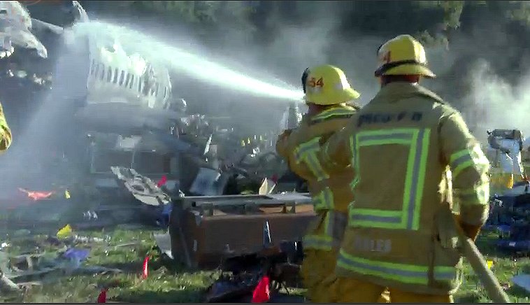
Image of the plane crash from Scandal S1E

Good evening, people. I am signing on just one more time. In my last blog post, I plan to revisit cinematic elements in the Scandal show, but in episode 5, “Crash and Burn”. The cinematographers capitalize on portions of the show where characters face tragedy and crises. Specifically, the cinematographic tactics used when Olivia and her team see the plane crash site and when they listen to the black box recording of the crash.

This episode begins with the disappearance of Pope and Associates’ client, Amanda Tanner. The team goes into a frenzy and cameras switch quickly between their faces as they scramble around. The show then suddenly cuts to Quinn and Harrison stumbling down a hillside to discover the horror of a deadly plane crash. The cameras flash horrific images of burned plane pieces, smoking fabrics, scattered clothes, and even dismembered body parts. Then, it pans back to the shocked faces of Quinn and Harrison. Dramatic music plays in the background and there is a grim filter on the lens as it blinks between these somber pictures. I believe Rhimes and her directors wanted Scandal viewers to feel the gravity of the situation just as Quinn and Harrison were experiencing. Olivia and her client, the husband of the plane’s pilot, visit the site later, and the somber mood is amplified by the client’s explanation that the red flags symbolized parts of passengers bodies. The cameras then proceed to pan around the crash site to demonstrate the hundreds of red flags scattered throughout the smothering plane pieces and all along the ground.

However, I think the most cinematographically intense scene occurs when Olivia and her team must listen to the black box recording of the crash. The pilots start out just conversing between each other in a friendly manner and the camera remains zoomed out at a long distance from the team while they listen. But, as the action picks up and the crewmembers become increasingly stressed, the camera starts focusing in closely on the facial expressions of Olivia’s team. Eventually, the camera starts cutting faster and faster between their horrified faces as the recording on the box intensifies. Finally, after all this action has built up, the camera stops on Olivia’s face, which fills the entire frame, at the exact moment that the plane crashes and the audio cuts out. Thus, viewers are left with her intense look filling the screen and it is completely silent. This very dramatic sequence of cinematographic elements increases the heart rate and suspense of viewers as they watch and listen carefully to this scene, just as the team’s heart rate and suspense rose when they listened to the black box recording.

Therefore, I believe in this episode of Scandal,  the cinematographers desire to use their filmographic art to connect the viewers to the emotions and experiences of Olivia and her team.

Quick Cuts, Chaos, and Colors

The Mindy Project remains steadfast in its exploration of the idea that life is messy, complicated, and not always fun. This is reflected in the rom-com genre itself, the music, the dialogue, and the cinematography. In general, the show is bright, chaotic, and complicated – the way in which the show is shot reflects this.

A notable example of this is in the season 2 episode “Music Festival”. The show relies on dramatic events as crucial plot points, and this episode is no different. The first scene involves a pastor declaring that he’s becoming a DJ. This declaration is coupled with a vast array of camera shots and angles. There’s the wide, sweeping shot of the church, the camera moving to follow the pastor down the aisle, close ups on Mindy and the pastor, shots of the audience, and ever-changing angles. These shots are pieced together quickly, rarely lasting more than a couple seconds. This scene was focused on dialogue, not actions, so most of the shots focus on the people talking and shift rapidly to match the quick nature of the conversations.

However, even in scenes not dialogue driven the nature of the cinematography remains the same. The name of the game is creating chaos in the background and placing the central action or characters in the front. At the musical festival, the backdrop is insane: people everywhere, bright colors, balloons, hoops, and things flying everywhere. Even still, the main characters remain in the center of all the shots, which allows the focus of the audience to stay on them. This usage of quick cuts relates strongly to the theme of the show – life’s chaos.

Mindy experiencing the chaos at her first music festival.

Similarly, the color scheme of the show is bright. Mindy herself is never seen in outfits of less than three contrasting colors, and all the background walls range from white to pale pastels. There is no absence of color, and the brightness allows everything to be seen plainly and clearly. This demonstrates the honestly the show is bringing, it doesn’t shy away or attempt to hide from the realities of life. It also relates to the fact that the show is a comedy, the brightness keeps the comedic nature of the show, even when the conversations or topics are difficult.

However, when the show opts to use muted colors and long shots, it’s a stark change of pace. This occurs when Mindy breaks up with her boyfriend. The only two camera angles are focused on the two characters, the shots are longer, the backgrounds are bare, and the colors are subdued. This creates two clear distinctions in the show: the time for fun and the time for serious matters. The show attempts to walk a fine line of being a funny rom-com, and still accurately reflecting the parts of life that are not enjoyable. The differences in cinematography allows the audience to understand when these tonal shifts will occur.

Camera Flips & Other Cinematographic Tips

I am not the best at focusing on details and minor messages in media, instead I focus on the plot and characteristics of the main characters. For me this class has been eye opening because we analyze all aspects of television, movies, etc in class. When I was analyzing an episode of Fresh off the Boat, I had to be super intentional and focus on the aspects of the show and visual design.


The first thing I noticed were the bright colors in the show, most likely because the producers are trying to emphasize that the entire show is in the past because it is based on a memoir. The best example is inside Eddie’s school hallway where the lockers are bright orange and the walls are bold yellow. The same theme is in the Huang house, where the wallpaper is yellow and green print, which is outdated for 2018, but in style for 1995.


The next thing I noticed was how the camera was only on the person who was talking. This means that while the scenes are long, the camera is constantly flipping between speaking characters. This did not annoy me…until…I over analyzed it through this prompt…whoops. The long camera shots promote growth of relationships because that is really what this show is about. The plot is just the same thing in different situations for comedic effect, while it focuses on the coming of age aspect of Eddie. But, back to the camera flipping a lot. This technique is super straightforward and focuses on the speaker more than the background or scenery. The quick flipping also enhances the back and forth bickering that is destined to happen in a family with three sons, a naive father, and a control-freak of a mother. But, it can also hurt your head a lot because the camera never stops moving in a similar way that Hallmark cameras are CONSTANTLY moving. And sometimes it is like woahh just zoom out a little bit!

In this ONE 40 second scene, the camera flipped drastically 17 TIMES to follow the speaker

I continued to go into the next episode and noticed all the same visual/cinematographic elements, so it is something that ties all the episodes together. While I have watched 6 episodes, this is the first time I was intentional and noticed the cinematographic components even though it is a constant throughout the series.

Capturing Comfort

Every episode of Murphy Brown follows a similar setup in its composition. Most notable is the intro. Each episode begins with a focus on an individual character and is sound tracked by a famous soul song. This is the title sequence which plays the actors names. Many episodes have a meta component with the song choice as the characters sing along and the lyrics give the viewer a glimpse into what the show will be about. This important sequence shows the camera following the character around the room and highlighting the do mundane actions they take. The actions manage to display the characters emotions without any need for dialogue. In this particular episode (season 1 episode 21, “The Bickners”) Frank sits on elevator as doors open and close without exiting, when he finally moves he gets a muffin and throws away the edible part, only keeping the wrapper. In the background “This is A Man’s World”. As the camera often does when a viewer is supposed to perceive the actor’s emotions, the camera goes up close to face.  These scenes always end with a fade out of music and dialogue begun by another character entering.

Murphy Brown is a sitcom, and thus it follows the trend of having a laugh track. This is to aid in the humor. Whenever a joke is made at the expense of someone it zooms into their reaction. The show features many long shots, yet occasionally adds short ones to keep an interesting flow and follow conversations. In between major scenes, the show fades out to a video of the office building and then zooms into top floor, this is possibly to suggest the importance of their work and give the audience a concept of location.

The show has three settings, Murphy’s house, the bar (even though Murphy is a recovering alcoholic), and the office. It only strays from these when following a specific story. This creates a comforting feel. As with the similar settings, all episodes have generally subdued tones, with earthy browns, grays, and pastels. The way episodes parallel each other make Murphy Brown an enjoyable and easy show to watch. One that takes on issues yet manages to not be too aggressive about it and keep viewers comfortable.

Related image

1/3 settings: Phil’s Bar and Grill

Powered by WordPress & Theme by Anders Norén