English 1102: Television and Feminism

Dr. Casey Alane Wilson • Georgia Institute of Technology

Tag: direction

Cinemat(Broad)ography and Dir(City)ection

Broad City is a really well shot show. Paying attention to the cinematography has especially enlightened me to the variance of shots and mise en scene particular to the show. The camera can be shaky in one scene and pan in the next. I most recently watched season 4 episode 1 of the series, and the show’s visual direction is often non-distracting but sometimes an aide to its humor. In the episode Ilana and Abbi are meeting each other for the first time, and the show explores their lives without each other and how much better they are in that same immediate day in an alternate scenario where they spend the day together. Over the top dvd movie menu esque transitions convey which reality is being displayed as it switches between each repeatedly until they eventually run into each other, no longer needing the transition to differentiate between realities. It definitely helped me keep track of what was going on as the characters wear the same clothes the entire time and the plot is only held together through these transitions.

In other episodes of Broad City, different areas of New York will have different lighting to give one a more gross, uncomfortable feeling when a man bothers them on the street compared to better lighting when they later stumble into a wealthy neighborhood. The use of lighting to convey meaning and emotion is an interesting tool. Broad City generally seems to use it as a tool to physically display the character’s anxiety. In one episode the power goes off in Abbi’s building, and her not being able to flush the toilet is heightened through the dark surroundings and shadows in the following scenes. A mundane inconvenience is better allowed to be thought of as more by the viewer because of how the show visually treats and accompanies the situation.

See the source image

Here is an interesting use of lighting from behind Abbi to highlight the revelation that she becomes a singer in an old bar when she blacks out.


 

Obadear, Let’s Shoot This Show

The first 30 seconds of season 2 of Search Party are an absolute masterpiece. Visually, we have a blank (ish) canvas; our protagonist’s face is looking directly at the camera (it’s soon revealed she’s actually looking into a mirror) with nothing else in the shot, save for a splotch of blood on her forehead. She’s facing what’s just happened (haha, get it?). The room feels so sterile.Without audio, this scene is particularly puzzling, especially for a first-time viewer. When you layer in the audio however, you can make the connection that our protagonist Dory has just gone through a very traumatic event. Snippets of recent happenings flash on the screen for a couple of seconds but disappear too quickly to get a sure sense of what is going on.

This inaugural scene sets the tone for the whole season: anxiety and mystery and trauma (oh my!). The camera work is shaky, implying a sense of urgency. The colors are muted (ironically, the only non neutral in the scene is the blood red sweater Elliot is wearing). The camera moves even with the actors, following Dory and Elliot upwards as he pulls her off the ground by her shoulders. There’s a strange intimacy hidden here, revealed deeply through all of these choices. That feeling, however, is immediately lost when Elliot comments about Chantal’s invitation to dinner. Our characters are still in the real world, even though this opening sequence is so dream-like. When I say dream-like, though, I really mean nightmarish. The scene is almost shot like a reality TV show. The camera focuses on the character’s face for much too long, almost uncomfortably close. A viewer could count all of Alia Shawkat’s freckles.

There’s another really beautiful scene in the episode where Drew is playing a melancholy keyboard tune. The room he’s in is blood orange, carpet included. The scene is lit very scarcely, but at the same time there is enough light for our characters to be bathed in a red hue. This scene is quite brilliantly shot, really, since it’s where Elliot, Drew, and Dory decide they are not going to report Keith’s murder to the police. It’s almost as if the redness is making their secret more evil.

One stylistic choice that stood out to me in this episode was the scene where they buried Keith. Remember that Search Party is, overall, a pretty dark show (pun intended). The lack of proper lighting actually bothered me as I’d have to constantly increase my laptop brightness to accommodate while watching. Thus, it’s interesting that in the darkest plot moment of the show, they choose to convey the characters outside. So picture this: four millennials, one freshly down from a coke high, burying a dead man (in a hot pink zebra stripe suitcase) in broad daylight.

Just pretend the suitcase is there too

Search Party is a very serious show, I promise.

They’re in jail for a reason right??

Sometimes, when watching this show, I forget that these girls are actually criminal masterminds so them manipulating the law confuses me at times; but then I remember these girls are in jail for a reason right? Chocolate Chip Nokie is episode ten in season six and in the first couple of minutes of the episode the directors do a great job at showing how easy it is for our beloved criminal masterminds to get away with running a “multi-million dollar” business.

https://drive.google.com/open?id=1uS5UNEMQkzqx5UaK0pbHofVPp_NB9o0O

The episode starts with our “don” Daya using heroin which flows into the showcase of  how she got it in Litchfield Maximum Security (emphasis on maximum). She convinces her mom to work with her by getting into the prison heroin business after her lover-Daddy-messes up how they bring in the contraband. After disguising the heroin packs at the bottom of an extremely unsuspicious container of Chocolate Chip Nokie protein shake, a guard brings it in unknowingly and as the containers are tossed in the trash the contents are obtained. GENIUS right?

In this very short 2 minute clip, the directors seem to capture every time the heroin is seen on screen very closely. From the time Daya uses it first to when her mom is placing it in the canister, heroin is the main focus. These camera angles emphasize the reason some of these girls are in jail. There is such a strong sense of trouble in these few seconds and it just reminds the audience that this is the reason we are watching the show. However it is amazing how these girls maximum their skills and run a full out business better than some of the businesses in their real world (cough cough Red).

The lighting stays consistently bright throughout these two minutes however it gets noticeably darker when the drugs are being transported. I think the directors added this hint of darkness because again the audience needs to remember that although doing it extremely well, a crime is being committed.

In these few minutes of an episode, angles, lighting, and an emphasis on strategy can make the audience in awe of the characters which also establishes a “reader-character connection”.

Nothing to See Here – Cinematography in Fresh off the Boat

After watching many episodes of “Fresh off the Boat,” it’s still hard to decide if there any elements of its cinematography that distinguish it from its counterparts. For the most part, the show follows similar shoot patterns as other ABC comedy shows (except for “Modern Family,” which mostly uses shaky shots to simulate a reality show). Conversations are shot with quick cuts between the talking characters, and with most of the show being conversations, we rarely see any continuous shots. For a show that is so unique, it’s a shame that its editing is essentially a carbon copy of its channel-mates.

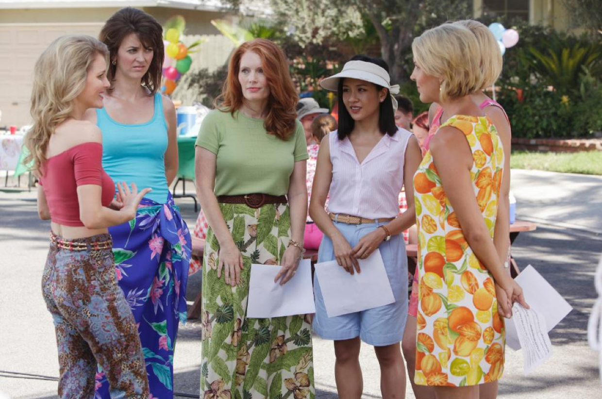
The use of color, however, is a bit more interesting. Most of the show is filmed in well-diffused daylight. The walls are always a pastel color, and this combination of color and light create a constant “warm” feel to the scenes. This mundane warmth could be representative of their new, cookie-cutter life in the American suburbs. It could also represent their new comfortable lifestyle thanks to the restaurant’s success. Another interesting color scheme difference in the show is not quite related to cinematography but is still interesting enough to be noted: clothing. Throughout the show, the white women in the neighborhood are always shown wearing brightly colored clothing with very unique patterns, a trademark of the early 1990s. In contrast, we see that Jessica almost always wears plain, light-colored clothes. This is likely a note of the cultural difference between the two parties; a direct symbol of the Huang family’s conservative values. It also shows that in spite of how well the Huangs have immersed themselves in their surroundings, they still remain different and not entirely a part of the community yet. This is especially apparent in S2E2 (my current episode), during which the neighborhood women (Honey included) make several more appearances alongside the Huangs than a typical episode.

Note how Jessica stands out from her neighbors. A clear example of color scheme differences used in the show.

I am far from a cinematography expert, so it’s safe to say that I am missing something, but as far I can see, “Fresh off the Boat” does not attempt to be unique in terms of cinematography. I believe the show-makers are aware that a majority of their audiences take cinematography for granted (myself included), so they focus more on the uniqueness of the plot. While it’s a little disappointing that the show does not innovate in this aspect, it doesn’t take away from it as a whole. “Fresh off the Boat” makes it place with unique writing and casting, not with camerawork.

The Visuals Behind Unbreakable Kimmy Schmidt

I decided to analyze the second episode of Unbreakable Kimmy Schmidt to study the show’s cinematography and direction. The show utilizes a diverse array of takes to enhance the scenes’ ability to convey different moods to the audience. For example, if the scene depicts a bonding moment between Kimmy and Titus or a motivational talk given by Kimmy to Titus, there tend to be fewer cuts and smoother transitions between takes. However, when conflict arises in the scene, the transitions are jarring and the takes are much shorter. This can be noticed in the scene where Kimmy reattempts grounding Xanthippe. The camera quickly cuts back and forth between Xan and Kimmy as Xan tries to verbally attack Kimmy and Kimmy fights back by threatening to expose Xan as a fraud to her friends. Unbreakable Kimmy Schmidt uses the combination of long takes and short cuts to sharpen the contrast between different moods.

Another interesting aspect of the show’s visuals is the lighting  The lighting is always bright in the show, regardless of the setting. Even in Kimmy’s underground loft which she shares with Titus, it is always well lit. I feel that this is in large part to convey Kimmy’s positivity towards any situation. Her personality is always cheerful even when her situation does not reflect this. This can also be noticed in the brightness of her clothes and lipstick. In Kimmy’s confrontation with Xan, Xan tears Kimmay apart for her light up Skechers. This colorful color scheme is also seen when Kimmy throws the birthday party Mrs. Voorhees calls for. Mrs. Voorhees complains that the party color scheme will not match her dress, but the color scheme is predictable as the entire show follows this color scheme. Lighting and color scheme play a major role in the show’s portrayal of Kimmy’s character and that is especially evident in this episode. The party Mrs. Voorhees requested was Kimmy’s outlet to express her personality to the family. It is no secret that Kimmy is not self-conscious, rather she embraces her vibrancy.

Kimmy Schmidt’s colorful clothing choice, a common outfit of hers

New Girl: Simple Cinematography Unlike the Normal Sitcom

While watching New Girl, the show takes on the generic format of a T.V. sitcom with quick shots where the camera will shift to the character speaking. Throughout the episode, specifically during the most recent episode, “Kryptonite”, the shots would consist of the characters talking to one another, and the camera would quickly shift to the face of another to highlight their reaction to the others. The reactions of characters to each other is the main basis of comedy for this show. The quick shots are important to the show because they keep the audience engaged. In fast-moving shows like New Girl, quick and dynamic shots are important because if the camera work is not crisp, the audience is likely to get bored.

In terms of lighting, the show is very well lit. The episodes are generally colorful as Jess has a very colorful personality and it’s enhanced by the background of the shots. Specifically, in this episode, about half of the episode is shot outside which is different from the previous episode, where most of the episode took place within the apartment where all the main characters live. The color scheme of this episode was still colorful but even when the characters were outside, the colors were still a bit subdued. I believe that the colors were subdued at times to fit the theme of the episode. The episode was about Jess getting over a breakup and finding herself again and it could represent Jess losing the happy part of herself for a guy for a period of time.

The directors of cinematography and visuals of New Girl do a great job of keeping the audience engaged without being overwhelming.  This means that the cinematography is very simple

This shows how the camera shifts from one character to another

Usually, sitcoms have fake audience laughter in the background and more sound effects to enhance the show. This allows New Girl to be more simple and for the comedy to be more natural through the show. Watching New Girl has been great because it’s a simple, funny and unique T.V. show that always finds new ways to make me laugh!

Powered by WordPress & Theme by Anders Norén