English 1102: Television and Feminism

Dr. Casey Alane Wilson • Georgia Institute of Technology

Tag: CINEMATOGRAPHY AND DIRECTION

Fresh Outta Film School

Fresh Off the Boat has a fresh visual design. The colors are bright, the cuts are quick, and the color scheme is warm. This show is so wholesome that it even reflects in the visual design. The colors are warm schemed, reflecting the warmth of the show and the inviting characters as the series wants to display their family dynamic. This has the effect of carrying over the program’s lightheartedness. There are no gloomy days, dark scenes, or special effects in the show. It is very clean cut and looks bright and cheery even when nighttime scenes are shown.

Image result for fresh off the opening gif

fight like sisters, love like sisters

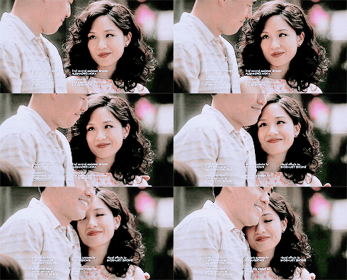
The show has mostly longer scenes, with a plotline falling over an average to long timeframe, but shots are quick and clean. Conversations between characters are shot with quick cuts between each perspective, ping-ponging between lines of dialogue. Every once in a while scenes are shot differently, like the opening of Episode 7, when the Huang’s are in a mock robbery scene. The opening of the showtimes special edits with riffs and music. The narration is paired with shots, especially when narrating the thoughts of multiple characters at a time, which the show does often. These long takes help the development of the show by allowing for longer jokes and humor with better punchlines and more drama between the characters. Scene 7 also shows a fantasy of Eddie Huang wanting to hit on his crush, who he is intimidated by, by showing her his music taste. In this scene, he gets up to walk back to her and enters a fantasy edit with backup dancers and an autotuned bus driver. More intimate scenes, like one on one conversations between the mom and dad, are shot closer up, leading you into the conversation as if you were there. If it weren’t shot this close, it would feel as though you are observing something private, and may lose engagement with viewers.
Related image

the way they look at each other <3

I find the intro of the show interesting cinematographically because it uses unique panning styles and zooms not used in the actual showtime. In the title sequence as well as most of Eddie’s scenes, the music is paired with the style of the shot. Zooms have riffs, sexy scenes have jazz, happy scenes have elevator music and Eddie’s got his 2pac. Is this show Straight Outta Compton or Straight Outta Suburbia?
It’s a text-mergency!!

Crazy Ex-Girlfriend uses several strategies in the cinematography and direction of the show in order to convey the emotions of the characters in the show. In season 1 episode 11 Rebecca Bunch accidentally sends a text to Josh Chan expressing her love for him, and has to figure out a way to delete the text before he sees it. Bunch goes through a rollercoaster of emotions during this episode due to the gravity of the situation and her severe anxiety. She has to find ways to deal with the problems happening in the episode along with this recurring anxiety.

Most of the show is shot with medium shots. You can see the character from the waist up and the background. It is very effective within the show because it shows the characters’ facial expressions and emotions up close, but also what’s going on in the background. There are some close-up shots which truly convey the characters’ emotions and the anxiety experienced by Bunch specifically. There are some long takes, such as the scene where Bunch is in a meeting at work and accidentally sends the text to Chan, but most are quick cuts. It matters because emotions are a significant theme in the show and using certain shots when filming is an effective way to convey them.

The lighting in the show is usually bright. When Bunch is at work, the colors are mute and serious. The colors became dark when Bunch got back to her apartment and Chan figured out that Bunch had fabricated her story as to why her apartment had gotten broken into. However, in general, the color scheme of the show is bright and cheery due to the light-hearted nature of the show. The episode stands out visually from many other episodes because it has more dark colors. The color scheme leans more to the dark side in this episode.

Juxtaposition of an Awkward Position

I’m not sure how the rest of you feel, but when I think of cinematography I think of CGI explosions and huge blockbuster movies like Star Wars or The Avengers.

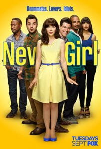
This means when looking at the cinematography of a show like New Girl my mindset required an adjustment.  But since then, I’ve realized the importance of direction in all forms of media, including television shows.  These shows are filled with purposeful decisions made by the director that alter the way in which the show is delivered.  And today I’m going to go more into depth on how these nuances guide the production of a New Girl episode!

The most recent episode of New Girl, Naked, was by far my favorite.  The concept of this episode is that Jess walks in on a singing and very naked Nick before a big date which results in him losing all self confidence.  At the same time Winston is having a hard time finding a job due to his love of basketball.  The clever aspects of direction I will focus on are the juxtaposition of setting and action, and the running of parallel story lines.

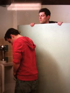
While watching this episode I had to pause it multiple times because the image on the screen was hilarious.  For evidence of this:  Please look below.

  What makes each of these funny is the fact that the actions being preformed don’t make sense in the given setting.  Examples:  Dancing naked… in front of a (semi-close) friend, discussing embarrassing moments… in an elevator with a stranger, checking your friend out… while he’s using the urinal.  These images all host a contrast between conventional setting and unconventional actions.  This is purposefully done by the directing team to make the character’s seem every more ridiculous and hilarious.  I think this is a common tactic by the crew for New Girl because of the contrasting nature of the show based in the stark differences between Jess and the guys.

The second aspect of the show which was cleverly directed was the running of similar plot lines.  Both Nick and Winston are having confidence issues (Nick with dating life and Winston with his career).  Jess and Schmidt respectively work to boost Nick and Winston’s confidence.  And as the similar story progress the show quickly pans back and forth between the two parties at play.  This move by the director is done to show both the similarities and differences of our characters.

Through this rapid back and forth from scene to scene the audience see’s how Nick and Winston both are doubting themselves and their decisions.  The director uses this to create sympathy for the characters.  The director also shows the different ways in which characters deal with their doubts (dancing to Jamaican music and crying over one’s wikipedia page).  This hilarious contrast is used to get laughs, successfully so I might add.

New Girl certainly isn’t a blockbuster action movie but it’s cinematography and direction should not be ignored.


Lights. Camera. ACTION!

As the acclaimed actress Julianne Moore once said, “People think that the directors direct actors. No. Really, what the director’s doing is directing the audience’s eye through the film.” As members of an audience, we often focus more on the actors and actresses that we see on screen rather than the directors and cinematographers that make the movies and tv shows we watch. These people are an integral part in creating the mood of a show while also engendering feelings and deciding how the audience will perceive the things that happen on the screen. To explore this idea further, let’s look at episode six from season one of Supergirl.

Rolling!

One thing that is evident from the very beginning is how quick the shots are. We see the camera changing viewpoints every time someone talks. Also, any time that someone moves or changes position within the scene the camera will move with them. During scenes like the ones in the coffee house at the beginning, the camera is constantly jumping back and forth between the two people talking, Kara and James. The camera is almost never still unless it is in moments when we are given new crucial information that we need time to process. An example of this is when Alex finds out that her boss knows something about her father’s death, and we can see how still the camera is in this moment.

The placement of the camera is also something that should be noted. The quick moving takes are often shot as a close-up of the person talking, or over the shoulder of the other person in the conversation. Throughout the episode, we feel as if we are up close and personal with the actors rather than far away. It is extremely evident that the director wants to make us feel like we are a part of the action that is happening on the screen. They want us to dodge the punches along with Kara and feel the wind on our face just like she does.

In regards to the lighting, the show as a whole is very brightly lit. The only things that are shown in a darker light are places like the DEO and people such as Kara’s evil aunt because these things are shrouded in mystery or evil. Because of the nature of the genre, it wants to convey a very clearly defined difference between good and evil, light and dark. It also wants to give the audience a sense of hope and optimism that good will win in the end which cannot be achieved with depressing and dismal lighting.

In conclusion, the director and cinematographer of a show have a lot of power in deciding how characters are perceived and how the plot of a show progresses. Through the use of lighting and the many different styles of camera angles, the audience can gain key insights into the different characters and what is going on around them.

The Cinematography of “Merry Christmas Season”

The episode “Christmas Eve Eve” on New Girl is the sixth season’s Christmas episode. It begins with a scene of Jess, Cece, Nick, Winston, and Schmidt worn out and tired after a long Halloween. The cinematography follows the same halloween vibe: it is dimly lit and the characters are in costume. This somber and spooky scene sets the stage for Winston to announce the news that Jess dreads most: no one wants to celebrate Christmas at the loft. A dreary background for dreary news.

Image result for new girl christmas eve eve

Jess is ready for Christmas Eve Eve!

The scene then shifts to a flashback of a past Christmas, which is happy, colorful, bright, and merry, but then Jess plugs another Christmas tree in, which cuts out the power, and all the Christmas Joy ends. Flashbacks are utilized many times in this episode, often accompanied by elevator-type music, so that the audience can tell it was a flashback rather than current times.

The remainder of the episode takes place two months later than the first scene when it is two days before Christmas, or as Jess says, “Christmas Eve Eve.” Everything from now on is jolly and bright. There are Christmas decorations around the loft, all the characters are wearing Christmas colors, and Jess is pumped for Christmas.

There is an interesting cinematography move that provides comedic effect when Nick puts on his new sunglasses and makes a joke. The show cuts directly to Jess unwrapping the gift she got for Nick- the same exact pair of sunglasses. It is unfortunate for Jess, but a great call on the film side.

Image result for new girl nick sunglasses christmas eve eve

Nick bought himself a lil Christmas gift

Another interesting scene is when Nick is in the bar, and it is bright and filled with joyful Christmas elves, but he is just stressed about going through all the receipts. It is a clever juxtaposition. Another well placed sequence of events is when Nick and Schmidt enter the mail truck and it is filled to the brim with boxes, but when they go to the actual store it is empty. This has the effect of showing the change of the times from when people used to actually shop in stores to the shift towards online shopping.

The episode ends with Jess sad in her room because she accidentally left her name out of the secret Santa drawing. However, the scene brightens up when Nick comes in to talk to her, and then brightens even more when Ferguson comes in with a Christmas hat on. This foreshadows that something bright and happy is about to happen. Nick brings Jess out to a snowy and jolly winter wonderland with singers and elves and happiness. This ending scene and Christmas theme throughout really sets this episode apart from the others because of the many allusions to Christmas and the cheers brought because of it!

Image result for new girl christmas eve eve

A happy ending featuring Darlene Love

Chicken Pox and Radars: Sitcom Filming

Sitcoms are some of the safest mediums in television, they have had a long history and have been almost perfected to a science. Shot by shot, Fresh off the Boat is your average sitcom fare. There is basically no risks taken, and it shows.

In most visual mediums (specifically television and movies) there are three types of shot: Long, Medium, and Close

An example of a medium shot in a movie.


And this might look closer than the medium shot, but compared to a classic close shot, it it too far away.

The show plays it safe, generally sticking to this medium, individual character-based shot composition. Compared to other episodes of the show, nothing much changes. This staple visual design is helped along by using another staple sitcom design technique, the shot reverse shot.

Characters, such as Jessica shown above, are often individually shot, with the camera making quick cuts to the other character she is talking to, such as Sunny or Louis.

Besides the normal sitcom shots and filming techniques (shot reverse shot and the medium shot) we do have some slight variations in Blind Spot episode 10 of season 1, such as the chicken pox animation that plays when a character contracts the virus and the strange horror-themed narrative they add in as a gag.

Ah, the classic ‘suddenly-appears-in-the-mirror’ horror technique.

I am surprised that they did anything different, but this difference was used a purely a gag.

To accentuate the character-based medium shots, there is one form of lighting in the show, bright and focused on the character’s face.

This lighting makes sense for a sitcom, we are expected to focus on character faces and reactions to the situations they are in thus delivering the comedy, but this is once again a classic sitcom decision. This lighting is consistent among most episodes in “Fresh off the Boat” and isn’t even changed in the gag-horror shots.

All of these shot and lightening choices are, once again, classic sitcom choices, which is perfectly fine. The shot quality, choice, and direction is fine because it does what it needs to, helps to frame the gags and dialogue, but it doesn’t do anything more.

Powered by WordPress & Theme by Anders Norén